Cascading style sheets 层叠样式表
1. 基础认知
css是给页面中的HTML标签设置样式的
1.1. CSS语法规则
css写在style标签中,style标签一般写在head标签里面,title标签下面
1 | <head> |
1.2. CSS引入方式
内嵌式:css写在style标签中,作用于当前页面约定写在head标签中
1
2
3
4
5
6
7
8<head>
<title></title>
<style>
p{
color: red;
}
</style>
</head>外联式:css写在一个单独的.css文件中,作用于多个页面需要通过link标签在网页中引入
1
<link rel="stylesheet" href="外部css文件.css">
行内式:css写在标签的style属性中,作用于当前标签1
<p style="color:red;"></p>
2. 基础选择器
2.1. 通配符选择器
- 结构:
*{css属性名:属性值;} - 作用:找到页面中所有的标签,设置样式
- 注意点:
- 一般用于统一设置内外边距为0
1 | *{ |
2.2. 标签选择器
- 结构:
标签名{css属性名:属性值;} - 作用:通过标签名,找到页面中所有这类标签,设置样式
- 注意点:
- 标签选择器选择的是一类标签,而不是单独某一个
- 标签选择器无论嵌套关系有多深,都能找到对应的标签
1 | h1{ |
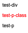
2.3. 类选择器
结构:
.类名{css属性名:属性值;}作用:通过类名,找到页面中所有带有这个类名的标签,设置样式
注意点:
- 所有标签上都有class属性,class属性的属性值称为类名
- 类名可以由
数字,字母,下划线,中划线组成,但不能以数字或中划线开头 - 一个标签可以同时有多个类名,类名之间可以空格隔开
- 类名可以重复,一个类选择器可以同时选中多个标签
1 | <style type="text/css"> |
2.4. id选择器
结构:
#id属性值{css属性名:属性值;}作用:通过id属性值,找到页面中所有带有这个id属性值的标签,设置样式
注意点:
- 所有标签上都有id属性
- id属性值类似于身份证号码,在一个页面中是惟一的,不可重复
- 一个标签只能有一个id属性值
- 一个id选择器只能选中一个标签
1 | <style type="text/css"> |
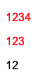
2.5. class选择器 vs id选择器
class类名与id属性值得区别
class类名相当于姓名,可以重复,一个标签可以同时有多个
class类名
id属性值相当于身份证号码,不可重复,一个标签只能有一个id属性值
class选择器与id选择器的区别
- 类选择器以 . 开头
- id选择器以 #开头
实际开发
- 类选择器用的最多
- id一般配合js使用,除非特殊情况,否则不要使用id设置样式
- 实际开发中会遇到冗余代码的抽取,可以将一些公共的代码抽取到一个公共的类中
3. CSS三大特性
3.1. 继承性
特性:子元素有默认继承父元素样式的特点
可以继承的常见属性
- color
- font-style,font-weight,font-size,font-family
- text-indent,text-align
- line-height
- …
注意点
可以通过调试工具判断样式是否可以继承
3.1.1. 去除li圆点
list-style
1 | <style> |
3.1.2. 不同浏览器统一字号
1 | body{ |
3.2. 层叠性
特性
- 给同一个标签设置不同的样式 -> 此时样式会层层叠加 -> 会共同作用在标签上
- 给同一个标签设置相同的样式 -> 此时样式会叠加覆盖 -> 最终写在最后的样式会作用在标签上
注意点
样式冲突是,只有当选择器优先级相同是,才能通过层叠性判断
3.3. 优先级
特性
不同选择器具有不同的优先级,优先级高的选择器样式会覆盖优先级低选择器样式
优先级
继承 < 通配符选择器 < 标签选择器 < 类选择器 < id选择器 < 行内样式 < !important
注意点
- !important 写在属性值的后面,分号的前面
- !important 不能提升继承的优先级,只要是继承优先级最低
- 实际开发中不建议使用!important
4. 选择器进阶
4.1. 复合选择器
4.1.1. 后代选择器 空格
作用
根据html标签的嵌套关系,选择父元素
后代中满足条件的元素选择器语法
选择器1 选择器2{css}结果
在选择器1中所找到的后代(儿子,孙子,重孙子,…)中,找到满足选择器2 的标签,设置样式
注意点
后代包括儿子,孙子,重孙子,...后代选择器中,选择器与选择器之间通过
空格隔开
1 |
|
4.1.2. 子代选择器 >
作用
根据html标签的嵌套关系,选择父元素
子代中满足条件的元素选择器语法
选择器1 > 选择器2{css}结果
在选择器1中所找到的子代(儿子)中,找到满足选择器2 的标签,设置样式
注意点
子代只包括儿子子代选择器中,选择器与选择器之间通过
>隔开
4.2. 并集选择器 ,
作用
同时选择多组标签,设置相同的样式
选择器语法
选择器1 , 选择器2{css}结果
在选择器1和选择器2选中的标签,设置样式
注意点
- 并集选择器中的每组选择器之间通过
,隔开 - 并集选择器中的每组选择器可以是基础选择器或者复合选择器
- 并集选择器中的每组选择器通常一行写一个,提高代码可读性
- 并集选择器中的每组选择器之间通过
1 | <style> |
4.3. 交集选择器
作用
选中页面中
同时满足多个选择器的标签选择器语法
选择器1选择器2{css}结果
(既又原则)找到页面中既能被选择器1选中,又能被选择器2选中的标签,设置样式
注意点
- 交集选择器中的选择器之间是紧挨着的,没有东西分隔
- 交集选择器中如果有标签选择器,标签选择器必须写在最前面
1 | <style> |
4.4. Emmet语法
作用:通过简写语法,快速生成代码
语法 — 类似于选择器
记忆 示例 效果 标签名 div <div></div>类选择器 .red <div class="red"></div>id选择器 #one <div id="one"></div>交集选择器 div.red#one <div class="red" id="one"></div>子代选择器 ul>li <ul><li></li></ul>内部文本 ul>li{内容} <ul><li>内容</li></ul>创建多个 ul>li*3 <ul><li></li><li></li><li></li></ul>
4.5. 伪选择器
在选择某元素的基础上,在文档中再增加一些额外的元素。
4.5.1. 结构伪类选择器
目标:能够使用结构伪类选择器在HTML中定位元素
作用:根据元素在HTML中的结构关系查找元素
优势:减少对HTML中类的依赖,有利于保持代码整洁
场景:常用于查找某父级选择器中的子元素
取值
选择器 说明 E:first-child{} 匹配父元素中第一个子元素,并且是E元素 E:last-child{} 匹配父元素中最后一个子元素,并且是E元素 E:nth-child(n){} 匹配父元素中第n个子元素,并且是E元素 E:nth-last-child(n){} 匹配父元素中倒数第n个子元素,并且是E元素
4.5.1.1. nth-child(n)
n为0,1,2,3,4,5,…
n可以组成常见公式
| 功能 | 公式 |
|---|---|
| 偶数 | 2n,even |
| 奇数 | 2n+1,2n-1,odd |
| 找到前5个 | -n+5 |
| 找到从第5个往后 | n+5 |
4.5.1.2. nth-of-type
选择器
| 选择器 | 说明 |
|---|---|
| E:nth-of-type | 只在父元素的同类型E子元素范围中,匹配第n个 |
区别
- nth-child 直接在所有汉字中数个数
- nth-of-type 先通过该类型找到符合的一堆子元素,然后在这一堆子元素中数个数
1 | <style> |
4.5.2. 链接伪类选择器
1 | /* 选中a链接 未访问过 的状态 */ |
4.5.3. 焦点伪类选择器
用于选中元素获取焦点时状态,常用于表单控件
1 | input:focus{ |
效果:
表单控件获取焦点时默认会显示外部轮廓线
4.5.4. 属性选择器
通过元素上的HTML属性来选择元素,常用语input标签
| 选择器 | 功能 |
|---|---|
| E[attr] | 选择具有attr属性的E元素 |
| E[attr=”val”] | 选择具有attr属性并且属性值等于val的元素 |
| E[attr^=”val”] | 匹配具有attr属性,且值以val开头的E元素 |
| E[attr$=”val”] | 匹配具有attr属性,且值以val结尾的E元素 |
| E[attr*=”val”] | 匹配具有attr属性,且值中含有val的E元素 |
input
1 | input[type="text"]{ |
button
1 | button{ |
4.6. 伪元素
目标:能够使用伪元素在网页中创建内容
区别:
元素:HTML设置的标签
伪元素:由CSS模拟出的标签效果
种类
伪元素 作用 ::before 添加一个伪元素,其将成为匹配选中的元素的第一个子元素 ::after 在父元素内容的最后添加一个伪元素 注意点
必须设置content属性才能生效
伪元素默认是行内元素
1 | <style> |
5. 权重叠加计算
场景
如果是复合选择器,此时需要通过权重叠加计算方法,判断最终哪个选择器优先级最高会生效
权重叠加计算公式
每一级之间不存在进位
复合选择器 行内样式个数 id选择器个数 类选择器个数 标签选择器个数 0 0 0 0 比较规则
- 先比较第一级数字,如果比较出来了,之后的统统不看
- 如果第一级数字相同,此时再去比较第二级数字,如果比较出来了,之后的统统不看
- ……
- 如果最终所有数字都相同,表示优先级相同,则比较层叠性(谁写在下面,之后的统统不看)
注意点
!important如果不是继承,则权重最高,天下第一
解题步骤
- 先判断选择器是否能直接选中标签,如果不能直接选中 -> 是继承,优先级最低 -> 直接pass
- 通过权重计算公式,判断谁权重最高
5.1. 案例一
最终div #one在id选择器列胜出
1 | <style> |
5.2. 普通题
#father #son 在id选择器列胜出
1 | <style> |
5.3. 标签选择器选择一类
div div 胜出
1 | <style> |
5.4. 权重叠加每位不存在进制
.one胜出
1 | <style> |
5.5. 权重相同时比较层叠性
#box1 div 和 div #box3权重相等,按照先后顺序 #box1 div胜出
1 | <style> |
5.6. 全是继承的特殊情况
1 | <style> |
6. 字体样式
使用字体和文本相关样式修改元素外观样式
6.1. 大小 font-size
px - 像素
em - 页面1个字符大小的基准值,基准值根据浏览器,用户自定义标准的不同而不同。
注意点:
- chrome默认文字大小是16px
- 单位需要设置,否则无效
1 | h1{ |
6.2. 粗细 font-weight
取值:
关键字
正常 normal 加粗 bold 纯数字:100-900的整百数
正常 加粗 700
注意点:
- 不是所有字体都提供了九种粗细,因此部分取值页面中无变化
- 实际开发中,以正常,加粗两种取值使用最多。
1 | h1{ |
6.3. 样式 font-style
取值:
- 正常:normal (默认值)
- 倾斜:italic
6.4. 类型 font-family
常见字体系列
无衬线字体(sans-serif)
- 特点:文字笔画粗细均匀,并且首尾无装饰
场景: 在网页中大多采用无衬线字体
- 常见系列字体:在mac中将显示有黑体,在Windows中将显示为微软雅黑
衬线字体(serif)
- 特点:文字笔画粗细不均,并且首尾有笔锋装饰
- 场景:报刊书籍中应用广泛
- 常见系列字体:宋体,Times New Roman
- 等宽字体(monospace)
- 特点:每个字母或文字的宽度相等
- 场景:一般用于程序代码编写,有利于代码的阅读和编写
- 常见系列字体:Consolas,fira code
- 特点:文字笔画粗细不均,并且首尾有笔锋装饰
常见取值:具体字体1,具体字体2,…,字体系列
- 具体字体:微软雅黑,黑体,宋体,楷体等
- 字体系列:sans-serif,serif,monosapce等
渲染规则
- 从左到右按照顺序查找,如果未安装该字体,则显示下一个字体
- 如果不支持,此时会根据操作系统,显示最后字体系列的默认字体
注意点
- 如果字体名称中存在多个单词,推荐使用引号包裹
- 最后一项字体系列不需要引号包裹
- 网页开发时,尽量使用系统常见自带字体,保证不同用户浏览网页都可以正确显示
1 | <body> |
6.5. font相关属性连写 swsf
取值:
font: style weight size family省略要求:只能省略前两个,如果省略了相当于设置了默认值
注意点:
- 要么把单独的样式写在连写的下面
- 要么把单独的样式写在连写的里面
6.6. 自定义字体
1 | @font-face{ |
7. 文本样式
7.1. 缩进 text-indent
取值:
- 数字+px
- 数字+em(推荐:1em=当前标志的font-size大小)
1 | p{ |
7.2. 文本水平对齐方式 text-align
可以操作的元素:文本,span标签,a标签,input标签,img标签
取值:
| 属性值 | 效果 |
|---|---|
| 左对齐 | |
| 居中 | |
| right | 右对齐 |
注意点:
如果需要让文本水平居中,text-align属性设置在文本所在标签的父元素
1 | <div style="text-align:center;"> |
7.3. 水平居中方法总结
7.3.1. text-align: center
可以操作的元素:文本,span标签,a标签,input标签,img标签
为了以上元素水平居中,text-align属性在标签的父元素中设置
7.3.2. margin: 0 auto
让div,p,h标签水平居中,直接设置在当前元素上
一般针对于固定宽度的盒子,如果大盒子没有设置宽度,默认占满父元素的宽度
7.4. 文本修饰 text-decoration
取值:
| 属性值 | 效果 |
|---|---|
| underline | 下划线 |
| line-through | 删除线 |
| overline | 上划线 |
| none | 无装饰线 |
开发中使用text-decoration:none; 清除a标签默认的下划线
7.5. 文字阴影 text-shadow
取值
| 参数 | 作用 | 取值 |
|---|---|---|
| h-shadow | 必须,水平偏移量,允许负值 | 数字+px |
| v-shadow | 必须,垂直偏移量,允许负值 | 数字+px |
| blur | 可选,模糊度 | 数字+px |
| color | 可选,阴影颜色 |
拓展:
阴影可以叠加设置,每组阴影取值之间以逗号隔开
1 | /* 右下方向添加阴影 */ |
7.6. 大写
1 | h1{ |
8. 行高 line-height
- 作用:控制行间距。给一行上下增加间距
- 取值:
- 数字+px
- 倍数(font-size的倍数)
- 应用
- 让单行文本垂直居中可以设置line-height: 文字父元素高度
- 网页精准布局是,会设置line-height: 1,可以取消上下间距
- 行高与font连写注意点
- 如果同时设置了行高和font连写,注意覆盖问题
font: style weight size/line-height fmaily;
1 | /* 先计算父元素的line-height值,然后将值继承给子元素 */ |
9. 颜色常见取值
属性名
文字颜色 - color
背景颜色 - background-color
属性值
颜色表示方式 表示含义 属性值 关键词 预定义的颜色名 red,green,blue rgb表示法 红绿蓝三原色。每项范围:0-255 rgb(0,0,0) rgba表示法 红绿蓝三原色+透明度,取值范围0-1 rgba(255,255,255,0.5) 十六进制表示法 #开头,将数字转换成十六进制表示 #000000,#ff0000
10. 背景相关属性
10.1. 背景颜色 background-color
- 属性值:关键字,rgb表示法,rgba表示法,#十六进制
- 注意点
- 背景颜色默认值是透明的:rgba(0,0,0,0),transparent
- 背景颜色不会影响盒子大小,并且还能看清盒子的大小和位置,一般在布局中会习惯先给盒子设置背景颜色
10.2. 背景线性渐变 linear-gradient
1 | background: linear-gradient(起始方向,颜色1,颜色2,...); |
背景渐变必须添加浏览器私有前缀
起始方向可以是方位名词,或者度数,如果省略默认就是top
10.3. 背景图片 background-image
- 属性值:background-image: url(‘图片路径’);
- 注意点
- 背景图片中url可以省略引导
- 背景图片默认在水平和垂直方向平铺
- 背景图片仅仅是指给盒子起到装饰效果,类似于背景颜色,是不能撑开盒子的
10.4. 背景平铺 background-repeat
属性值
| 取值 | 效果 |
|---|---|
| repeat | 默认值-水平和垂直方向都平铺 |
| no-repeat | 不平铺 |
| repeat-x | 沿着水平方向平铺 |
| repeat-y | 沿着垂直方向平铺 |
10.5. 背景位置 background-position
属性值
background-position: 水平方向位置 垂直方向位置;
方位名词(最多只能表示9个位置)
水平方向
left,center,right
垂直方向
top,center,bottom
数字+px(坐标)
坐标系
原点(0,0) - 盒子的左上角
x轴 - 水平向右
y轴 - 垂直向下
操作
将图片左上角与坐标点重合即可
注意点
方位名词取值和坐标取值可以混使用,第一个取值表示水平,第二个取值表示垂直
10.6. 背景图片大小 background-size
取值
| 取值 | 场景 |
|---|---|
| 数字+px | 简单方便,常用 |
| 百分比 | 相对于当前盒子自身的宽高百分比 |
| contain | 包含,将背景图片等比例缩放,直到不会超出盒子的最大 |
| cover | 覆盖,将背景图片等比例缩放,直到刚好填满整个盒子没有空白 |
10.7. 背景属性连写 background
顺序
background: color image repeat position/size;省略问题
可以按照需求省略;
在pc端,如果盒子大小和背景图片大小一样,此时可以直接写成
background: url()注意点
如果需要设置单独的样式和连写
- 要么把单独的样式写在连写的下面
- 要么把单独的样式写在连写的里面
10.8. img标签和背景图片区别
在网页中展示展示一张图片
直接写上img标签
img标签不设置宽高默认以原尺寸显示
div+背景图片
需要设置div宽高,因为背景图片只是装饰的css样式
10.9. 精灵图
场景: 项目中将多张小图片合并成一张大图片,这张大图片就称之为精灵图
优点:减少服务器发送次数,减轻服务器的压力,提高页面加载速度
例如:需要在网页中展示8张小图片
- 8张小图片分别发送 -> 请求8次
- 合成一张精灵图发送-> 请求1次
使用步骤
- 创建一个盒子
- 将小图片的宽高设置给盒子
- 将精灵如设置为盒子的背景图片
- 分别取
负值设置给盒子的background-position: x y
1 | .one{ |
11. 元素显示模式
11.1. 块级元素 display:block;
显示特点
- 独占一行
- 宽度默认是父元素的宽度,高度默认由内容撑开
- 可以设置宽高
代表标签
div,p,h系列,ul,li,dl,dt,dd,form,header,aside,nav,footer,...
11.2. 行内元素 display:inline;
显示特点
- 一行可以显示多个
- 宽度和高度默认由内容撑开
- 不可以设置宽高
代表标签
a,span,b,u,i,s,strong,ins,em,del...
11.3. 行内块元素 display:inline-block;
显示特点
- 一行可以显示多个
- 可以设置宽高
代表标签
input,textarea,button,select...img标签有行内块元素特点,但是chrome调试工具显示的是inline
12. 标准流
标准流又称文档流,是浏览器在渲染显示网页内容时默认采用的一套排版规则,规定了应该以何种方式排列元素
- 块级元素:从上往下,垂直布局,独占一行
- 行内元素/行内块元素:从左往右,水平布局,空间不够自动拆行
13. HTML嵌套规范
块级元素一般作为大容器,可以嵌套:文本,块级元素,行内元素,行内块元素等
p标签中不要嵌套div,p,h系列等块级元素a标签内部可以嵌套任意元素
a标签中不要再嵌套a标签
14. 盒子模型
14.1. 盒子模型的介绍
- 页面中的每一个标签,都可以看做是一个盒子,通过盒子的视角更方便的进行布局
- 浏览器在渲染网页时,会将网页中的元素看做是一个个的矩形区域,形象的称之为盒子
- CSS中规定每个盒子分别由
内容区域(content),内边距区域(padding),边框区域(border),外边距区域(margin)构成
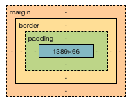
14.2. 内容的宽度和高度
css的width和height属性默认设置的是盒子内容区域的大小
14.3. 边框 border
属性
属性名 属性值 作用 border-width 数字+px 边框粗细 border-style 实线solid,虚线dash,点线dotted 边框样式 border-color 颜色取值(数字、rgb,#) 边框颜色 连写
border: width style color;单方向设置
只给盒子的每个方向单独设置边框
属性名:border-方位名词
border-top,border-bottom,border-left,border-right
14.4. 内边距 padding
作用:设置边框与内容区域之间的距离
取值
取值 示例 含义 一个值 padding: 10px; 上右下左设置为10px 两个值 padding: 10px 20px; 上下设置为10px,左右设置为20px 三个值 padding: 10px 20px 30px; 上设置为10px,左右设置为20px,下设置为30px; 四个值 padding: 10px 20px 30px 40px; 上设置为10px,右设置为20px,下设置为30px,左设置为40px 规则
顺时针赋值
14.5. 盒子实际大小计算公式
盒子尺寸400*400,背景绿色,边框10px 实线 黑色
1 | /* 这是错误的,这样设置的div的尺寸为460*460 */ |
设置width和height是内容的宽高!
设置border,padding会撑大盒子!
盒子实际大小计算公式
- 盒子宽度 = 左边框+左内边距+内容宽度+右内边距+右边框
- 盒子高度 = 上边框+上内边距+内容高度+下内边距+下边框
14.6. 不会撑大盒子的特殊情况
- 如果子盒子没有设置宽度,此时宽度默认是父盒子的宽度
- 此时子盒子设置左右的padding或者左右的border,此时不会撑大盒子
14.7. 自动内减 box-sizing: box-border;
浏览器会自动计算多余大小,自动在内容中减去
14.8. 外边距 margin
作用:设置盒子与盒子之间的距离
取值
取值 示例 含义 一个值 margin: 10px; 上右下左设置为10px 两个值 margin: 10px 20px; 上下设置为10px,左右设置为20px 三个值 margin: 10px 20px 30px; 上设置为10px,左右设置为20px,下设置为30px; 四个值 margin: 10px 20px 30px 40px; 上设置为10px,右设置为20px,下设置为30px,左设置为40px 规则
顺时针赋值
单方向设置
方向 属性 效果 水平左 margin-left 当前盒子往右移动 水平右 margin-right 右边的盒子往右移动 垂直上 margin-top 当前盒子往下移动 垂直下 margin-bottom 下面的盒子往下移动
14.9. 外边距折叠现象
14.9.1. 合并现象
场景:
垂直布局的块级元素,上下的margin会合并结果:最终两者距离为margin的最大值
1
2
3
4
5
6
7
8
9
10
11
12
13
14
15
16
17
18
19
20<style>
*{
margin: 0;
padding: 0;
}
.box1{
width: 100px;
height: 100px;
background-color: red;
margin-bottom: 100px;
}
.box2{
width: 100px;
height: 100px;
background-color: blue;
margin-top: 100px;
}
</style>
<div class="box1"></div><div class="box2"></div>
14.9.2. 塌陷现象
- 场景:
互相嵌套的块级元素,子元素的margin-top会作用在父元素上 - 结果:导致父元素一起往下移动
- 解决:
- 给父元素设置border-top或者padding-top,来分隔父子元素的margin-top
- 给父元素设置overflow: hidden
- 转换成行内块元素
- 设置浮动
- 使用双伪元素清除浮动
1 | <style> |
14.10. 元素存在默认内外边距
浏览器会默认给部分标签设置默认的margin和padding,但一般在项木开始前需要先清除这些标签默认的margin和padding,后序自己设置
- body标签默认有margin
- p标签默认有上下的margin
- ul标签默认有上下的margin和padding-left
解决方法
淘宝网代码
1
2
3
4blockquote,body,button,dd,dl,dt,filedset,form,h1,h2,h3,h4,h5,h6,hr,input,legend,li,ol,p,pre,td,textarea,ul{
margin: 0;
padding: 0;
}京东代码
1
2
3
4*{
margin: 0;
padding: 0;
}
14.11. 行内元素的margin和padding无效情况
场景:给行内元素设置margin和padding时
结果:
水平方向的margin和padding布局有效
垂直方向的margin和padding布局无效
14.12. 盒子阴影 box-shadow
取值
| 参数 | 作用 |
|---|---|
| h-shadow | 必须,水平偏移量,允许负值 |
| v-shadow | 必须,垂直偏移量,允许负值 |
| blur | 可选,模糊度 |
| spread | 可选,阴影扩大 |
| color | 可选,阴影颜色 |
| inset | 可选,将阴影改为内部阴影 |
15. 浮动
15.1. 作用
- 图文环绕
- 网页布局
15.2. 代码 float
属性值
| 属性名 | 效果 |
|---|---|
| left | 左浮动 |
| right | 右浮动 |
15.3. 特点
浮动元素会脱离标准流,在标准流中不占位置
浮动元素比标准流高半个级别,可以覆盖标准流中的元素
浮动找浮动,下一个浮动元素会在上一个浮动元素后面左右浮动
浮动元素会受到上面元素边界的影响
浮动元素有特殊的显示效果
一行可以显示多个
可以设置宽高
⚠️注意点
浮动的元素不能通过text-align: center和margin: 0 auto,让浮动元素本身水平居中
15.3.1. 实现布局
代码
1 | <style> |
15.3.2. 实现导航

步骤:
- 清除默认的margin和padding
- 找到ul,去除小圆点
- 找到li标签,设置浮动让li一行显示
- 找到a标签,设置宽高 -> a标签默认是行内元素,默认不能设置宽高
- 方法一:给a标签设置dispaly: inline-block
- 方法二:给a标签设置display: block
- 方法三:给a标签设置float: left
1 | <style> |
15.4. 清除浮动
含义:清除浮动带来的影响
如果子元素浮动了,此时子元素不能撑开标准流的块级元素
原因:子元素浮动后脱标,变得不占位置
目的:需要父元素有高度,从而不影响其他网页元素的布局
15.4.1. 设置父元素高度
- 优点:简单粗暴
- 缺点:有些布局不能固定父元素高度,如:新闻列表,京东推荐模块
15.4.2. 额外标签法
操作
- 在父元素内容的最后添加一个块级元素
- 给添加的块级元素设置
clear:both
特点
缺点:会在页面中添加额外的标签,让页面的HTML结构变得复杂
15.4.3. 单伪元素清除法
- 操作:用伪元素替代额外标签
- 优点:项目中使用,直接给标签加类即可清除浮动
1 | <style> |
15.4.4. 双伪元素清除法
操作
1
2
3
4
5
6
7
8.clearfix::before,
.clearfix::after{
content: '',
display: table;
}
.clearfix::after{
clear:both;
}优点:项目中使用,直接给标签加类即可清除浮动
15.4.5. 给父元素设置 overflow:hidden
- 优点:方便
16. BFC
Block Formatting Context 块格式化上下文
是Web页面的可视CSS渲染的一部分,是块盒子的布局过程发生的区域,也是浮动元素与其他元素交互的区域。
创建BFC方法:
- html标签是BFC盒子
- 浮动元素是BFC盒子
- 行内块元素是BFC盒子
- overflow属性取值不为visible。如:auto,hidden
- ……
BFC盒子常见特点:
- BFC盒子会默认包裹住内部子元素 -> 应用:清除浮动
- BFC盒子本身与子元素之间不存在margin 的塌陷现象 -> 应用:解决margin的塌陷
17. 网页常见布局
17.1. 标准流
块级元素独占一行 – 垂直布局
行内元素/行内块元素一行显示多个 – 水平布局
17.2. 浮动
让原本垂直布局的块级元素变成水平布局
17.3. 定位
可以让元素自由的摆放在网页的任意位置
一般用于盒子之间的层叠情况
18. 定位
18.1. 基本介绍
- 可以解决盒子与盒子之间的层叠问题
- 定位之后的元素层级最高,可以层叠在其他盒子上面
- 可以让盒子始终固定在屏幕中的某个位置
18.2. 基本使用
设置定位方式
属性名:position
属性值:
定位方式 属性值 静态定位 static 相对定位 relative 绝对定位 absolute 固定定位 fixed 设置偏移值
- 偏移值设置分为两个方向,水平和垂直方向各选一个使用
- 选取的原则一般是就近原则
方向 属性名 属性值 含义 水平 left 数字+px 距离左边的距离 水平 right 数字+px 距离右边的距离 垂直 top 数字+px 距离上边的距离 垂直 bottom 数字+px 距离下边的距离
18.3. 静态定位 position:static;
静态定位是默认值,就是之前认识的标准流
注意点:
- 静态定位不能通过方位属性进行移动
- 之后说的定位不包括静态定位,一般特指后几种:相对,绝对,固定
18.4. 相对定位 position:relative;
自恋型定位,相对于自己之前的位置进行移动
特点:
- 需要配合方位属性实现移动
- 相对于自己原来位置进行移动
- 在页面中占位置,
没有脱标
应用场景:
- 配合绝对定位组cp(子绝父相)
- 用于小范围的移动
18.5. 绝对定位 position:absolute;
拼爹型定位,相对于非静态定位的父元素进行定位移动
特点:
- 需要配合方位属性实现移动
- 默认相对于浏览器可视区域进行移动
- 在页面中不占位置,
已经脱标
应用场景:
配合绝对定位组cp(子绝父相)
18.5.1. 相对于谁偏移
- 祖先元素中没有定位,默认相对于浏览器进行移动
- 祖先元素中有定位,相对于
最近的 有定位的祖先元素进行移动
18.6. 子绝父相
场景:让子元素相对于父元素进行自由移动
含义:
子元素:绝对定位
父元素:相对定位
子绝父相好处
父元素是相对定位,则对网页布局影响最小
18.6.1. 子元素水平居中
子绝父相
子盒子向右移动父盒子的一半
子盒子向左移动自己的一半
普通做法:margin-left: -子盒子宽度;
优化做法: transform: translateX(-50%);
1 | <style> |
18.6.2. 子元素水平垂直居中
1 | <style> |
18.7. 固定定位position:fixed;
死心眼型定位,相对于浏览器进行定位移动
特点:
- 需要配合方位属性实现移动
- 相对于浏览器可视区域进行移动
- 在页面中不占位置,
已经脱标
应用场景:
让盒子固定在屏幕中的某个位置
18.8. 四种定位总结
| 定位方式 | 属性值 | 相对于谁移动 | 是否占位置 |
|---|---|---|---|
| 静态定位 | static | 不能通过方位属性移动 | 占位置 |
| 相对定位 | relative | 相对于自己原来的位置 | 占位置 |
| 绝对定位 | absolute | 相对于最近的且有定位的祖先元素移动 | 不占位置(脱标) |
| 固定定位 | fixed | 相对于浏览器可视区域 | 不占位置(脱标) |
18.9. 元素的层级关系
18.9.1. 不同布局方式元素的层级关系
标准流 < 浮动 < 定位
18.9.2. 不同定位之间的层级关系
相对,绝对,固定默认层级相同
此时HTML中写在下面的元素层级更高,会覆盖上面的元素
18.9.3. 改变定位元素的层级 z-index
属性值:数字
数字越大,层级越高
一般设置最高层级 z-index:999;
19. 装饰
19.1. 垂直对齐方式 vertical-align
19.1.1. 基线
浏览器文字类型元素排版中存在用于对齐的基线baseline
19.1.2. 文字对齐方式
- 场景:解决
行内/行内块元素垂直对齐问题 - 问题:当图片和文字在一行中显示时,其实底部不是对齐的
19.1.3. 属性值
| 属性值 | 效果 |
|---|---|
| baseline | 默认,基线对齐 |
| top | 顶部对齐 |
| middle | 中部对齐 |
| bottom | 底部对齐 |
19.1.4. 解决无法对齐问题
- 文本框和表单无法对齐问题
1 | <style> |
input和img无法对齐问题
div中的文本框,文本框无法贴顶问题
div不设高度由img标签撑开,此时img标签下面会存在额外间隙问题
使用line-height让img标签垂直居中问题
1
2
3
4
5
6
7
8
9
10
11
12
13
14
15
16
17<style>
.father{
width: 400px;
height: 400px;
background-color: yellow;
/*仅设置line-height无法使图片居中,
img默认底部基线对齐,
必须配合img的vertical-align使用*/
line-height: 400px;
}
img{
vertical-align: middle;
}
</style>
<div class="father">
<img src="" alt="">
</div>
19.2. 光标类型cursor
设置鼠标光标在元素上时显示的样式
属性值
| 属性值 | 效果 |
|---|---|
| default | 默认值,通常是箭头 |
| pointer | 小手效果,提示用户可以点击 |
| text | 工字型,提示用户可以选择文字 |
| move | 十字光标,提示用户可以移动 |
19.3. 边框圆角 border-radius
取值:数字+px,百分比
赋值规则:从左上角开始赋值,然后顺时针赋值,没有赋值的看对角
19.3.1. 画正圆
盒子必须是正方形
设置边框圆角为盒子宽高的一半
1 | <style> |
19.3.2. 胶囊按钮
盒子必须是长方形
设置边框圆角为盒子高度的一半
1 | <style> |
19.4. overflow溢出部分显示效果
指的是盒子内容部分所超出盒子范围的区域
场景:控制内容溢出部分的显示效果,如:显示,隐藏,滚动条
属性值
属性值 效果 visible 默认值,溢出部分可见 hidden 溢出部分隐藏 scroll 无论是否溢出,都显示滚动条 auto 根据是否溢出,自动显示或隐藏滚动条
19.5. 元素本身隐藏属性 display:none;
让某元素本身在屏幕中不可见。如:鼠标:hover之后元素隐藏
属性:
- visibility:hidden;
- display:none;
区别:
- visibility:hidden; 隐藏元素本身,并且在网页中占位置
- display:none; 隐藏元素本身,并且在网页中不占位置
注意点:
- 开发中经常会通过display属性完成元素的显示隐藏切换
- diaplay:none; 隐藏,display:block; 显示
默认son元素隐藏,当鼠标移入father后让son显示
1 | <style> |
19.6. 元素整体透明度 opacity
属性值:0-1之间的数字
1:表示完全不透明
0:表示完全透明
注意点:
opacity会让元素整体透明,包括里面的内容,如:文本,子元素等
19.7. 边框合并 border-collapse:collapse;
让相邻表格边框进行合并,得到细线边框效果
1 | table{ |
19.8. 用css画三角形
- 原理:利用盒子边框
- 步骤
- 设置一个盒子
- 设置四周不同颜色的边框
- 将盒子宽高设置为0,仅保留边框
- 得到四个三角形,选择其中一个后,其他三角形设置颜色为透明
1 | <style> |
20. CSS 书写顺序
| 顺序 | 类别 | 属性 |
|---|---|---|
| 1 | 布局属性 | display,position,float,clear,visibility,overflow |
| 2 | 盒子模型+背景 | width,height,margin,padding,border,background |
| 3 | 文本内容属性 | color,font,text-decoration,text-align,line-height |
| 4 | 点缀属性 | cursor,border-raduis,text-shadow,box-shadow |
开发中推荐多用类+后代,但不是层级越多越好,一个选择器中的类选择器的个数推荐不超过3个
21. 过渡 transition
让元素的样式慢慢的变化,常配合hover使用
取值
参数 取值 过渡的属性 all:所有能过渡的属性都过渡;具体属性名,如:width-只有width有过渡 过渡的时长 数字+s 注意点
- 过渡需要:默认状态和hover状态样式不同,才能有过渡效果
- transition属性给需要过渡的元素本身加
- transition属性设置在不同状态中,效果不同的
- 给默认状态设置,鼠标移入移出都有过渡效果
- 给hover状态设置,鼠标移入有过渡效果,移出没有过渡效果
1 | div{ |
22. 2D转换 transform
22.1. 移动 translate
1 | tranform: translate(x,y); |
x-正向 向右,负向 向左
y-正向 向下,负向 向上
不会影响其他元素的位置
数值的百分比是相对于自身元素的 tranform: translate(50%,50%); 表示向右向下移动自身宽高的一半
⚠️注意:对行内标签没有效果
22.2. 旋转 rotate
1 | transform: rotate(45deg); |
- 度数取值为0-360
- 角度为正时,顺时针,负时,逆时针
- 默认旋转的中心的是元素的中心点
22.3. 转换中心点 transform-origin
元素转换中心点
1 | transform-origin: x y; |
- x y 默认转换的中心点事元素的中心点(50% 50%)
- 还可以给x y 设置像素或者方位名词(top,left,bottom,right,center)
案例
1 | <style> |
22.4. 缩放scale
1 | tranform: scale(x,y); |
- transform: scale(1,1):宽高都放大1倍
- transform: scale(2,2):宽高都放大2倍
- transform: scale(2):宽高都放大2倍
- transform: scale(0.5,0.5):宽高都缩小1倍
- 优势-可以设置转换中心点缩放,而且
不影响其他盒子
1 | <style> |
22.5. 转换综合写法
- 同时使用多个转换,格式为
transform: translate() rotate() scale() ... - 其顺序会影响转换的效果。先选择会改变坐标轴方向
- 同时有唯一和其他属性时,要将位移放在最前面
23. 动画 animation
可通过设置多个节点来精确控制一个或一组动画,常用来实现复杂的动画效果
23.1. 用keyframes定义动画
- 0% 是动画的开始,100% 是动画的完成
- 在 @keyframes 中规定某项css样式,就能创建由当前样式逐渐改为新样式的动画效果
- 可以做多个状态的变化 0%,25%,75%,100%
- 百分比就是总的时间的划分
- 也可以用 from to 替换 0% 100%
1 | @keyframes 动画名称{ |
23.2. 使用动画
1 | animation-name: 动画名称; |
23.3. 动画常用属性
| 属性 | 描述 |
|---|---|
| @keyframes | 规定动画 |
| animation | 所有动画属性的连写,除animation-play-state属性 |
| animation-name | 规定 @keyframes动画的名称 |
| animation-duration | 规定动画完后一个周期所花费的秒或毫秒,默认是0 |
| animation-timing-function | 规定动画的速度曲线,默认是ease |
| animation-delay | 规定动画何时开始,默认是0 |
| animation-iteration-count | 规定动画播放次数,默认是1,可以是infinite |
| animation-direction | 规定动画是否在下一周期逆向播放,默认是normal,可以是alternate 逆播放 |
| animation-play-state | 规定动画是否正在运行或暂停。默认是running,还有pause |
| animation-fill-mode | 规定动画结束后状态,保持forwards,回到起始backwards |
23.4. 连写
animation: 动画名称 持续时间 运动曲线 何时开始 播放次数 是否反方向 动画起始或结束的状态
定位效果
1 | <style> |
23.5. 动画速度 animation-timing-function
| 值 | 描述 |
|---|---|
| linear | 动画从头到尾的速度是相同的,匀速 |
| ease | 默认。动画以低速开始,然后加快,在结束前变慢 |
| ease-in | 动画以低速开始 |
| ease-out | 动画以低速结束 |
| ease-in-out | 动画以低速开始和结束 |
| steps | 指定了时间函数中的间隔数量(步长) |
23.5.1. 步长应用-打字效果
1 | <style> |
23.5.2. 奔跑的小熊
1 | <style> |
24. 3D转换
24.1. 三维坐标系
- x轴:水平向右,右为正,左为负
- y轴:垂直向下,下为正,上为负
- z轴:垂直屏幕,外为正,里为负
24.2. 3D移动 translate3d
3D移动在2D移动的基础上多加了一个可以移动的z方向
tansform: translateX(100px)
向右移动
tansform: translateY(100px)
向下移动
tansform: translateZ(100px)
向外移动
tansform: translate(100px,100px,100px)
x y z 三方向都移动
24.3. 透视 perspective
在2D平面产生
近大远小视觉立体,只是效果是二维的透视也称为视距,视距就是人的眼睛到屏幕的距离
距离视觉点越近的在电脑平面成像越大,越远成像越小
透视的单位是像素
透视写在被观察元素的父盒子上面透视就是z轴,物体距离屏幕的距离,z轴越大(正向往屏幕外),看到的物体越大
24.4. 3D旋转 rotate3d
元素在三维平面内沿着x轴,y轴,z轴或者自定义轴进行旋转
左手原理,大拇指指向轴正向,其余四指弯曲方向即为旋转正向
transform: rotateX(45deg)
沿着x轴正方向(往里)旋转45度
transform: rotateY(45deg)
沿着y轴正方向(往里)旋转45度
transform: rotateZ(45deg)
沿着z轴正方向旋转45度 - 看起来跟2d旋转相同
transform: rotate3d(x,y,z,45deg)
沿着自定义轴旋转45度
如 transform: rotate3d(1,1,0,45deg),沿x,y对角线旋转
24.5. 3D呈现 tranform-style
父盒子中拥有多个子盒子时
- 控制子元素是否开启三维立体环境
- transform-style: flat; 子元素不开启3d立体空间,默认
- transform-style: preserve-3d; 子元素开启立体空间
- 代码写给父级,但是影响的是子盒子
24.5.1. 案例一
1 | <style> |
24.5.2. 案例二:两面翻转
1 | <style> |
24.5.3. 案例三:3D导航栏
1 | <style> |
24.5.4. 案例四:旋转木马
实现6个面的旋转效果
1 | <style> |
25. 浏览器私有前缀
为了兼容老版本的写法
- -moz-:代表firefox浏览器私有属性
- -ms:代表ie浏览器私有属性
- -webkit-:代表safari,chrome浏览器私有属性
- -o-:代表opera浏览器私有属性
提倡的写法
1 | -webkit-border-raduis: 10px; |
26. 图标字体
[阿里巴巴矢量图标库](http:// iconfont.cn/)
在线创建矢量图 https://glyphsapp.com/
使用font awesome图标
1 | <link href="css/fontawesome/css/all.css" rel="stylesheet"> |
26.1. 边框
1 | .block{ |
样式
dotted 点状线
solid 实线
dashed 虚线
26.2. 颜色
前三个值为0-255,第4个值为0-1,0完全透明,1完全不透明
1 | color: rgba(red, green, blue, alpha); |
26.3. 框模型
1 | box-sizing:border-box; |
内容区域先扣除内边距和边框的宽度,剩下的宽度才是内容宽度
1 | box-sizing:center-box; |
内容区域不包括内边距和边框的宽度
26.4. 背景图片
页面图片是以链接外部显示的。也就是说,任何图像的显示都需要在HTML文档之外放置相应的图片文件。
1 | <body> |
“body” 表示样式应用的对象是<body>标签,括号之内为样式的详细内容,在此指定body的背景属性为图片显示,图片的路径为back.jpg。
26.4.1. 设置元素的背景图片
1 | h1{ |
26.4.2. 背景尺寸
1 | background-size: 150px 43px; |
指定背景尺寸为150x43像素
26.4.3. 背景图片居中显示
1 | <body> |
26.5. 区域内容居中
1 | <body> |
26.6. transform
1 | /* container在Y轴方向上移动-50% */ |
translate(0,50px) 在x和y方向上移动
rotate(90deg) 顺时针旋转90度
rotateX(90deg) rotateY(90deg) rotateZ(90deg) 3D旋转90度
scale(1.2,1.6) x和y方向的缩放程度
26.7. 链接变按钮
1 | a{ |
26.8. 元素定位
26.8.1. 块级元素
h1,p
块级元素默认display属性 display:block; 可以修改为inline使其成为行内元素,块级元素可以包含块级元素和行内元素
可以设置宽度和高度,默认宽度为100%占满整行
float:left;控制元素浮动方向
clear:both;元素左右两侧均不允许浮动元素,元素独占一行
26.8.2. 行内元素
span
display:inline; 行内元素不能包含块级元素,仅可以设置行高,设置宽度和高度无效
26.8.3. 定位
position:relative; 相对定位
position:absolute; 绝对定位,也需要相应的父元素参照物,父元素定位设置为相对定位。top,left,bottom,right设置元素显示位置。
26.9. 列表
26.9.1. 清除列表样式
1 | ul{ |
26.9.2. 列表前缀样式
1 | li{ |
26.9.2.1. 单独设置列表前缀样式
1 | li:first-child{ |
26.9.2.2. 雪碧图 CSS Sprites
将许多图片拼合起来形成一张大图,用css来控制图片的显示大小和显示位置,实现不同的元素中显示不同的图片内容,减少网页的http请求来提升页面的性能。
每张图片96x100,第二张图片距离顶部100像素,第三张图片距离顶部200,以此类推,像素左边距离0像素
1 | li{ |
26.9.3. 列表元素并列显示
1 | li{ |
26.10. 阴影效果
26.10.1. 文字阴影text-shadow
1 | h1{ |
26.10.2. 元素阴影box-shadow
1 | #box{ |
26.11. 创建外部css文件
过多的css样式使得html文件代码变得冗长。
将所有样式代码放在外部的css中,在HTML中引入样式文件
1 | <head> |
index.css
1 | @charset "UTF-8" |
26.12. HTML5布局
26.12.1. 图文混排
1 | <style type="text/css"> |
float代表设置浮动,img这个块级元素被从整个文档流中抽取出来,根据浮动的方向重新定位,img原有的位置空了出来,被下方的段落取代,两者由“上下”排列变成了“排排坐”。由于img右浮动后占据了右侧的一块区域,因此段落中的行内元素将避开这一已经被占据的区域,最终呈现出图文混排效果。
1 | <style type="text/css"> |
margin-top: -200px; 带有负值的margin-top属性来使得图片向上推出
26.12.2. 两列均分布
包括了一个section节点,以及节点下的两个article节点。每一个article 中均包含了h1、p和img等三个元素,分别对应标题,文字和图片
1 | <section> |
样式
1 | *{ |
此时原先section的边框和背景不见了!
将article加以浮动时,按之前学习的原理,它们就被从文档流中出去了,变为浮动在文档流之上。当section中的两个元素都浮动时,其内部的文档流都被,这样它就去了自身的高度,也就是高度 “坍塌”了。要解决这一问题,我们常常通过在元素中加一个不浮动的子元素来浮动带来的影响,通过::after元素来完成
1 | section::after{ |
一般单独命名类,实现调用
1 | .clearfix::before, .clearfix:after{ |
将display属性设为table,并设clear为both,是为了使清除浮动的时形成一种名为BFC (Block Format Content,块级格式上下文)的机制。在BFC中,元素布局不外界的影响,我们往往利用该特性来消除浮动元素对其他非浮动元素带来的影响。此外,在BFC中,块级元素与由行内元素组成的“行盒子”会垂直地沿其父元素的边框排列。触发BFC的因素很多,如上设display为table即为其中的一种因素(也可以设display为 inline-block、table-cell、table-caption、flex、inline-flex等)。此外,overflow不为visible也会触发BFC,如当为图片设置浮动时,可以看到段落中的文字是环绕图片排列的,而为段落添加overflow属性为hidden,则可以触发其BFC制。将转换为BFC后,可以看到文字不再围绕图片排列 了,这样我们也就清除了img浮动对段落元素的影响
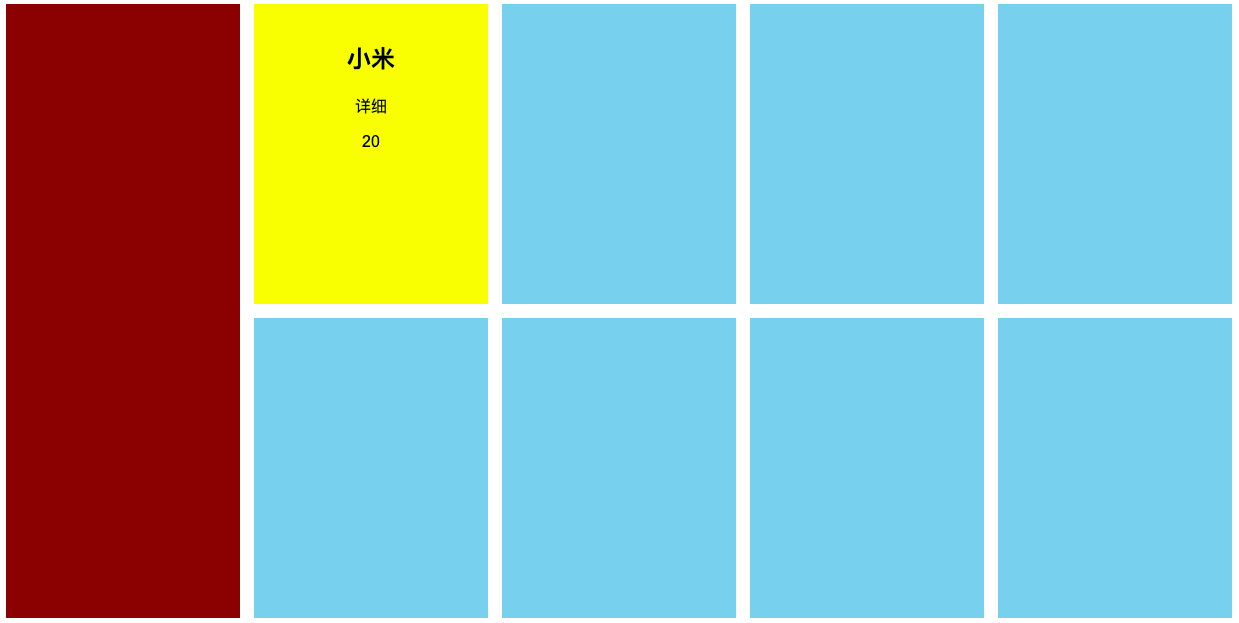
26.12.3. 格子布局
26.12.3.1. 2行2列
1 | <body> |
包含了一个section元素,其下有4个article元 素,分别对应4个不同的格子。每个格子元素中又包含了h1、 p和img三种元素,分别对应每个格子中的标题、文字和图片。
实现每行显示2个artitle
1 | *{ |
添加边框
1 | article{ |
26.12.3.2. 两行第二行跨列
1 | <body> |
css
设置最后一个article宽度为100%
1 | *{ |
26.12.3.3. 两行两列-第二列跨行
设置每个article高度为50%,第二个article高度为100%,导致下方的第三个格子被推了出去,借助margin-top负值使其放回原位,同时增加第二个article的内上边距使其居中显示
1 | *{ |
26.12.4. 多列等高布局
1 | <section class="clearfix"> |
对于不同的文字内容,每一列高度不同,通过设置padding-bottom增加内边距,运用负值margin-bottom抵消多出来的像素。为每一列设设置了底部外边距为负的200像素,这一设置在外部显示上不会造成任何影响,但是能够使每一列的高度向上减少200像素,使得每一列的实际高度又恢复原始高度。如此如果前高度为800像素的某列,在这一设置后外在仍然显示为800像素的背景高度,但实际高度又回到了300像素。将section的overflow设置为hidden,使得超过该元素高度之外的内容被隐藏起来。
1 | *{ |
26.12.5. 两列自适应布局
一列固定,一列宽度自适应
1 | <div class="row"> |
css
1 | *{ |
26.13. 移动端布局
26.13.1. 百分比布局
由于移动端屏幕尺寸的特殊性,很难在移动端设置一个固定的页面最小宽度,因此往往采取百分比动态布局方式。
1 | <div class="comic"> |
css
1 | *{ |
26.13.2. Flexbox 弹性布局
可以把各种float浮动,margin,width原有布局属性统统去掉
1 | body{ |
26.13.3. @media 不同分辨率样式
1 | @media all and (max-width: 480px){ |
导入外部分辨率样式
1 | /*为screen(屏幕)和print(印刷)这两种媒体类型定义不同的样式文件*/ |
应用于style标签
1 | <style type="text/css" media="screen"> |
26.13.4. 去除ios默认按键样式
1 | *{ |
26.13.5. 移动端文字大小自动调整
1 | html { |
26.14. 动画效果
26.14.1. transition
transition是为页面元素设置某个需要产生动画效果的属性,如宽度(width)、高度(height)、透明度(opacity), 至3D旋转等,并使得这些属性的值在发生变化时产生相应的过效果。我们常常在制作类似按钮标经过和移出效果时使用transition
26.14.1.1. 指针滑过
1 | a{ |
使用transition属性指定动画效果,动画属性为all,即当超链接元素中任何属性发生变化,都以动画形式现,动画的时间为0.5秒
linear 动画速度,匀速
ease 由匀速速开始,然后变快,然后再以匀速结束
ease-in 慢速开始
ease-out 慢速结束
ease-in-out 慢速开始和结束。
26.14.2. animation
animation则是关键动画,它可以先为动画设多个节点,在每个节点中含有不同的状态属性,通过使用animation我们可以得到更为复杂的动画效果
26.14.3. greensock.js
GSAP是GreenSock推出的新一代动画引,它包括了Flash和HTML5等多种平台,官方网站为http://greensock.com,中文 https://www.tweenmax.com.cn/index.html。在GSAP中有多种HTML5动画引,TweenMax是其中功能最为全面的,其精简版则被称为TweenLite
1 | <img src="shuttle.png" id="shuttle"> |
TweenMax.to()方法代表执行一条动画语句,在语句中定义了运动对象、动画时间,以及动画属性。先延长1秒后(delay:1),在接下来的1秒时间内,以Back.easeOut这一弹性速度线(ease:Back. easeOut)移动到距离屏幕左侧250像素(left:250),垂直居中(top:’50%’)的位置,并旋转90(rotation:90)。 动画结束时,将调用completeHandler函数(onComplete:completeHandler),该函数将在接下来的2秒内,使元素移动到最右侧(left:’100%’),并大小缩小为20%(scale:.2),透明度变为完全透明(opacity:0),速度曲线为先回弹再向右运动(ease:Back.easeIn)。
TweenMax还能完成一些常规CSS动画法实现的属性变化,如制作圆角弧度动画
将一个边框为5像素的正方形在两秒内变为了圆形,并循环播放
1 | TweenMax.to(box, 2, {borderRadius:"50%", repeat:-1}); |
26.15. 前段框架
26.15.1. BootStrap
BootStrap把每一行(row)分为12列,我们可以通过对列数的分配来确定内容的宽度比例