考拉移动端网页
1. 整体代码
- 采用宽375px为样本,全程计量单位为vw
- 采用less预处理css
2. 公共样式
2.1. variables.less
- 定义网页使用的字体,颜色
1 | @normalFontSize: 3.7333vw; |
2.2. reset.less
- 初始化一些元素
1 | body,div,ul,li,input,a,img,p { |
2.3. mixins.less
- 定义一些公用样式
1 | @import url(./variables); |
3. .topbar
1 | <!-- 搜索栏 --> |
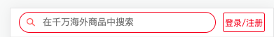
- 整个div.topbar元素固定定位在网页头部,宽度为100%,高度为60px
- 内部有div.search,div.button元素,在div.search中垂直居中
- div.button元素宽度固定为60px,div.search元素宽度占满剩余宽度
1 | .topbar { |
3.1. .search
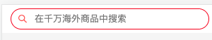
- div.search元素内部有img,input元素,两者垂直居中
- img元素固定宽度12px,input元素则占满剩余宽度
- :placeholder-shown 用于设置input的占位符样式
1 | .search { |
3.2. .button

1 | .button { |
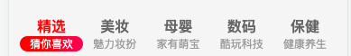
4. .icon-slider
1 | <!-- 图标栏 --> |
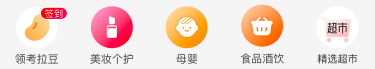
- 5个li元素刚好平分整个ul宽度,则每个li元素宽度为75px
- 因为上边的div.topbar元素是固定定位,已脱离标准流,网页布局div.icon-slider元素就会从top:0的位置开始,导致div.icon-slider元素被div.topbar元素覆盖。就需要设置div.icon-slider元素外上边距40px,刚好是div.topbar的高度
- 为了a元素内部img拥有75px宽度,将a元素设为块级元素,让a元素拥有100%父元素li的宽度
1 | .icon-slider { |
5. .allowance
1 | <!-- 硬核补贴 --> |
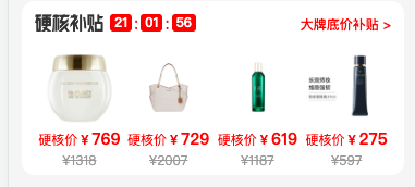
- div.allowance元素整个外边距12px,内边距12px,还有圆角12px
- 内部有div.header,div.info两个元素,垂直布局
1 | .allowance { |
5.1. .header
1 | <div class="header"> |
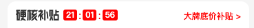
- div.header元素有div.left,div.right元素组成,两者贴边且垂直居中
- div.left元素是img,div.time元素,两者水平排布,但也垂直居中
- img明确宽高63x16
- div.time元素应该结合js实现倒计时
1 | .header { |
5.2. .info
1 | <ul class="info"> |
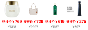
- 4个li元素刚好平分整个ul宽度
1 | .info { |
6. .tabbar
1 | <!-- 底部导航栏 --> |
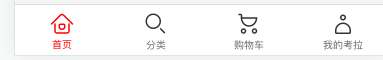
- div.tabbar元素在视口固定定位,已脱标
- 高度设置中的
env(safe-area-inset-bottom)表示像iphone等手机中可能有主导航下划线(用于返回主页,唤出多软件等),会加上这一段高度
- 高度设置中的
- 4个li元素平分ul宽度,li元素内部a元素为块级元素,占满整个li元素的宽高
1 | .tabbar { |
7. .main
1 | <div class="main"> |
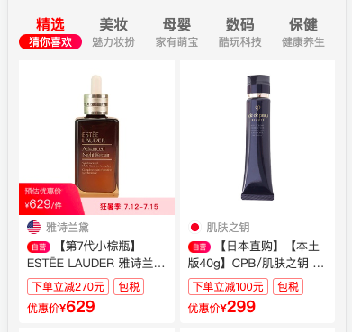
- div.main元素左右两边的外边距跟div.allowance一样,下边距是因为div.tabbar元素脱标导致div.tabbar元素显示的时候会覆盖在div.main元素之上
- div.main元素内部有ul.nav,div.content元素
- 应该使用js实现点击导航切换div.content中的内容
1 | .main { |
7.1. .nav
1 | <ul class="nav"> |
- 5个li元素平分整个ul元素的宽度,li元素内部span元素水平居中
- 设置active类,在选中某个li元素时改变样式
1 | .nav { |
7.2. .content
1 | <div class="content"> |
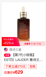
- 整个div.content元素flex布局,允许多行flex-wrap:wrap,有多个div.item元素
- div.item元素由一个块级元素a组成,a元素中img,div.news元素
- 设置div.news元素是为了div.brand,div.title,div.info,div.price元素拥有相同的左右边距
- div.brand元素是img+span元素,两者垂直居中
- div.title元素是img+文字,两者居中对齐。文字是显示两行,多余以…表示
- div.price元素样式跟div.icon-slider元素中的div.price元素样式差不多
1 | .content { |