1. 认识Grid布局
对于界面布局:定位,浮动,flex布局
flex布局相对于前面的布局来说更加的强大
- 但是flex是一个一维布局方案(one-dimensional layout)
- 只能指定”项目”针对轴线的位置
- 它主要的布局是在主轴(main axis)上进行操作,也提供了一些交叉轴(cross axis)属性
CSS为了进一步增强布局能力,提供了grid布局
- CSS Grid Layout(又名“Grid”或“CSS Grid”)是一种基于二维的布局系统(two-dimensional layout)
- 将容器划分成”行”和”列”,产生单元格,然后指定”项目所在”的单元格
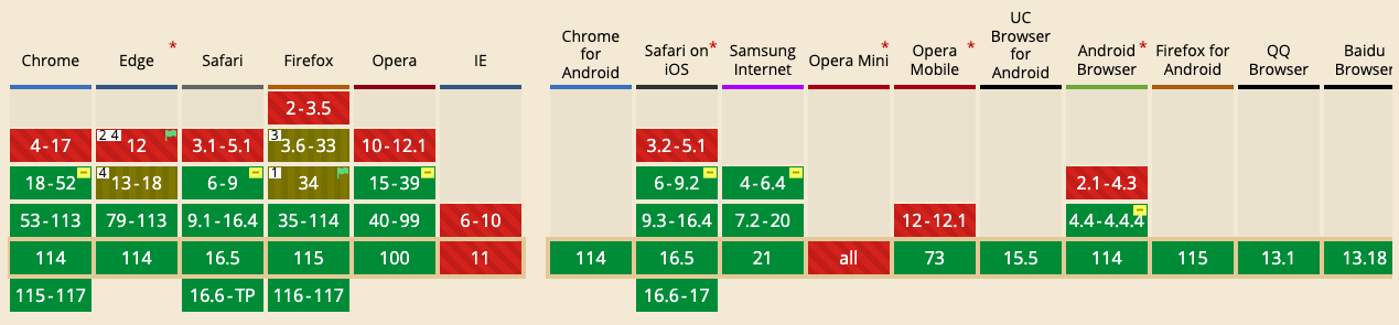
目前公司生产环境基本是使用flex布局为主,因为grid兼容性比flex布局差一些
2. grid布局重要概念
2.1. 容器和项目
- Grid Container容器
- 元素设置display为grid的盒子
- Grid Item项目
- grid container的直接子项(必须是直接子代)
1 | <style> |
- 最外层的div.container就是容器,内层的div.box1,div.box2,div.box3就是项目
- 但是项目就能是容器的直接子元素,内部的span元素就不是项目
2.2. 网格线
Grid Line
构成网络结构的分割线
可以是垂直的(列网格线)或水平的(行网格线)
n行有n+1根行网格线,m列有m+1根垂直网格线
2.3. 网格区域
Grid Area
由四条网格线包围的总空间
一个网格区域可以由任意数量的网格单元组成
2.4. 网格轨道
- Grid Track
- 两条相邻网格线之间的空间
- 可以看成是网格的行或列
3. grid container常见属性
3.1. display
1 | .container { |
- 将元素定义为网格容器,并为其内容建立网格格式化上下文
- grid - 块级网格容器
- inline-grid - 行内网格容器
3.2. grid-template-columns/rows
使用以空格分隔的值列表定义网格的列和行
- grid-template-columns定义列宽
- grid-template-rows定义行高
值可以是px,百分比,1fr
值的个数代表项目的个数
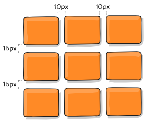
3.2.1. 三行三列
- 三行三列,列宽和行高都是100px
1 | .container { |
3.2.2. repeat()
可以使用
repeat()函数,简化重复的值接受两个参数,第一个参数是重复的次数,第二个参数是所要重复的值
如三行三列同100px
1
2
3
4
5.container {
display: grid;
grid-template-columns: repeat(3,100px);
grid-template-rows: repeat(3,100px);
}6列
1
2
3
4.container {
display: grid;
grid-template-columns: repeat(2,20px 40px 60px);
}等价于
1
2
3
4.container {
display: grid;
grid-template-columns: 20px 40px 60px 20px 40px 60px;
}
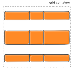
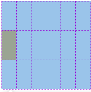
3.2.3. auto-fill关键字
固定单元格情况下,可以使用auto-fill关键字自动填充整个容器
1
2
3.container {
grid-template-columns: repeat(auto-fill,100px);
}
3.2.4. fr关键字
类似于flex布局中的flex-grow:1,占比容器剩余空间
- 三列平分容器宽度
1
2
3.container {
grid-template-columns: repeat(3,1fr);
}- 第一列50px,二三列平分剩余宽度
1
2
3.container {
grid-template-columns: 50px 1fr 1fr;
}
3.2.5. auto关键字
- 由浏览器决定长度
1 | .container { |
- 第二列占满剩余空间
3.2.6. minmax()
- 产生一个长度范围,参数为(最小值,最大值)
1 | .container { |
- 表示第二列列宽不小于100px,不大于1fr
3.2.7. line-name
- 在属性值内使用方括号[ ]指定每一根网格线的名字
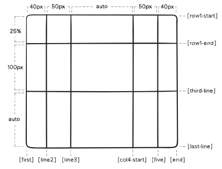
1 | .container { |
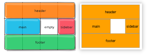
3.3. grid-template-areas
- 定义网格区域名,区域可以由一个或多个单元格组成
- 注意,网格区域的命名会影响到网格线
- 每个区域的起始网格线,会自动命名为
区域名-start,终止网格线自动命名为区域名-end - 如果区域名为
foo,则起始位置的水平网格线和垂直网格线叫做foo-start,终止位置的水平网格线和垂直网格线叫做foo-end
- 每个区域的起始网格线,会自动命名为
3.3.1. 值的选择
1 | .container { |
- grid-area-name - 由grid-name指定的网格区域名
- . - 没有用到该单元格,或者该单元格不属于任何区域
- none - 没有定义的网格区域 名
3.3.2. 三行四列
1 | <style> |
3.4. grid-template
- grid-template-rows,grid-template-columns,grid-template-areas的连写
3.4.1. 值的选择
- none - 都用默认值
- grid-template-rows / grid-template-columns - 仅设置网格行列
1 | .container { |
3.4.2. 两行跨三列
1 | <style> |
等价于
1 | .container { |
3.5. grid-column/row-gap
- 指定网格线的大小。可以想象成行列之间的水槽宽度。
- column-gap 设置列间距,row-gap 设置行间距
- 可以使用 column-gap,row-gap
- Chrome 68 + 、 Safari 11.2 Release50 + 和 Opera 54 + 已经支持无前缀属性
1 | .container { |
3.6. grid-gap
- grid-row-gap,grid-column-gap的连写
- 可以直接使用gap属性
- Chrome 68+, Safari 11.2 Release 50+, and Opera 54+已经支持
1 | .container { |
如果行列间距一样,可以写成
1
grid-gap: 10px;
等价于
1
grid-gap: 10px 10px;
3.7. justify-items
- 设置网格项的水平(左中右)对齐方式
1 | .container { |
| 值 | 说明 | 表现 |
|---|---|---|
| start | 对齐起始左边缘 | 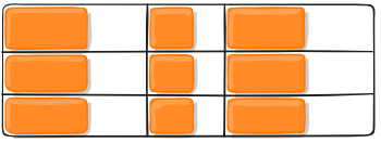 |
| end | 对齐结束右边缘 | 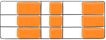 |
| center | 水平居中 | 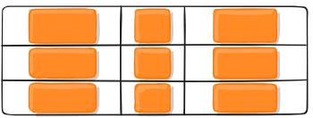 |
| stretch | 拉伸。占满网格项的整个宽度 |  |
3.8. align-items
- 设置网格项的垂直(上中下)对齐方式
1 | .container { |
| 值 | 说明 | 表现 |
|---|---|---|
| start | 对齐起始上边缘 |  |
| end | 对齐结束下边缘 |  |
| center | 垂直居中 |  |
| stretch | 拉伸。占满网格项的整个高度 | 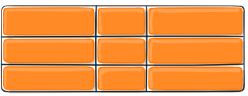 |
3.9. place-items
- 同时设置align-items和justify-items属性值
- 当两个属性值相同时,可以只写一个。如
place-item: center;
1 | .container { |
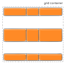
3.10. justify-content
- 如果所有的网格项目都使用像 px 这样不灵活的单位来调整大小,就会出现网格的总大小小于其网格容器的大小。在这种情况下,可以在网格容器中设置网格的对齐方式
- justify-content属性就是设置整个内容区域在容器里面的水平位置
1 | .container { |
| 值 | 说明 | 表现 |
|---|---|---|
| start | 对齐容器的起始左边缘 | 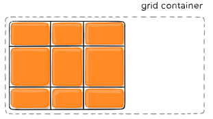 |
| end | 对齐容器的结束右边缘 |  |
| center | 水平居中 |  |
| stretch | 拉伸。占满容器的整个宽度 | 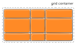 |
| space-between | 每个项目间隔相等 项目与容器边缘没有间隔 |
 |
| space-around | 每个项目两侧间隔相等 项目之间的间隔比项目与容器边缘的间隔大一倍 |
 |
| space-evenly | 每个项目两侧间隔,项目与容器边缘的间隔都相等 |  |
3.11. align-content
- align-content属性就是设置整个内容区域在容器里面的垂直位置
1 | .container { |
| 值 | 说明 | 表现 |
|---|---|---|
| start | 对齐容器的起始上边缘 | 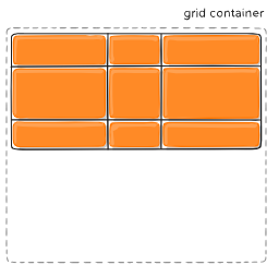 |
| end | 对齐容器的结束下边缘 | 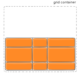 |
| center | 垂直居中 | 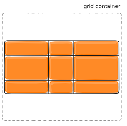 |
| space-between | 每个项目间隔相等 项目与容器边缘没有间隔 |
 |
| space-around | 每个项目两侧间隔相等 项目之间的间隔比项目与容器边缘的间隔大一倍 |
 |
| space-evenly | 每个项目两侧间隔,项目与容器边缘的间隔都相等 |  |
3.12. place-content
- 同时设置align-content 和 justify-content属性值
- 除 Edge 之外的所有主要浏览器都支持 place-content 属性
1 | .container { |
3.13. grid-auto-columns/rows
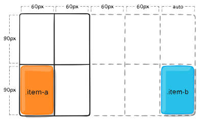
一些项目的指定位置,在现有网格的外部。比如网格只有2行2列,但是某一个项目指定在第5列。这时,浏览器会自动生成网格线,形成隐式网格轨道,以便放置项目
grid-auto-columns属性和grid-auto-rows属性用来指定自动生成的网格轨道(即隐式网格轨道)的大小,写法和grid-template-columns/rows一样
举例:原有2行2列的容器
1
2
3
4
5
6
7
8
9
10
11
12.container {
width: 500px;
display: grid;
grid-template-columns: 60px 60px;
grid-template-rows: 90px 90px;
}
.item {
background-color: orange;
font-size: 16px;
text-align: center;
line-height: 90px;
}- 需要在(第1列,第2行),(第5列,第2行)放项目
1
2
3
4
5
6
7
8.item-a {
grid-column: 1 / 2;
grid-row: 2 / 3;
}
.item-b {
grid-column: 5 / 6;
grid-row: 2 / 3;
}1
2
3
4<div class="container">
<div class="item item-a">3</div>
<div class="item item-b">4</div>
</div>div.item-b左右被line5,line6包围,上下被row1-end,row2-start包围,形成一个网格轨道
但是line5,line6是不存在的。因为引用了不存在的网格线,所以会创建隐式轨道来填补空白。如果不指定隐式轨道的宽度,会取容器的剩余空间平分
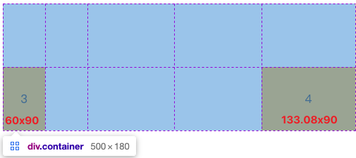
通过grid-auto-columns指定这些隐式轨道的宽度
1
grid-auto-columns: 60px;
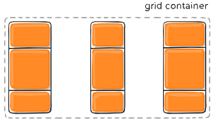
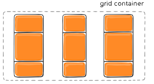
3.14. grid-auto-flow
- 如果没有指明网格上的网格项位置,那么将启用自动放置算法以自动放置这些项
- grid-auto-flow属性控制自动放置算法的工作方式
1 | .container { |
| 值 | 说明 |
|---|---|
| row | 默认值。告诉自动布局算法依次填充每一行,根据需要添加新行 |
| column | 告诉自动布局算法依次填充每一列,根据需要添加新列 |
| dense | 告诉自动布局算法使用一种“稠密”堆积算法,如果后面出现了稍小的元素,则会试图去填充网格中前面留下的空白。这样做会填上稍大元素留下的空白,但是会改变项目的视觉顺序,并可能导致项目出现顺序错误,这对可访问性不利 |
3.14.1. 两行五列 - 横排
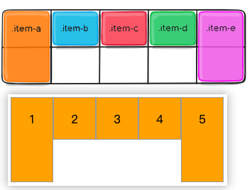
- div.item-a,div.item-e的位置固定,中间的三个div默认填充行
1 | <style> |
3.14.2. 两行五列-竖排
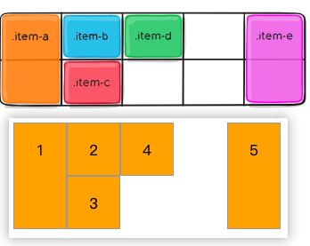
- div.item-a,div.item-e的位置固定,中间的三个div现在填充列
1 | .container { |
3.15. grid
- grid-template-rows,grid-template-columns,grid-template-areas,grid-auto-rows,grid-auto-columns,grid-auto-flow的连写
3.15.1. 值的选择
none- 都用默认值grid-template- grid-template-rows,grid-template-columns,grid-template-areas的连写<grid-template-rows> / [ auto-flow && dense? ] <grid-auto-columns>?- grid-template-rows设置值
- 如果 auto-flow 关键字位于斜杠的右侧,则将 grid-auto-flow 设置为 column
- 如果另外指定了dense稠密关键字,则自动放置算法使用“稠密”打包算法
- grid-auto-columns 如果不设置,值为auto
[ auto-flow && dense? ] <grid-auto-rows>? / <grid-template-columns>- grid-template-columns 设置值
- 如果 auto-flow 关键字位于斜杠的左侧,则将 grid-auto-flow 设置为 row
- grid-auto-rows 如果不设置,值为auto
3.15.2. 举例
grid-template1
2
3
4
5
6
7
8.container {
grid: 100px 300px / 3fr 1fr;
}
.container {
grid-template-rows: 100px 300px;
grid-template-columns: 3fr 1fr;
}[ auto-flow && dense? ] <grid-auto-rows>? / <grid-template-columns>1
2
3
4
5
6
7
8.container {
grid: auto-flow / 200px 1fr;
}
.container {
grid-auto-flow: row;
grid-template-columns: 200px 1fr;
}<grid-template-rows> / [ auto-flow && dense? ] <grid-auto-columns>?1
2
3
4
5
6
7
8
9.container {
grid: 100px 300px / auto-flow 200px;
}
.container {
grid-template-rows: 100px 300px;
grid-auto-flow: column;
grid-auto-columns: 200px;
}
4. grid item常见属性
- float、 display: inline-block、 display: table-cell、vertical-align 和 column-* 属性对网格项没有影响
4.1. grid-column/row-start/end
- 通过引用特定的网格线确定网格项在网格中的位置
- grid-column-start/grid-row-start 是项目开始的行,grid-column-end/grid-row-end 是项目结束的行
4.1.1. 值的选择
1 | .item { |
- 如果没有声明 grid-column-end/grid-row-end,默认情况下该项将跨越1个轨道
- 项目可以相互重叠。可以使用 z-index 来控制堆叠顺序
| 值 | 说明 |
|---|---|
| number | 表示编号网格线的数字 |
| name | 表示指定网格线名 |
| span number | 跨越所提供的网格轨道数量 |
| span name | 跨越所提供的网格线名 |
| auto | 表示自动放置、自动跨度或默认跨度为1 |
4.1.2. (2-5,1-3)
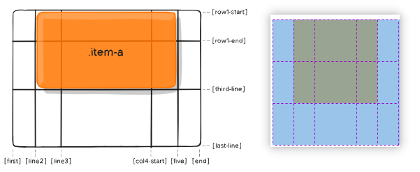
1 | <style> |
4.1.3. (1-4,2-4)
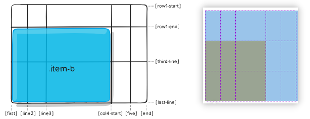
1 | .item-b { |
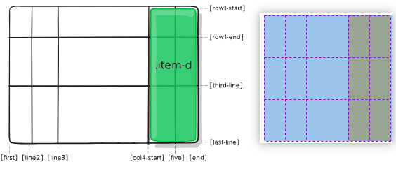
4.2. grid-column/row
- grid-column-start,grid-column-end,grid-row-start,grid-row-end的连写
1 | .item { |
(2-5,1-3)就可以写成
1
2
3
4.item-a {
grid-column: 2 / span 3;
grid-row: row1-start / span 2;
}(1-4,2-4) 就可以写成
1
2
3
4.item-a {
grid-column: 1 / span col4-start;
grid-row: 2 / 4;
}当只跨一个轨道,可以只写一个start-line
1
2
3
4.item-a {
grid-cloumn: 1;
grid-row: 2;
}
4.3. grid-area
- 为网格项提供一个名称,以便可以由使用 grid-template-area 属性创建的模板引用该网格项
- 或者,此属性可以用作 grid-row-start + grid-column-start + grid-row-end + grid-column-end 的更简短的缩写
4.3.1. 作为网格项名
1 | <style> |
4.3.2. 作为网格项位置的连写
grid-area: grid-row-start / grid-column-start / grid-row-end / grid-column-end
1 | <style> |
4.4. justify-self
- 单元格内网格项在行轴的对齐方式
1 | .item { |
| 值 | 说明 | 表现 |
|---|---|---|
| start | 对齐单元格的起始左边缘 | 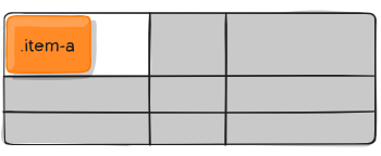 |
| end | 对齐单元格的结束右边缘 | 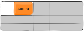 |
| center | 水平居中 | 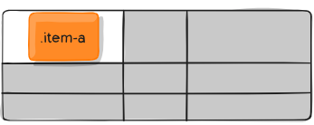 |
| stretch | 拉伸。占满单元格整个宽度 | 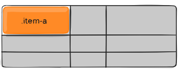 |
4.5. align-self
- 单元格内网格项在列轴的对齐方式
1 | .item { |
| 值 | 说明 | 表现 |
|---|---|---|
| start | 对齐单元格的起始上边缘 | 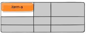 |
| end | 对齐单元格的起始下边缘 | 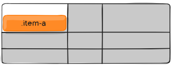 |
| center | 垂直居中 | 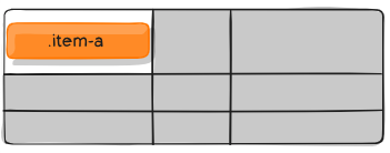 |
| stretch | 拉伸。占满整个单元格的高度 | 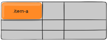 |
4.6. place-self
- align-self 和 justify-self 的连写
- align-self 和 justify-self 值相同时,可以只写一个值
1 | place-self: auto | <align-self> / <justify-self> |