实现王者荣耀首页 https://pvp.qq.com/ 两个div.main-item部分
1. div.main-item
1 | <div class="main-item"> |
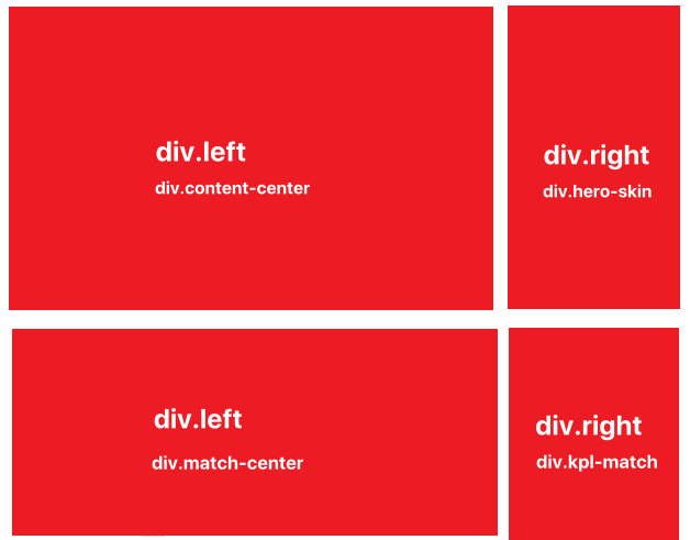
- 有两个div.main-item,都有div.left-area,div.right-area元素,水平排布
1 | .main .main-item { |
2. 共同头部和导航
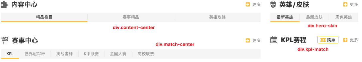
2.1. div.item_header
1 | <div class="item_header"> |
- 头部都是 i+span 组合,两者垂直居中
1 | .item_header { |
2.2. div.item_nav
1 | <div class="item_nav"> |
- 导航都是 a+span 组合,span元素充当a元素之间的分界线
1 | .item_nav { |
3. div.content-center
1 | <div class="content-center"> |
- div.content-center元素中div.item-nav元素的a元素平分剩余空间
1 | /* 内容中心 */ |
3.1. div.content-list
1 | <div class="content-list"> |
- div.content-list元素中的每个div.area元素宽度为100%,水平排布,多余被隐藏
- 导航点播内容逐渐展示js实现
1 | /* 内容列表 */ |
3.2. div.great-part
1 | <div class="area great-part"> |
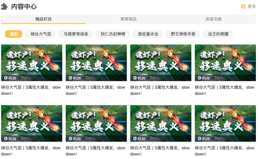
3.3. div.caption
- 该部分的样式,div.great-part元素和div.match-part元素是一样的,div.hero-part有所不同
1 | /* 内容列表中的内容标题 */ |
3.4. div.sub-content-list
- 内部有多个ul.video_list元素,水平排布,宽度都是100%,多余被隐藏
- 导航点播内容js实现
1 | /* 内容列表中的内容标题对应子内容 */ |
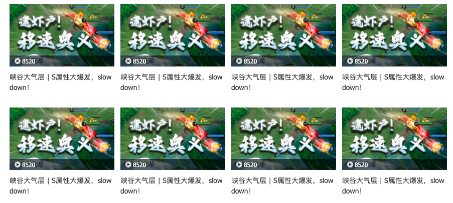
3.5. 共同的视频列表
- 在 div.content-center的多个ul.video_list中
- 在div.match-center的多个ul.video_list中
1 | <ul class="video_list"> |
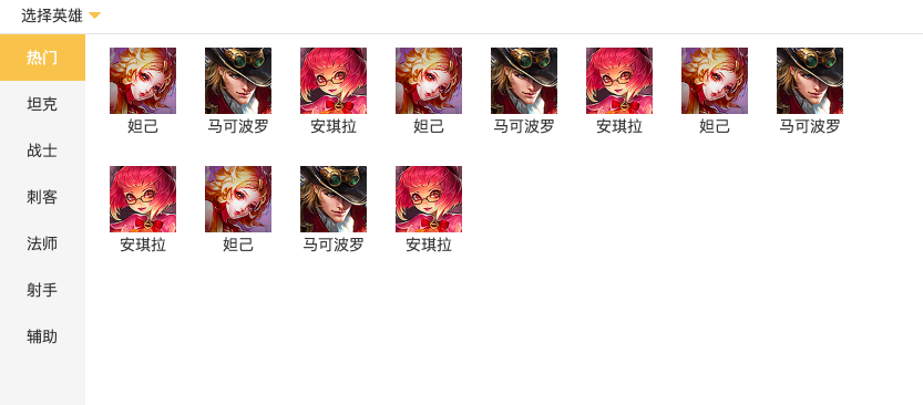
div.video_list元素flex布局,允许分行flex-wrap:wrap,元素贴边
每个li元素由内部的a元素撑起来,a元素中有div.pic,p元素。div.pic中有img元素,脱标的div.info和脱标的div.mask
- div.info相对于div.pic元素绝对定位到底部
- div.mask默认不可见display:none,当鼠标悬停在div.pic上时显示
一行4个li元素,第4,8个视频项会因为多右外边距而被放到下一行,所以需要去掉4n的右外边距
1 | /* 内容中心-赛事中心 视频播放样式 */ |
3.6. div.match-part
1 | <!-- 赛事精品 --> |
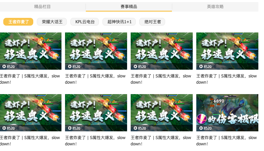
- 布局和样式跟div.great-part一样
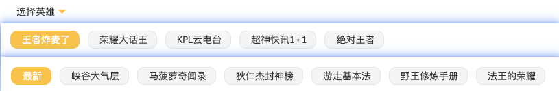
3.7. div.hero-part
1 | <div class="area hero-part"> |
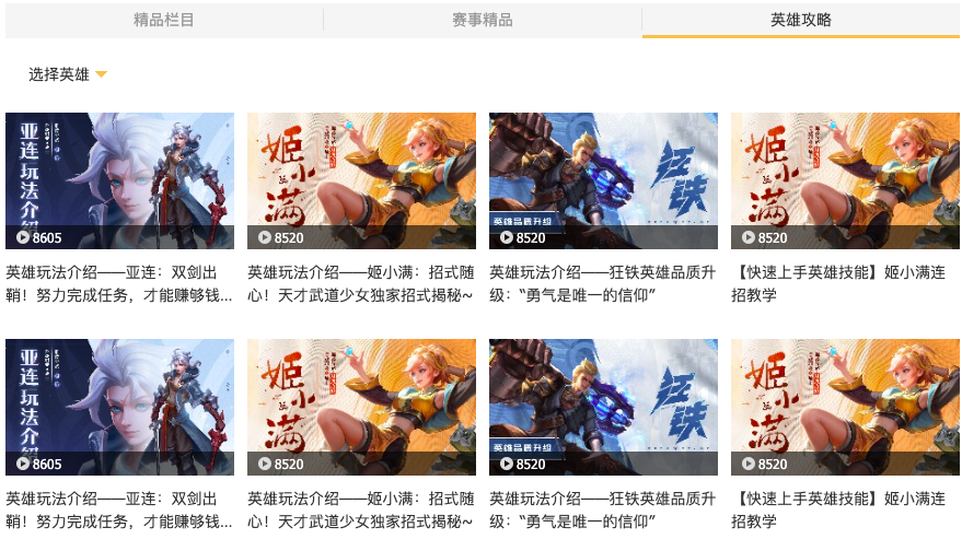
- div.hero-part元素中div.caption元素只有一个a元素+i元素
- 为什么设置div.caption元素的宽度?
- div.caption元素是块级元素,默认宽度占满整个高度,设置的鼠标悬停样式在扫过div.caption区域就会被触发,意味着鼠标离a.select元素很远,但在同一高度,样式还会被触发
- 如果设置的是div.caption元素下的a.select元素的鼠标悬停,无法选中a.select元素的父元素的兄弟元素
- 为什么设置div.caption元素的宽度?
- div.hero-part元素的布局隐藏了div.dropdown元素,只有鼠标进入div.caption元素区域,才会显示
1 | /* 英雄攻略 - 下拉框 */ |
3.8. div.dropdown
1 | <div class="dropdown"> |
- div.dropdown元素相对于div.hero-part元素绝对定位
- div.dropdown元素由 ul.hero-type,div.hero-list组成,水平排布
- ul.hero-type中li元素垂直布局
- div.hero-list中有多个ul.part元素,每个ul.part元素高度为100%,垂直布局,多余被隐藏
- ul.part元素flex布局,允许多行,设置overflow-y:auto,允许滚动
1 | .content-center .hero-part .dropdown { |
4. div.hero-skin
1 | <div class="hero-skin"> |
- div.hero-skin元素中的div.item-nav的a元素平分剩余空间
1 | .hero-skin { |
4.1. div.hero-content
1 | <div class="hero-content"> |
- div.hero-content元素中的每个div.area元素宽度为100%,水平排布,多余被隐藏
- 导航点播列表js实现
1 | /* 导航列表下的不同内容 */ |
4.2. div.new-hero
1 | <div class="area new-hero"> |

- div.new-hero元素有div.hero-info,div.hero-pic元素,垂直布局
- div.hero-info元素中有a,div.bottom元素,垂直布局
- ul.hero-pic元素中有四个li元素,水平布局,平分空间
4.3. div.hero-info
1 | <div class="hero-info"> |
- div.bottom元素占45px高,a元素为块级元素占满剩余高度,全部宽度
1 | /* 英雄信息 */ |
4.4. div.hero-pic
1 | <ul class="hero-pic"> |

- ul.hero-pic元素中有4个li元素,四者有共同宽度的情况下平分剩余空间
- div.mask,span.name默认不可见,鼠标悬停在li元素上时才显示
- div.mask,span.name是脱标的,相对于每个li.item绝对定位
- div.mask是宽高占满整个li元素
- span.name是水平垂直居中,writing-mode: vertical-lr;表示上下书写
1 | /* 英雄图片 */ |
4.5. div.new-skin
- 布局跟div.new-hero一样
4.6. div.free-hero

- 布局其实跟div.new-hero一样,只是少了div.hero-info
5. div.match-center
1 | <div class="match-center"> |
- div.match-center元素中的div.item-nav的a元素从左开始排布
1 | /* 赛事中心 */ |
5.1. div.match-content
1 | <div class="match-content"> |
- div.mathc-content元素中的每个div.area元素宽度为100%,水平排布,多余被隐藏
- 导航点播内容逐渐展示js实现
1 | .match-center .match-content { |
5.2. div.area
1 | <div class="area"> |

- div.area元素中有div.match-news,ul.video_list元素,垂直布局
5.3. div.match-news
1 | <div class="match-news"> |
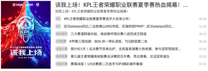
- div.match-news有左a.pic,右ul.news_list元素
- a.pic元素是块级元素,有固定宽度211px
- ul.new_list元素 flex:1,占满剩余宽度
1 | .match-center .match-content .match-news { |
5.4. ul.news_list
1 | <ul class="news_list"> |
- div.match-center元素的新闻列表和div.main-top.center元素中的新闻列表布局相似,又有不同
- 第一个li元素,只是拥有a.big,a.small元素的文字链接
- 其余li元素,拥有span,a,em元素
1 | .match-center .news_list { |
5.5. ul.video_list
1 | <ul class="video_list"> |
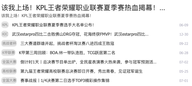
- 布局跟div.content-center中视频列表一样,多了div.info中的em,表现为年-月-日
6. div.kpl-match
1 | <div class="kpl-match"> |

- div.kpl-match元素中导航div.item_header和其他三个有所不同,多了一个购票链接
- 导航下是table表格,表格下是a元素的图片
1 | /* 赛程 */ |
6.1. .team_icon队徽样式
1 | /* 赛程-对战队伍队徽 */ |
6.2. table
1 | <table class="match-content"> |
- 表格是4x4的,第一行是表头,有背景色,剩余3行有 时间.time,队伍信息.pic,vs字样.pk,队伍信息.pic 四列组成
1 | * 表格 */ |