前端-CSS学习笔记14-王者荣耀实战

实现王者荣耀首页 https://pvp.qq.com/

1. 整体代码

pvp.zip

2. 重置样式

1
2
3
4
5
6
7
8
9
10
11
12
13
14
15
16
17
18
19
20
21
22
23
24
25
26
27
28
29
30
31
32
body,div,ul,li,p,span,a,h1,dl,dt,dd,em,i,table,thead,tbody,tr,td{
margin: 0;
padding: 0;
}
body {
font: 14px/1.5 "Microsoft YaHei",Tahoma,"simsun",sans-serif;
}
ul,li {
list-style: none;
}

a {
text-decoration: none;
outline: none;
}

img {
vertical-align: top;
width: 100%;
height: 100%;
}
i,em {
font-style: normal;
}

table {
/* 合并单元格边框 */
border-collapse: collapse;
}
table,th,tr {
border: none;
}

3. 共同样式

3.1. 尺寸

1
2
3
4
5
6
7
8
9
10
11
12
13
14
15
16
.wrapper_01 {
width: 980px;
margin: 0 auto;
}
.wrapper_02 {
width: 1300px;
margin: 0 auto;
}
.wrapper_03 {
width: 890px;
margin: 0 auto;
}
.wrapper_04 {
width: 1200px;
margin: 0 auto;
}

3.2. 图标

1
2
3
4
5
6
7
8
9
10
11
12
13
14
15
16
17
18
19
20
21
22
23
24
25
26
27
28
29
30
31
32
33
34
35
36
37
38
39
40
41
42
43
44
45
46
47
48
49
50
51
52
53
54
55
56
57
58
59
60
61
62
63
64
65
66
67
68
69
70
71
72
73
74
.title_icon_01 {
display: inline-block;
width: 30px;
height: 30px;
background: url(../img/sprite/title_sprite.png);
}

.title_icon_02 {
display: inline-block;
width: 30px;
height: 30px;
background: url(../img/sprite/title_sprite.png) no-repeat -30px 0;
}

.content_icon {
display: inline-block;
width: 22px;
height: 23px;
background: url(../img/sprite/index_sprite.png) no-repeat -1px -107px;
}
.game_icon {
display: inline-block;
width: 24px;
height: 29px;
background: url(../img/sprite/index_sprite.png) no-repeat -2px -183px;
}
.add_icon {
display: inline-block;
width: 14px;
height: 14px;
background: url(../img/sprite/index_sprite.png) no-repeat -252px 0;
}
.hero_icon {
display: inline-block;
width: 18px;
height: 25px;
background: url(../img/sprite/index_sprite.png) no-repeat -1px -144px;
}
.calendar_icon {
display: inline-block;
width: 23px;
height: 23px;
background: url(../img/sprite/index_sprite.png) no-repeat -157px -107px;
}
.select_icon {
display: inline-block;
width: 11px;
height: 6px;
background: url(../img/sprite/index_sprite.png) no-repeat -256px -28px;
}
.money_icon {
display: inline-block;
width: 18px;
height: 14px;
background: url(../img/sprite/index_sprite.png) no-repeat -252px -88px;
}
.mask_icon {
display: inline-block;
width: 40px;
height: 40px;
background: url(../img/sprite/index_sprite.png) no-repeat -192px -64px;
}
.tencent_logo {
display: inline-block;
width: 285px;
height: 64px;
background: url('../img/sprite/foot-sprite.png') no-repeat;
}
.beauty_logo {
display: inline-block;
width: 70px;
height: 64px;
background: url('../img/sprite/foot-sprite.png') no-repeat -285px 0;
}

3.3. 清浮动

1
2
3
4
5
6
7
8
/* 清浮动 */
.clearfix::after {
content: "";
display: block;
height: 0;
visibility: hidden;
clear: both;
}

4. top

4.1. 思路

  • div.top 中包含一个水平居中的div.wrapper_01
  • div.wrapper_01包含div.left,div.right元素,两者贴边
  • div.left元素中有a.logo,img.ost-ads,a.ost-big元素
    • a.logo元素是块级元素,显示的是背景图片
    • a.logo元素拥有文字是为了搜索引擎的检索,进一步为了文字不显示需要向前缩进超大值
    • a.ost-big元素默认相对于div.left元素绝对定位,默认元素隐藏。只有鼠标在img.ost-ads元素上悬停时a.ost-big元素才会显示
    • 鼠标离开img.ost-ads元素时,a.ost-big元素为了能够显示,还需要设置鼠标悬停在a.ost-big元素上时,元素显示
  • div.right元素中有div.platform,div.recommend,div.recommend-box元素
    • div.platform,div.recommend元素都有i元素作为图标
    • div.platform,div.recommend元素内部都是flex布局,侧轴居中,元素垂直居中
    • div.recommend-box元素相对于div.right元素绝对定位,默认元素隐藏。只有鼠标在div.recommend元素上悬停时div.recommend-box元素才有高度
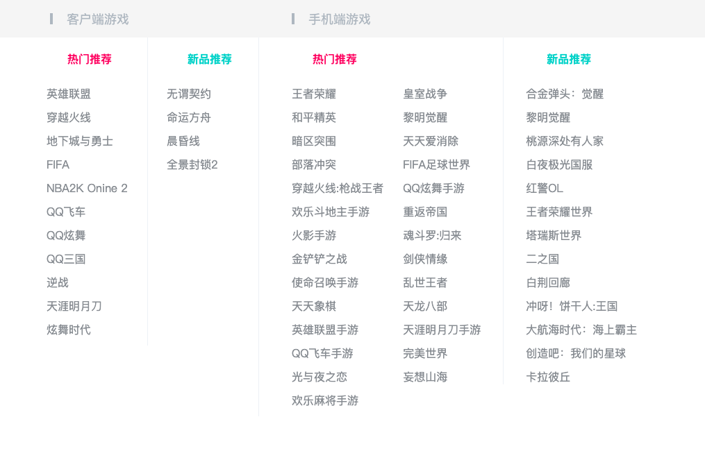
      • div.recommend-box元素内部 div.pc,div.mobile元素
      • div.pc,div.mobile元素内部都有div.title,div.list元素
      • div.list元素中有多个dl-dt-dd列表

4.2. div.top

1
2
3
4
5
6
7
8
9
10
11
12
13
14
15
16
17
<div class="top">
<div class="wrapper_01">
<div class="left">
<a href="#" class="logo">腾讯游戏logo</a>
<img src="./img/top/ost.jpeg" class="ost-ads">
<a href="#" class="ost-big">... </a>
</div>
<div class="right">
<div class="platform">...</div>
<div class="recommend">...</div>
<div class="recommend-box">
<div class="pc">...</div>
<div class="mobile">...</div>
</div>
</div>
</div>
</div>

  • 整个div.top的高度由子元素div.wrapper_01撑起来,div.wrapper_01元素宽高为980x41
  • div.wrapper_01元素为了内部元素垂直居中,设置行高=盒高
1
2
3
4
5
6
7
8
9
10
11
12
.top {
border-bottom: 1px solid #f5f5f5;
}
.top .wrapper_01 {
display: flex;
justify-content: space-between;

height: 41px;
padding: 0 5px;

line-height: 41px;
}

4.3. div.left/div.right

  • div.left元素中有a.logo,img.ost-ads,a.ost-big元素
  • div.right元素中有div.platform,div.recommend,div.recommend-box元素
1
2
3
4
5
.top .left,
.top .right {
display: flex;
position: relative;
}
1
<a href="#" class="logo">腾讯游戏logo</a>

1
2
3
4
5
6
7
8
9
/* 腾讯游戏logo */
.top .logo {
position: relative;
display: block;
width: 150px;
background: url(../img/top/logo.png) no-repeat top center/112px auto;
text-indent: -9999px;
z-index: 11;
}

4.5. img.ost-ads

1
<img src="./img/top/ost.jpeg" class="ost-ads">

1
2
3
4
/* 广告位 */
.top .ost-ads {
width: 230px;
}

4.6. a.ost-big

1
2
3
<a href="#" class="ost-big">
<img src="./img/top/ost_big.jpeg">
</a>

  • 默认该元素不显示(display:none),只有鼠标悬停在 img.ost-ads上时才显示
  • 在显示 a.ost-big 元素时,还能显示 a.logo元素
    • 所以a.logo的层级高于a.ost-big,但a.ost-big层级不能低于img.ost-ads
    • 所以设置a.ost-big的z-index为10,a.logo的z-index为11。要保证两者都是定位元素z-index才有效
1
2
3
4
5
6
7
8
9
10
11
12
13
14
15
16
17
18
19
20
.top .ost-ads:hover + .ost-big,
.top .ost-big:hover {
display: block;
}

.top .ost-big {
position: absolute;
left: 0;
top: 0;
display: none;
width: 970px;
height: 185px;
padding: 0 3px 3px;
border-bottom: 1px solid #eee;
background: #fff;
z-index: 10;
}
.top .ost-big img {
width: 100%;
}

4.7. div.platform

1
2
3
4
<div class="platform">
<i class="title_icon_02"></i>
<a href="#" class="title">成长守护平台</a>
</div>

  • 绿色圆图标是来自于一张精灵图
  • 为了内部两者垂直居中,需要设置侧轴居中 align-items: center
1
2
3
4
5
6
7
8
9
10
11
12
13
14
/* 成长守护平台 */
.top .platform {
position: relative;
display: flex;
align-items: center;
margin-right: 20px;
font-size: 14px;
}
.top .platform .title {
color: #464646;
}
.top .platform .title:hover {
color: #f00;
}

4.8. div.recommend

1
2
3
4
<div class="recommend">
腾讯游戏热门推荐
<i class="title_icon_01"></i>
</div>

  • 箭头图标和div.platform中的图标来自于同一张精灵图,图中箭头方向向右,为了让其向下,用到rotate形变
1
2
3
4
5
6
7
8
9
10
11
12
13
14
15
/* 腾讯游戏热门推荐 */
.top .recommend {
display: flex;
align-items: center;
font-size: 14px;
color: #333;
cursor: pointer;
}
.top .recommend .title_icon_01{
position: relative;
left: -3px;
top: -3px;
transform: rotate(90deg);
opacity: 0.1;
}

4.9. div.recommend-box

1
2
3
4
5
6
7
8
9
10
<div class="recommend-box">
<div class="pc">
<div class="title">...</div>
<div class="list">...</div>
</div>
<div class="mobile">
<div class="title">...</div>
<div class="list">...</div>
</div>
</div>

  • div.recommend-box高度为0,默认不可见,鼠标悬停在div.recommmend元素上时,div.recommend-box才拥有高度
    • 为了高度从0-658px有缓慢增加效果,添加tansition属性
  • div.pc + div.mobile,div.pc元素宽度确定,div.mobile元素宽度扩充至占满剩余空间
1
2
3
4
5
6
7
8
9
10
11
12
13
14
15
16
17
18
19
20
21
22
23
.top .recommend:hover + .recommend-box,
.top .recommend-box:hover{
height: 658px;
}

/* 下拉框 */
.top .recommend-box {
position: absolute;
display: none;
top: 41px;
right: 15px;
width: 1020px;
height: 0;
background-color: #fff;
z-index: 9999;
transition: all .5s;
}
.top .recommend-box .pc {
width: 373px;
}
.top .recommend-box .mobile {
flex: 1;
}

4.9.1. div.title

1
2
3
4
5
6
7
8
9
10
11
12
13
<div class="pc">
<div class="title">
<i class="icon"></i>
<span>客户端游戏</span>
</div>
</div>

<div class="mobile">
<div class="title">
<i class="icon"></i>
<span>手机端游戏</span>
</div>
</div>

  • div.title元素中有 i.icon,span元素,两者要垂直居中 align-items: center;
    • i.icon为行内块级元素,宽高为4x16
    • span为行内非替换元素,只能设置字号18px
1
2
3
4
5
6
7
8
9
10
11
12
13
14
15
16
17
18
19
20
21
22
23
24
25
26
/* 下拉框标题 */
.top .recommend-box .title {
display: flex;
align-items: center;
height: 54px;
background-color: #f5f5f5;
font-size: 18px;
color: #AFB7BF;
}

.top .recommend-box .pc .title {
padding-left: 73px;
}
.top .recommend-box .mobile .title {
padding-left: 48px;
}

.top .recommend-box .icon {
display: inline-block;
width: 4px;
height: 16px;
background-color: #AFB7BF;
}
.top .recommend-box .title span {
margin-left: 20px;
}

4.9.2. div.list

1
2
3
4
<div class="list">
<dl class="rank hot">...</dl>
<dl class="rank new">...</dl>
</div>
  • 分为 热门推荐 和 新品推荐 两个模块,两者水平排布
1
2
3
4
/* 下拉框列表 */
.top .recommend-box .list {
display: flex;
}

4.9.3. div.rank.hot

1
2
3
4
5
6
7
8
9
10
11
12
13
14
15
16
17
18
19
20
21
22
23
24
<!-- pc -->
<dl class="rank hot">
<dt class="rank-title">热门推荐</dt>
<dd>
<ul class="rank-list">
<li><a href="#" class="item">英雄联盟</a></li>
...
</ul>
</dd>
</dl>

<!-- mobile -->
<dl class="rank hot">
<dt class="rank-title">热门推荐</dt>
<dd class="more">
<ul class="rank-list">
<li><a href="#" class="item">王者荣耀</a></li>
...
</ul>
<ul>
...
</ul>
</dd>
</dl>

  • 客户端的热门推荐模块右边有1px的边框,手机端的左边有1px的边框

    1
    2
    3
    4
    5
    6
    7
    8
    .top .pc .rank.hot {
    padding-left: 68px;
    border-right: 1px solid #EDF1F5;
    }
    .top .mobile .rank.hot {
    padding-left: 47px;
    border-left: 1px solid #EDF1F5;
    }
  • 热门推荐模块的标题都是红色大字

    1
    2
    3
    4
    5
    6
    7
    8
    9
    10
    11
    .top .recommend-box .rank-title {
    font-size: 16px;
    font-weight: 600;
    line-height: 22px;
    padding-bottom: 28px;
    padding-top: 20px;
    padding-left: 30px;
    }
    .top .recommend-box .hot .rank-title {
    color: #FF3C6A;
    }
  • 手机端的热门推荐是有两个列表,使其水平排布

    1
    2
    3
    .top .recommend-box .list .more {
    display: flex;
    }
  • 列表中的每一个a元素,必须显示在一行中,多余用…表示

    1
    2
    3
    4
    5
    6
    7
    8
    9
    10
    11
    12
    13
    14
    15
    16
    17
    .top .recommend-box .item {
    display: block;
    min-width: 116px;
    margin-right: 28px;
    margin-bottom: 12px;
    font-size: 16px;
    line-height: 22px;
    color: #868B90;

    white-space: nowrap;
    text-overflow: ellipsis;
    overflow: hidden;
    }

    .top .recommend-box .item:hover {
    color: #000;
    }

4.9.4. div.rank.new

1
2
3
4
5
6
7
8
9
10
11
12
13
14
15
16
17
18
19
20
21
<!-- pc -->
<dl class="rank new">
<dt class="rank-title">新品推荐</dt>
<dd>
<ul class="rank-list">
<li><a href="#" class="item">无谓契约</a></li>
...
</ul>
</dd>
</dl>

<!-- mobile -->
<dl class="rank new">
<dt class="rank-title">新品推荐</dt>
<dd>
<ul class="rank-list">
<li><a href="#" class="item">合金弹头:觉醒</a></li>
...
</ul>
</dd>
</dl>

  • 手机端新品推荐的左边有1px的边框
1
2
3
4
5
6
7
8
9
10
11
12
13
14
15
16
17
.top .pc .rank.new {
padding-left: 27px;
}

.top .mobile .rank.new .rank-list {
padding-left: 32px;
border-left: 1px solid #EDF1F5;
}

.top .recommend-box .new .rank-title {
color: #13CAC5;
}

.top .mobile .rank.new .rank-title {
padding-left: 62px;
border-left: 1px solid #EDF1F5;
}

5. header

5.1. 思路

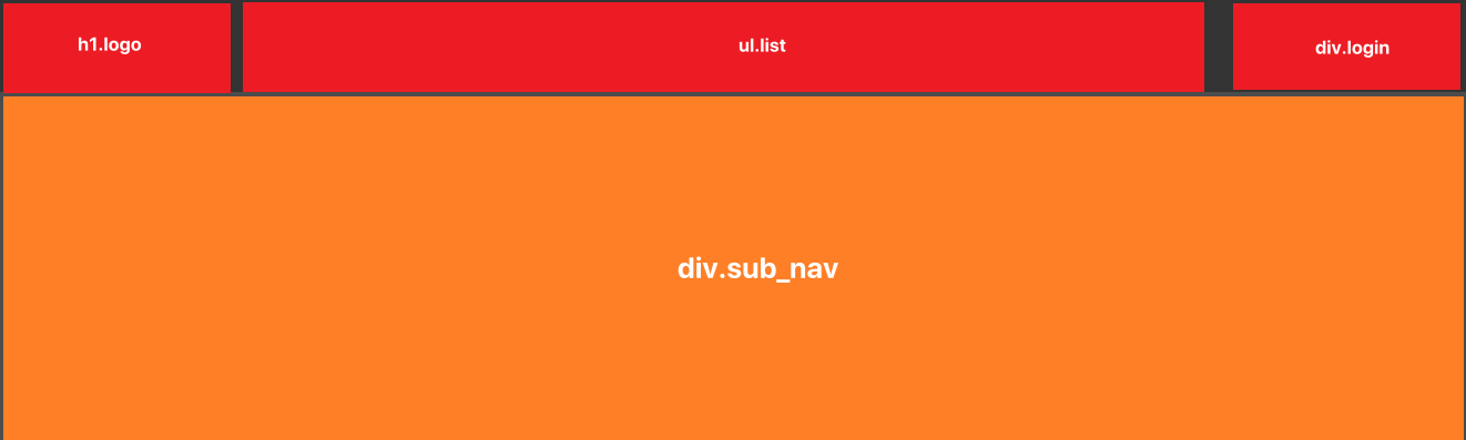
  • div.header 元素高度为84px

    • div.header元素中有 div.wrapper_02,div.sub-nav元素

    • div.wrapper_02元素高度等于84px,内部放横栏,有h1,ul.list,div.login三个元素,三者水平贴边

    • div.sub-nav元素中放下拉导航栏,默认不可见

    • 鼠标悬停在div.header元素上时,div.sub-nav元素高度才展示

  • div.sub-nav元素中a元素文字前的图标通过伪元素::before实现

5.2. div.header

1
2
3
4
5
6
7
8
<div class="header">
<div class="wrapper_02">
<h1><a href="#" class="logo">王者荣耀</a></h1>
<ul class="list">...</ul>
<div class="login">... </div>
</div>
<div class="sub-nav">...</div>
</div>

  • div.header元素设置透明背景,高度由子元素div.wrapper_02元素撑起来,div.sub-nav元素已脱标

  • div.wrapper_02元素宽高为1300x84

1
2
3
4
5
6
7
8
9
10
.header {
position: relative;
background-color: rgba(0,0,0,0.8);
}
.header .wrapper_02 {
display: flex;
height: 84px;
justify-content: space-between;
align-items: center;
}
1
<h1><a href="#" class="logo">王者荣耀</a></h1>

  • 一般就是用 h1元素,也是在网页中唯一使用h1元素的地方
  • a元素中的文字是为了给浏览器检索,在网页中不应该显示,向前缩进至无法显示,但存在 text-indent: -9999px;
1
2
3
4
5
6
7
8
.header .logo {
display: block;
width: 200px;
height: 54px;
margin-right: 30px;
background: url(../img/header/logo.png);
text-indent: -9999px;
}

5.4. ul.list

1
2
3
4
5
6
7
8
9
<ul class="list">
<li>
<a href="#" class="item">
<span class="title">游戏资料</span>
<em class="info">DATA</em>
</a>
</li>
...
</ul>

  • 整个div.wrapper_02元素的宽度是固定的1200px,h1.logo元素宽度也固定200px,div.login元素宽度固定为182px,所以 ul.list设置 flex:1; 即flex-grow:1; 将占据父元素所有剩余空间
  • 鼠标悬停在每个li元素上时,鼠标是会变为小手的,说明a元素占据整个li元素,所以将a元素变为快元素,设置宽高=li元素
  • a元素内部是垂直布局的,所以将span和em元素都改为块级元素
1
2
3
4
5
6
7
8
9
10
11
12
13
14
15
16
17
18
19
20
21
22
23
24
25
26
27
28
29
30
31
32
33
34
.header .list {
display: flex;
flex: 1;
height: 100%;
}
.header .list .item {
display: block;
width: 115px;
height: 100%;
padding-top: 20px;
box-sizing: border-box;
text-align: center;
}
.header .item:hover .title,
.header .item:hover .info {
color: #e4b653;
}
.header .list .item:hover {
background: url(../img/sprite/index_sprite.png);
}

.header .list .title {
display: block;
color: #c9c9dd;
font-size: 18px;
line-height: 30px;
}
.header .list .info {
display: block;
padding-top: 5px;
font-size: 12px;
line-height: 16px;
color: #858792;
}

5.5. div.login

1
2
3
4
5
6
7
8
9
<div class="login">
<a href="#" class="avatar">
<img src="./img/header/avatar.png" alt="">
</a>
<div class="info">
<a href="#">欢迎登录</a>
<p>登录后查看游戏战绩</p>
</div>
</div>

  • 头像和文字是水平布局,文字垂直布局
1
2
3
4
5
6
7
8
9
10
11
12
13
14
15
16
17
18
19
20
.header .login {
display: flex;
width: 182px;
}
.header .login .avatar {
display: block;
width: 42px;
height: 42px;
margin-right: 7px;
border: 1px solid #d9ad50;
border-radius: 42px;
}
.header .login .info a {
color: #ffffff;
font-size: 16px;
}
.header .login .info p {
color: #858792;
font-size: 14px;
}

5.6. div.sub-nav

1
2
3
4
5
6
7
8
9
10
11
12
13
<div class="sub-nav">
<ul class=" wrapper_03">
<li class="item">
<a href="#">版本介绍</a>
<a href="#">游戏介绍</a>
<a href="#">英雄资料</a>
<a href="#" class="hot">爆料站</a>
<a href="#" class="fans">世界观体验站</a>
<a href="#">游戏壁纸</a>
</li>
...
</ul>
</div>

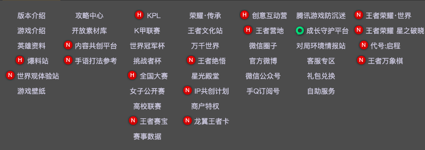
  • div.sub-nav元素已脱标,为绝对定位

  • div.sub-nav元素内部有div.wrapper_03元素,该元素宽度为890px,水平居中

  • div.wrapper_03元素是由多个ul>li>a元素组成的,水平居中

    • 设置每个li元素宽度为115px = 上面ul.list中li元素的宽度

    • 设置li元素内容显示在一行,不能换行white-space: nowrap;

  • 有些文字前有红色图标,用伪元素::before,分为.hot,.fans,.guard不同显示内容

    • 为了图标和文字垂直居中,设置父元素a为flex布局
  • 有些a元素加了图标,内容宽度>115px,需要设置整体内容后移margin-left: 5px;

1
2
3
4
5
6
7
8
9
10
11
12
13
14
15
16
17
18
19
20
21
22
23
24
25
26
27
28
29
30
31
32
33
34
35
36
37
38
39
40
41
42
43
44
45
46
47
48
49
50
51
52
53
54
55
56
57
58
59
60
61
62
63
64
65
66
67
.header:hover .sub-nav{
height: 315px;
}
.header .sub-nav {
position: absolute;
left: 0;
right: 0;
top: 84px;
height: 0px;
background-color: rgba(0, 0, 0, 0.7);
overflow: hidden;
transition: all 0.5s;
}
.header .wrapper_03{
display: flex;
padding: 15px 0 30px 50px;
text-align: center;
}

.header .sub-nav .item {
width: 115px;
white-space: nowrap;
}
.header .sub-nav a {
display: flex;
justify-content: center;
align-items: center;
height: 30px;
line-height: 30px;
font-size: 14px;
color: #c9c9dd;
}
.header .sub-nav a:hover {
color: #f3c258;
text-decoration: underline;
}
/* 内容超过宽度 */
.header .sub-nav .exceed {
justify-content: flex-start;
margin-left: 5px;
}

.header .sub-nav a.hot::before,
.header .sub-nav a.fans::before,
.header .sub-nav a.guard::before {
content: "";
display: inline-block;
flex-shrink: 0;
width: 24px;
height: 24px;
padding-right: 2px;
background: url(../img/sprite/index_sprite.png);
}
/* icon_hot */
.header .sub-nav a.hot::before {
background-position: -163px -68px;
}

/* icon_fans */
.header .sub-nav a.fans::before {
background-position: -137px -68px;
}

/* icon_guard */
.header .sub-nav a.guard::before {
background-position: -136px -5px;
}

6. wrapper

6.1. 思路

  • div.wrapper元素由 div.bg-container,div.man元素组成
    • div.bg-container元素脱标,充当div.wrapper元素部分的背景
    • div.wrapper元素的高度由div.main元素撑起来
    • div.main元素设置较大的上外边距,使得div.bg-container元素的图片头部可以显示

6.2. div.wrapper

1
2
3
4
<div class="wrapper">
<div class="bg-container">...</div>
<div class="main wrapper_04">...</div>
</div>
  • css
1
2
3
.wrapper {
position: relative;
}

6.3. div.bg-container

1
2
3
4
<div class="bg-container">
<div class="bg"></div>
<a href="#" class="wrapper_04">查看详情</a>
</div>

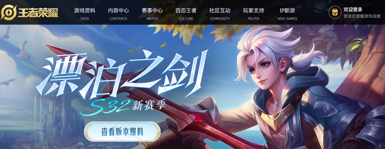
  • div.bg-container元素向上偏移84px,而84px就是div.header元素的高度。这么做是为了实现叠放在div.header元素下方效果
  • div.bg-container元素高度由div.bg元素撑起来,因为a元素为了迎合图片中的按钮位置已脱标
  • a元素宽高为1200x440,水平居中
1
2
3
4
5
6
7
8
9
10
11
12
13
14
15
16
17
18
19
20
.wrapper .bg-container {
position: absolute;
left: 0;
right: 0;
top: -84px;
}
.bg-container .bg {
height: 1300px;
background: url(../img/wrapper/bg.jpg) no-repeat center top;
}
.bg-container a {
position: absolute;
top: 84px;
left: 0;
right: 0;
margin: 0 auto;
display: block;
height: 440px;
text-indent: -9999px;
}

6.4. div.main

1
2
3
4
5
6
<div class="main wrapper_04">
<div class="main-top">...</div>
<div class="quick-entrance">...</div>
<div class="main-item">...</div>
</div>
  • div.main元素自身宽度为1200px,水平居中,设置比div.bg-container中a元素高度更大的上偏移值才能避免误触
  • div.main元素中有div.main-top,div.quick-entrance,两个div.main-item元素,都是垂直布局
1
2
3
4
.wrapper .main {
position: relative;
padding-top: 540px;
}

6.5. div.main-top

1
2
3
4
5
<div class="main-top">
<div class="left">...</div>
<div class="center">...</div>
<div class="right">...</div>
</div>

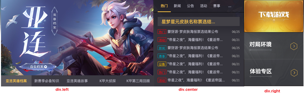
  • div.main-top元素由背景图将区域分为div.left,div.center,div.right三个元素,三者水平居中
    • div.left元素中图片是自动+手动轮播
    • div.center元素中根据标题实现新闻内容的切换
    • div.right元素就是三张背景图的堆积
1
2
3
4
5
6
.wrapper .main-top {
display: flex;
justify-content: space-between;
height: 342px;
background: url(../img/wrapper/main-top/main_bg.png) no-repeat;
}

6.6. div.left

1
2
3
4
5
6
7
8
9
10
11
12
13
14
15
16
17
18
19
20
21
22
23
24
25
26
<div class="left">
<ul class="photos">
<li class="item">
<a href="#"><img src="./img/wrapper/main-top/01.jpeg" alt=""></a>
</li>
<li class="item">
<a href="#"><img src="./img/wrapper/main-top/02.jpeg" alt=""></a>
</li>
<li class="item">
<a href="#"><img src="./img/wrapper/main-top/03.jpeg" alt=""></a>
</li>
<li class="item">
<a href="#"><img src="./img/wrapper/main-top/04.jpeg" alt=""></a>
</li>
<li class="item">
<a href="#"><img src="./img/wrapper/main-top/05.jpeg" alt=""></a>
</li>
</ul>
<div class="btns">
<a href="#" class="active">亚连英雄档案</a>
<a href="#">新赛季必备知识</a>
<a href="#">亚连英雄故事</a>
<a href="#">K甲大侦探</a>
<a href="#">K甲第三周回顾</a>
</div>
</div>

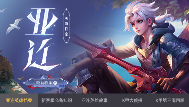
  • div.left元素有明确的宽度604px,也就规定了内部图片宽度为604px
  • div.left元素中有ul.photos,div.btns两个元素,垂直布局
1
2
3
4
.main-top .left {
width: 604px;
overflow: hidden;
}

6.6.1. ul.photos

  • ul.photos元素中每个li元素的宽度为100%,5个li元素水平排列
1
2
3
4
5
6
7
8
9
10
11
12
13
14
15
16
17
.main-top .photos {
display: flex;
height: 298px;
}
.main-top .photos:hover {
animation-play-state: paused;
}
.main-top .photos .item {
width: 100%;
/* 禁止缩放 */
flex-shrink: 0;
}
.main-top .photos a {
display: block;
width: 100%;
height: 100%;
}

6.6.2. 图片轮播

图片轮播js实现

6.6.3. div.btns

  • div.btns元素中5个a元素,平分div.btns元素宽度
  • active类是为了js控制按钮切换时,选中按钮的需要
1
2
3
4
5
6
7
8
9
10
11
12
13
14
15
16
17
.main-top .btns {
display: flex;
justify-content: space-around;
height: 44px;
line-height: 44px;
}
.main-top .btns a {
flex: 1;
font-size: 14px;
text-align: center;
color: #b1b2be;
}
.main-top .btns a.active,
.main-top .btns a:hover {
background: rgba(255,255,255,0.15);
color: #f3c258;
}

6.6.4. 按钮点播

图片轮播下的按钮点播js实现

6.7. div.right

1
2
3
4
5
<div class="right">
<a href="#" class="download"></a>
<a href="#" class="battle"></a>
<a href="#" class="try"></a>
</div>

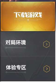
  • div.right元素宽度占满div.main-top元素的剩余空间
  • div.right元素高度是三个a元素垂直布局堆积的高度
  • a元素都是块级元素,内容来自于同一张精灵图不同位置
1
2
3
4
5
6
7
8
9
10
11
12
13
14
15
16
17
18
19
20
21
/* right */
.main-top .right {
flex: 1;
}
.main-top .right a {
display: block;
background: url(../img/sprite/index_sprite.png) no-repeat;
}

.main-top .right .download {
height: 128px;
background-position: 0 -219px;
}
.main-top .right .battle {
height: 106px;
background-position: 0 -350px;
}
.main-top .right .try {
height: 108px;
background-position: 0 -461px;
}

6.8. div.center

1
2
3
4
5
6
7
8
<div class="center">
<div class="nav">...</div>
<div class="news">
<!-- 热门 -->
<ul class="news_list">...</ul>
...
</div>
</div>

  • div.center元素由div.nav,div.news元素组成,垂直布局
  • div.center元素宽度占满div.main-top的剩余空间
  • div.center元素设置溢出隐藏,是为了内部新闻列表移动时,其他新闻项不可见
1
2
3
4
5
/* center */
.main-top .center {
flex: 1;
overflow: hidden;
}

6.8.1. div.nav

1
2
3
4
5
6
7
8
9
10
<div class="nav">
<ul class="list">
<li class="item active"><a href="#">热门</a></li>
<li class="item"><a href="#">新闻</a></li>
<li class="item"><a href="#">公告</a></li>
<li class="item"><a href="#">活动</a></li>
<li class="item"><a href="#">赛事</a></li>
</ul>
<a href="#" class="more">...</a>
</div>

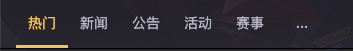
  • 为了让ul.list,a.more元素水平排布,设置div.nav是flex布局,其实div.nav元素中ul.list每个li.item元素样式其实和a.more样式都一样,除了:hover时的样式
  • 每个li.item元素
    • 为了看起来文字和下划线有一定间距,设置line-height很大,但不能超过整个元素的高度
    • 为了鼠标悬停和未悬停状态的li元素下边框不影响整体高度,设置下边框颜色透明
1
2
3
4
5
6
7
8
9
10
11
12
13
14
15
16
17
18
19
20
21
22
23
24
25
26
27
28
29
30
31
.main-top .nav {
display: flex;
padding: 0 17px;
border-bottom: 1px solid #000;
}
.main-top .nav .list {
display: flex;
}
.main-top .nav .more,
.main-top .nav .item {
width: 52px;
height: 48px;
border-bottom: 3px solid transparent;
box-sizing: border-box;
font-size: 14px;
text-align: center;
line-height: 45px;
}
.main-top .nav .more,
.main-top .nav .item a {
display: block;
color: #b8b9c5;
}
.main-top .nav .item.active,
.main-top .nav .item:hover {
border-bottom-color: #f3c258;
}
.main-top .nav .item.active a,
.main-top .nav .item:hover a {
color: #f3c258;
}

6.8.2. div.news

1
2
3
4
5
6
7
8
9
10
11
12
13
14
15
16
17
18
19
20
21
22
23
24
<div class="news">
<!-- 热门 -->
<ul class="news_list">
<li class="title">
<a href="#">星梦星元皮肤名称票选结果公布</a>
</li>
<li class="item">
<div class="left">
<span class="hot">热门</span>
<a href="#">蒙犽源·梦皮肤海报票选结果公布</a>
</div>
<em class="date">06/25</em>
</li>
...
</ul>
<!-- 新闻 -->
<ul class="news_list">...</ul>
<!-- 公告 -->
<ul class="news_list">...</ul>
<!-- 活动 -->
<ul class="news_list">...</ul>
<!-- 赛事 -->
<ul class="news_list">...</ul>
</div>

6.8.3. .news_list类样式

1
2
3
4
5
6
7
8
9
10
11
12
13
14
15
16
17
18
19
20
21
22
23
24
25
26
27
28
29
30
31
32
33
34
35
36
37
38
39
40
/* main-top和match-center的新闻列表样式相同 */
.news_list .item {
display: flex;
justify-content: space-between;
align-items: center;
}
.news_list .item .left {
display: flex;
align-items: center;
}
.news_list a {
position: relative;
display: block;

white-space: nowrap;
text-overflow: ellipsis;
overflow: hidden;
}
.news_list .date {
font-size: 12px;
}
.news_list .item span {
display: inline-block;
text-align: center;
font-size: 12px;
}
.news_list .item .hot,
.news_list .item .activity {
border: 1px solid #ff3636;
color: #ff3636;
}
.news_list .item .new,
.news_list .item .game {
border: 1px solid #1e96ab;
color: #1e96ab;
}
.news_list .item .notice {
border: 1px solid #f4be19;
color: #f4be19;
}

6.8.4. div.news_list

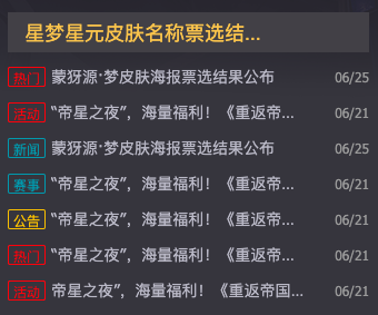
  • div.news 由多个ul.new_list组成,每个ul.new_list元素宽度为100%,水平排布。此时就需要在div.news的父元素中设置溢出隐藏-div.center
  • ul.new_list中的布局和div.main-item中div.match-center中的新闻布局一样,所以抽取成 new_list类
    • 第一个li元素是不同的,只有a元素
    • 其余li元素有div.left,em.date元素,div.left中有span和a元素,三者垂直居中
      • span和a外套一个div.left是为了让span元素贴li元素左边,a元素贴span元素,而em贴li元素右边,单就flex布局无法实现
      • span元素是块级元素,有宽高32x16
      • a元素是块级元素,限制宽为230px,超过部分文字以…显示
      • em元素字体小于span和a元素
1
2
3
4
5
6
7
8
9
10
11
12
13
14
15
16
17
18
19
20
21
22
23
24
25
26
27
28
29
30
31
32
33
34
35
36
37
38
39
40
41
42
43
/* news */
.main-top .news {
display: flex;
}
.main-top .news .news_list{
flex-shrink: 0;
width: 100%;
padding: 0 17px;
box-sizing: border-box;
}

.main-top .news_list .title {
height: 36px;
padding: 0 15px;
margin-top: 18px;
margin-bottom: 11px;
background-color: #414046;
line-height: 36px;
color: #f3c258;
}
.main-top .news_list .title a {
width: 230px;
font-size: 18px;
color: #f3c258;
}

.main-top .news_list .item {
margin-bottom: 11px;
}
.main-top .news_list .item a {
width: 230px;
color: #b8b9c5;
}
.main-top .news_list span {
width: 32px;
height: 16px;
border-radius: 2px;
margin-right: 5px;
}

.main-top .news_list .date {
color: #999;
}

6.8.5. 导航转换新闻列表

导航点播列表js实现

6.9. div.quick-entarnce

1
2
3
4
5
6
<div class="quick-entrance">
<a href="#"><img src="./img/wrapper/quick-entrance/01.jpg" alt=""></a>
<a href="#"><img src="./img/wrapper/quick-entrance/02.png" alt=""></a>
<a href="#"><img src="./img/wrapper/quick-entrance/03.jpg" alt=""></a>
<a href="#"><img src="./img/wrapper/quick-entrance/04.png" alt=""></a>
</div>

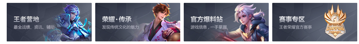
  • 4个a元素水平排布,a元素需要设置溢出隐藏,因为在鼠标悬停时img元素被放大一点
1
2
3
4
5
6
7
8
9
10
11
12
13
14
15
16
17
/* quick-entrance */
.main .quick-entrance {
display: flex;
height: 134px;
margin: 28px 0 34px;
justify-content: space-between;
}

.main .quick-entrance a{
overflow: hidden;
}
.main .quick-entrance img{
transition: all 0.2s linear;
}
.main .quick-entrance a:hover img{
transform: scale(1.1);
}
本文结束  感谢您的阅读