transform,transition,animation,vertical-align,white-space,text-overflow,css中的函数,BFC
1. transform 形变
CSS transform属性允许元素旋转,缩放,倾斜或平移
Transform是形变的意思,transformer就是变形金刚
注意事项,并非所有的盒子都可以进行transform转换,(
行内级元素不能进行形变)- 行内非替换元素不能形变 :span/a/strong/i/…
- 表格元素不能形变:table/tr/td/thead/tbody/tfoot
形变
不会影响其他元素的位置
1.1. transform用法
1 | transform = none | <transform-list> |
同时使用多个转换,格式为
transform: translate() rotate() scale() ...- 其顺序会影响转换的效果。先选择会改变坐标轴方向
- 同时有唯一和其他属性时,要将位移放在最前面
transform function
rotate()rotate3d()rotateX()rotateY()rotateZ()scale()scale3d()scaleX()scaleY()scaleZ()translate()translate3d()translateX()translateY()translateZ()
1.2. 2D转换
1.2.1. translate
平移:translate(x, y)
- 用于移动元素在平面上的位置
- translate本身表示翻译的意思,在物理上也可以表示平移
值个数
- 一个值时,设置x轴上的位移
- 二个值时,设置x轴和y轴上的位移
- x-正向 向右,负向 向左
- y-正向 向下,负向 向上
值类型
数字:translate(100px,100px)
百分比:
参照元素本身( refer to the size of bounding box )可用于元素的垂直水平居中
1
2
3
4position :absolute;
left: 50%;
top: 50%;
transform: translate(-50%,-50%);
1.2.2. scale
缩放:scale(x, y)
值个数
- 一个值时,设置x轴上的缩放
- 二个值时,设置x轴和y轴上的缩放
值类型:
数字
1-保持不变
2-放大一倍
0.5-缩小一半
百分比:等价于小数点
1.2.3. rotate
旋转:rotate(deg)
值个数
- 一个值时,表示旋转的角度
值类型
值 说明 deg 旋转的角度,正数为顺时针,负数为逆时针 gradians 百分度,将一个圆分为400度 radians 弧度 turns 圈数 - 90deg = 100grad = 0.25trun = 1.5708rad
- -90deg = -100grad = -0.25trun = -1.5708rad
- 180deg = 200grad = 0.5turn = 3.1416rad
- 0deg = 0grad = 0trun = 0rad
注意:旋转的原点受transform-origin的影响
1.2.4. skew
倾斜:skew(x, y)
值个数
- 一个值时,表示x轴上的倾斜
- 二个值时,表示x轴和y轴上的倾斜
值类型
- deg:倾斜的角度
- 正数为顺时针
- 负数为逆时针
注意:倾斜的原点受transform-origin的影响
1.2.5. transform-origin
transform-origin:变形的原点
一个值
- 设置x轴的原点
两个值
- 设置x轴和y轴的原点
- x y 默认转换的中心点是元素的中心点(50% 50%)
必须是 length,percentage,或 left, center, right, top, bottom关键字中的一个
- left, center, right, top, bottom关键字
- length:从左上角开始计算
- 百分比:参考元素本身大小
1.3. 3D转换
1.3.1. 三维坐标系
- x轴:水平向右,右为正,左为负
- y轴:垂直向下,下为正,上为负
- z轴:垂直屏幕,外为正,里为负
1.3.2. translate3d
3D移动在2D移动的基础上多加了一个可以移动的z方向
tansform: translateX(100px)
向右移动
tansform: translateY(100px)
向下移动
tansform: translateZ(100px)
向外移动
tansform: translate(100px,100px,100px)
x y z 三方向都移动
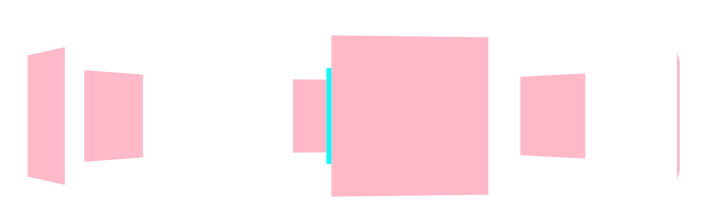
1.3.3. perspective
在2D平面产生
近大远小视觉立体,只是效果是二维的透视也称为视距,视距就是人的眼睛到屏幕的距离
距离视觉点越近的在电脑平面成像越大,越远成像越小
透视的单位是像素
透视写在被观察元素的父盒子上面透视就是z轴,物体距离屏幕的距离,z轴越大(正向往屏幕外),看到的物体越大
1.3.4. rotate3d
元素在三维平面内沿着x轴,y轴,z轴或者自定义轴进行旋转
左手原理,大拇指指向轴正向,其余四指弯曲方向即为旋转正向
transform: rotateX(45deg)
沿着x轴正方向(往里)旋转45度
transform: rotateY(45deg)
沿着y轴正方向(往里)旋转45度
transform: rotateZ(45deg)
沿着z轴正方向旋转45度 - 看起来跟2d旋转相同
transform: rotate3d(x,y,z,45deg)
沿着自定义轴旋转45度
如 transform: rotate3d(1,1,0,45deg),沿x,y对角线旋转
1.3.5. tranform-style
父盒子中拥有多个子盒子时
- 控制子元素是否开启三维立体环境
- transform-style: flat; 子元素不开启3d立体空间,默认
- transform-style: preserve-3d; 子元素开启立体空间
- 代码写给父级,但是影响的是子盒子
1.3.6. 案例一
1 | <style> |
1.3.7. 案例二 - 两面翻转
1 | <style> |
1.3.8. 案例三 - 3D导航栏
1 | <style> |
1.3.9. 案例四 - 旋转木马
实现6个面的旋转效果
1 | <style> |
2. transition 过渡动画
- 什么是transition?
- CSS transition提供了一种在更改CSS属性时控制动画速度的方法
- 可以让CSS属性变化成为一个持续一段时间的过程,而不是立即生效的
- 比如将一个元素从一个位置移动到另外一个位置,默认在修改完CSS属性后会立即生效
- 可以通过CSS transition,让这个过程加上一定的动画过程,包括一定的曲线速率变化
- transition是为页面元素设置某个需要产生动画效果的属性,如宽度(width)、高度(height)、透明度(opacity), 至3D旋转等,并使得这些属性的值在发生变化时产生相应的过效果
- 通常将两个状态之间的过渡称为隐式过渡,因为开始与结束之间的状态有浏览器决定
- A CSS transition tells the browser to draw the intermediate states between the initial and final states, showing the user a smooth transition.
- CSS transition 可以决定
- 哪些属性发生动画效果(明确地列出这些属性)
- 何时开始(设置delay)
- 持续多久(设置duration)
- 如何动画(定义timing function,比如匀速地或先快后慢)
- transition属性是 transition-property,transition-duration,transition-timing-function 和 transition-delay 的 一个简写属性
2.1. 常见属性
| 属性 | 说明 |
|---|---|
| transition-property | 指定应用过渡属性的名称 可以写all表示所有可动画的属性,属性是否支持动画查看文档 |
| transition-duration | 指定过渡动画所需的时间。单位可以是秒(s)或毫秒(ms) |
| transition-timing-function | 指定动画的变化曲线 |
| transition-delay | 指定过渡动画执行之前的等待时间 |
2.2. transtion缺点
- transition来进行过渡动画,但是过渡动画只能控制首尾两个值
- 从关键帧动画的角度相当于只是定义了两帧的状态:第一帧和最后一帧
- 不能定义中间状态
- transtion不能重复执行,除非再次触发动画
- transition需要在特定状态下会触发才能执行,比如某个属性被修改了
- 希望有更多状态的变化,可以使用animation
3. animation 动画
- 可通过设置多个节点来精确控制一个或一组动画,常用来实现复杂的动画效果
3.1. @keyframes定义动画
- 0% 是动画的开始,100% 是动画的完成
- 在 @keyframes 中规定某项css样式,就能创建由当前样式逐渐改为新样式的动画效果
- 可以做多个状态的变化 0%,25%,75%,100%
- 百分比就是总的时间的划分
- 也可以用 from to 替换 0% 100%
1 | @keyframes 动画名称{ |
3.2. 常用属性
| 属性 | 描述 |
|---|---|
| @keyframes | 规定动画 |
| animation | 所有动画属性的连写,除animation-play-state属性 |
| animation-name | 规定 @keyframes动画的名称 |
| animation-duration | 规定动画完后一个周期所花费的秒或毫秒,默认是0 |
| animation-timing-function | 规定动画的速度曲线,默认是ease |
| animation-delay | 规定动画何时开始,默认是0 |
| animation-iteration-count | 规定动画播放次数,默认是1,可以是infinite |
| animation-direction | 规定动画是否在下一周期逆向播放,默认是normal,可以是alternate 逆播放 |
| animation-play-state | 规定动画是否正在运行或暂停。默认是running,还有paused |
| animation-fill-mode | 规定动画结束后状态,保持最后一帧的位置forwards,回到第一帧的位置backwards,回到没有执行动画的位置none |
3.3. animation连写
animation: 动画名称 持续时间 运动曲线 何时开始 播放次数 是否反方向 动画起始或结束的状态
3.4. animation-timing-function
- 动画速度曲线
| 值 | 描述 |
|---|---|
| linear | 动画从头到尾的速度是相同的,匀速 |
| ease | 默认。动画以低速开始,然后加快,在结束前变慢 |
| ease-in | 动画以低速开始 |
| ease-out | 动画以低速结束 |
| ease-in-out | 动画以低速开始和结束 |
| steps | 指定了时间函数中的间隔数量(步长) |
3.4.1. 打字效果
1 | <style> |
3.4.2. 奔跑的小熊
1 | <style> |
3.5. greensock.js
- GSAP是GreenSock推出的新一代动画,官方网站为http://greensock.com,中文 https://www.tweenmax.com.cn/index.html
- 在GSAP中有多种HTML5动画,TweenMax是其中功能最为全面的,其精简版则被称为TweenLite
1 | <img src="shuttle.png" id="shuttle"> |
TweenMax.to()方法代表执行一条动画语句,在语句中定义了运动对象、动画时间,以及动画属性
- 先延长1秒后(delay:1),在接下来的1秒时间内,以Back.easeOut这一弹性速度线(ease:Back. easeOut)移动到距离屏幕左侧250像素(left:250),垂直居中(top:’50%’)的位置,并旋转90(rotation:90)
- 动画结束时,将调用completeHandler函数(onComplete:completeHandler),该函数将在接下来的2秒内,使元素移动到最右侧(left:’100%’),并大小缩小为20%(scale:.2),透明度变为完全透明(opacity:0),速度曲线为先回弹再向右运动(ease:Back.easeIn)
TweenMax还能完成一些常规CSS动画法实现的属性变化,如制作圆角弧度动画
将一个边框为5像素的正方形在两秒内变为了圆形,并循环播放
1
TweenMax.to(box, 2, {borderRadius:"50%", repeat:-1});
4. vertical-align
4.1. 认识 vertical-align
https://developer.mozilla.org/zh-CN/docs/Web/CSS/vertical-align
| 初始值 | baseline |
|---|---|
| 适用元素 | 行内元素,表格元素,或者 ::first-letter,::first-line |
| 是否是继承属性 | 否 |
| 百分比 | 参照元素的行高 |
| 计算值 | for percentage and length values, the absolute length, otherwise the keyword as specified |
| Animation type | a length |
4.2. line boxes行盒
- This property affects the vertical positing inside a line box of boxes generated by an inline-level element.
- 官方文档翻译:vertical-align会影响行内块级元素在一个行盒中垂直方向的位置
- 一个div没有设置高度的时候,会不会有高度?
- 没有内容,没有高度
- 有内容,内容撑起来高度
- 但是内容撑起来高度的本质是什么呢?
- 内容有行高(line-height),撑起来了div的高度
- 行高为什么可以撑起div的高度?
- 这是因为line boxes的存在,并且line-boxes有一个特性,包裹每行的inline level
- 而其中的文字是有行高的,必须将整个行高包裹进去,才算包裹这个line-level
- 如果这个div中有图片,文字,inline-block,甚至设置了margin这些属性呢?
- 将所有的属性值包裹起来撑起行盒
- 多个行盒撑起整个div高度
4.3. 属性值
- 设置在行内级元素上
| 属性值 | 效果 |
|---|---|
| baseline | 默认,基线对齐 |
| top | 把行内级盒子的顶部跟line boxes顶部对齐 |
| middle | 行内级盒子的中心点与父盒基线加上字母height一半的线对齐 |
| bottom | 把行内级盒子的底部跟line box底部对齐 |
| percentage | 把行内级盒子提升或者下降一段距离(距离相对于line-height计算/元素高度), 0%意味着同baseline一 样 |
| length | 把行内级盒子提升或者下降一段距离,0cm意味着同baseline一样 |
4.4. baseline
结论:line-boxes一定会想办法包裹住当前行中所有的内容
但是,为什么对齐方式千奇百怪?
- 官方vertical-align的默认值是baseline对齐
baseline都是什么?
- 文本的baseline是字母div的下方
- inline-block默认的baseline是margin-bottom的底部(没有,就是盒子的底部)
- inline-block有文本时,baseline是最后一行文本的下方
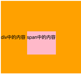
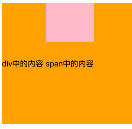
4.5. middle
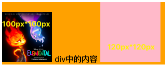
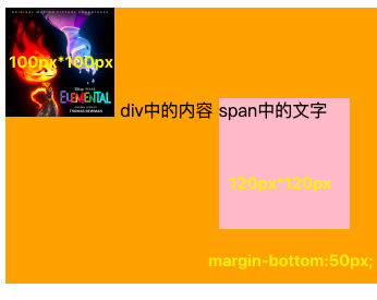
并不能直接使图片垂直居中
父盒子高度为auto,图片高度为120px时
- 父盒子高度完全由图片高度撑起来,并不算是让图片实现垂直居中
- 文本的居中还是使用line-height
父盒子高度为250px,图片高度为120px时
- middle定义的是行内级盒子的中心点与父盒基线加上字母height一半的线对齐
- 是红色框和黄色框高度相同
- middle定义的是行内级盒子的中心点与父盒基线加上字母height一半的线对齐
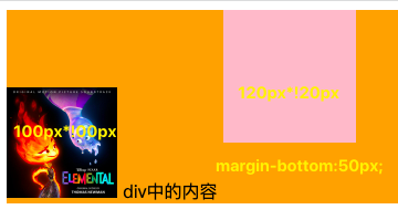
父元素行高设置为250px时
文字是垂直居中,但是大部分字体会进行文本下沉,导致字母高度一半并不在肉眼所见的字母一半位置。最终middle对齐时,图片会下沉
- 红色框和黄色框高度不等,红色框高一点
4.6. 对齐的不同情况
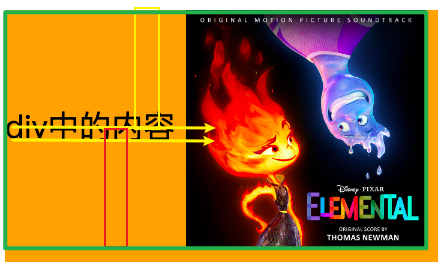
只有文字时,line boxes如何包裹内容?
- 仅包裹内容
只有图片,line boxes如何包裹内容?
- 预留空间,为了图片和未来的文字对齐
- 解决方法
- 改为其他对齐方式 vertical-align:top/middle/bottom
- 改为块级元素 display:block
有图片,有文字时,line-boxes如何包裹内容?
- 文本的baseline是
字母div的下方
- 文本的baseline是
有图片,有文字,有inline-block(比图片要大)如何包裹内容?
- inline-block的基线是
盒子的底部
- inline-block的基线是
有图片,有文字,有inline-block(比图片要大)而且设置了margin-bottom,如何包裹内容?
- inline-block的基线是盒子底部,有margin-bottom时是
margin-bottom底部
- inline-block的基线是盒子底部,有margin-bottom时是
有图片、文字、inline-block(比图片要大)而且设置了margin-bottom并且有文字,如何包裹内容?
- inline-block有文本时,baseline是
最后一行文本的下方
- inline-block有文本时,baseline是
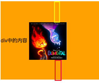
图片与行盒顶部对齐,有文字、inline-block(无内容,小于图片),line-boxes如何包裹内容?
- 行盒一定会包裹所有的内容
- 图片与行盒顶部对齐,其他元素依然基线对齐
4.7. 行内块级元素分离现象
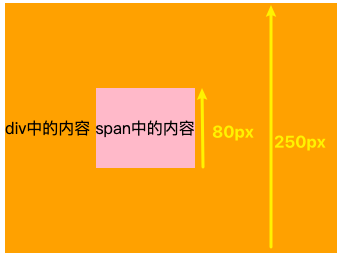
4.7.1. 行内块级元素垂直居中
- span的行高为80px,父元素行高为250px,都将盒子内部设置为只有一个行盒
- span的内容在自身盒子内居中,父元素的内容也在自身盒子内居中
- 两者文本内容在基线上对齐,又因为文字大小相同,所以span也在父元素中居中
- 注意:文本大小必须一样
4.7.2. 改变行内级元素文本大小
- 将span元素的文本字号改为30px时,发现span就无法在父元素中居中
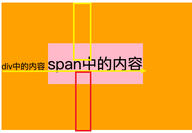
4.7.3. 改变行内级元素行高-分离现象
行高变小,内容上移,盒子下移
- span行高设置为40px
行高变大,内容下移,盒子上移
span行高为父元素行高250px
5. white-space
- white-space用于设置空白处理和换行规则
- 空白:空格 tab键 换行符
- normal:
合并所有连续的空白,允许单词超屏时自动换行 - nowrap:
合并所有连续的空白,不允许单词超屏时自动换行 - pre:
阻止合并所有连续的空白,不允许单词超屏时自动换行 - pre-wrap:
阻止合并所有连续的空白,允许单词超屏时自动换行 - pre-line:
合并所有连续的空白(但保留换行),允许单词超屏时自动换行
- normal:
6. text-overflow
text-overflow通常用来设置文字溢出时的行为
- clip:溢出的内容直接裁剪掉(字符可能会显示不完整)
- ellipsis:溢出那行的结尾处用省略号表示
text-overflow生效的前提是overflow不为visible
常见的是将white-space、text-overflow、overflow一起使用
1
2
3white-space: nowrap;
text-overflow: ellipsis;
overflow: hidden;
7. CSS中的函数
- CSS函数通常可以更加灵活的来编写样式的值
- 常用比如rgb/rgba/translate/rotate/scale等,还有
- var:使用CSS定义的变量
- calc:计算CSS值, 通常用于计算元素的大小或位置
- blur:毛玻璃(高斯模糊)效果
- gradient:颜色渐变函数
7.1. var
CSS中可以自定义属性
属性名需要以两个减号(–)开始
属性值则可以是任何有效的CSS值
1
2
3html {
--why-color: red;
}
通过var函数来使用
1
2
3span {
color: var(--why-color);
}规则集定义的选择器, 是自定义属性的可见作用域(只在选择器内部有效)
- 所以推荐将自定义属性定义在html中,也可以使用
:root 选择器
- 所以推荐将自定义属性定义在html中,也可以使用
7.2. calc
- calc() 函数允许在声明 CSS 属性值时执行一些计算
- 计算支持加减乘除的运算
- +和-运算符的两边必须要有空白字符
- 通常用来设置一些元素的尺寸或者位置
- 计算支持加减乘除的运算
1 | div { |
7.3. blur
blur() 函数将
高斯模糊应用于输出图片或者元素blur(radius)
- radius,模糊的半径,用于定义高斯函数的偏差值,偏差值越大,图片越模糊
通常会和两个属性一起使用
- filter:将模糊或颜色偏移等图形效果应用于元素
- backdrop-filter:为元素后面的区域添加模糊或者其他效果
1
2
3
4filter: blur(20px);
background: rgba(0,0,0,.5);
backdrop-filter: blur(5px);
7.4. gradient
gradient是一种 image CSS数据类型的子类型,用于表现两种或多种颜色的过渡转变
CSS的image数据类型描述的是2D图形
- 比如background-image、list-style-image、border-image、content等
- image常见的方式是通过url来引入一个图片资源,也可以通过CSS的gradient函数来设置颜色的渐变
gradient常见的函数实现有下面几种
- linear-gradient():创建一个表示两种或多种颜色线性渐变的图片
- radial-gradient():创建了一个图像,该图像是由从原点发出的两种或者多种颜色之间的逐步过渡组成
- repeating-linear-gradient():创建一个由重复线性渐变组成的image
- repeating-radial-gradient():创建一个重复的原点触发渐变组成的image
- 等等
7.4.1. linear-gradient
linear-gradient:创建一个表示两种或多种颜色线性渐变的图片
1
2
3
4
5
6
7
8/* 默认从上到下 */
background-image: linear-gradient(blue, red);
/* 从左到右 */
background-image: linear-gradient(to right, blue, red);
/*从左上到右下 */
background-image: linear-gradient(to right bottom, blue, red);
background-image: linear-gradient(45deg, blue, red);
background-image: linear-gradient(to right, blue, red 10%, purple 40px, orange);
7.4.2. radial-gradient
- radial-gradient:创建了一个图像,该图像是由
从原点发出的两种或者多种颜色之间的逐步过渡组成
1 | background-image: radial-gradient(blue, red); |
8. 浏览器私有前缀
官方文档专业术语vendor-specific extensions(供应商特定扩展)
为什么需要浏览器前缀
- CSS属性刚开始并没有成为标准,浏览器为了防止后续会修改名字给新的属性添加了浏览器前缀
- 叫做浏览器私有前缀,只有对应的浏览器才能解析使用
-moz-:代表firefox浏览器私有属性
-ms-,-mso-:代表ie浏览器私有属性
-webkit-:代表safari,chrome浏览器私有属性
-o-,-xv-:代表opera浏览器私有属性
注意:不需要手动添加,后面学习了模块化打包工具会自动添加浏览器前缀
1 | -webkit-border-raduis: 10px; |
9. FC
什么是FC?
FC的全称是Formatting Context,元素在标准流里面都是属于一个FC的
- https://www.w3.org/TR/CSS2/visuren.html#normal-flow
- Boxes in the normal flow belong to a formatting context, which may be block or inline, but not both simultaneously. Block-level boxes participate in a block formatting context. Inline-level boxes participate in an inline formatting context.
块级元素的布局属于Block Formatting Context(BFC)
- 也就是block level box都是在BFC中布局的
行内级元素的布局属于Inline Formatting Context(IFC)
- 而inline level box都是在IFC中布局的
9.1. BFC
BFC - Block Formatting Context
block level box都是在BFC中布局的,那么这个BFC在哪里呢?
- Floats, absolutely positioned elements, block containers (such as inline-blocks, table-cells, and table-captions) that are not block boxes, and block boxes with ‘overflow’ other than ‘visible’ (except when that value has been propagated to the viewport) establish new block formatting contexts for their contents.
MDN上有整理出在哪些具体的情况下会创建BFC
- 根元素(html)
- 浮动元素(元素的 float 不是 none)
- 绝对定位元素(元素的 position 为 absolute 或 fixed)
- 行内块元素(元素的 display 为 inline-block)
- 表格单元格(元素的 display 为 table-cell,HTML表格单元格默认为该值),表格标题(元素的 display 为 table-caption,HTML表格标题默认为该值)
- 匿名表格单元格元素(元素的 display 为 table、table-row、 table-row-group、table-header-group、table-footer-group(分别是HTML table、row、tbody、thead、tfoot 的默认属性)或 inline-table)
- overflow 计算值(Computed)不为 visible 的块元素
- 弹性元素(display 为 flex 或 inline-flex 元素的直接子元素)
- 网格元素(display 为 grid 或 inline-grid 元素的直接子元素)
- display 值为 flow-root 的元素
9.2. BFC有什么作用
官方文档对BFC作用的描述
- In a block formatting context, boxes are laid out one after the other, vertically, beginning at the top of a containing block. The vertical distance between two sibling boxes is determined by the ‘margin’ properties. Vertical margins between adjacent block-level boxes in a block formatting context collapse.
- In a block formatting context, each box’s left outer edge touches the left edge of the containing block (for right-to-left formatting, right edges touch). This is true even in the presence of floats (although a box’s line boxes may shrink due to the floats), unless the box establishes a new block formatting context (in which case the box itself may become narrower due to the floats).
简单概况如下
- 在BFC中,box会在垂直方向上一个挨着一个的排布
- 垂直方向的间距由margin属性决定
- 在同一个BFC中,相邻两个box之间的margin会折叠(collapse)
- 在BFC中,每个元素的左边缘是紧挨着包含块的左边缘的
那么有什么用呢?
- 解决margin的折叠问题
- 解决浮动高度塌陷问题
9.2.1. 解决折叠问题(权威)
在同一个BFC中,相邻两个box之间的margin会折叠(collapse)
官方文档明确的有
- The vertical distance between two sibling boxes is determined by the ‘margin’ properties. Vertical margins between adjacent block-level boxes in a block formatting context collapse.
那么让两个box是不同的BFC - 就可以解决折叠问题
- div.box1在div.container中,div.container因为overflow:hidden形成了新的BFC
- div.box2在html中,html在BFC中
- div.box1 和 div.box2 在不同的BFC中就能解决折叠问题
1
2
3
4
5
6
7
8
9
10
11
12
13
14
15
16
17
18
19
20
21
22
23<html>
<style>
.container {
overflow: hidden;
}
.box1, .box2 {
width: 200px;
height: 200px;
}
.box1 {
background: purple;
}
.box2 {
bcakground: orange;
}
</style>
<body>
<div class="container">
<div class="box1"></div>
</div>
<div class="box2"></div>
</body>
</html>
9.2.2. 解决浮动高度塌陷(权威)
网上有很多说法,BFC可以解决浮动高度塌陷,可以实现清除浮动的效果
- 但是从来没有给出过BFC可以解决高度塌陷的原理或者权威的文档说明
- 也压根没有办法解释,为什么可以解决浮动高度的塌陷问题,但是不能解决绝对定位元素的高度塌陷问题呢?
事实上,BFC解决高度塌陷需要满足两个条件
- 浮动元素的
父元素触发BFC,形成独立的块级格式化上下文(Block Formatting Context) - 浮动元素的父元素的高度是auto的
- 浮动元素的
BFC的高度是auto的情况下,是如下方法计算高度的
https://www.w3.org/TR/CSS2/visudet.html#root-height
10.6.7 ‘Auto’ heights for block formatting context roots
In certain cases (see, e.g., sections 10.6.4 and 10.6.6 above), the height of an element that establishes a block formatting context is computed as follows:
If it only has inline-level children, the height is the distance between the top of the topmost line box and the bottom of the bottommost line box.
If it has block-level children, the height is the distance between the top margin-edge of the topmost block-level child box and the bottom margin-edge of the bottommost block-level child box.
Absolutely positioned children are ignored, and relatively positioned boxes are considered without their offset. Note that the child box may be an anonymous block box.
In addition,
if the element has any floating descendants whose bottom margin edge is below the element's bottom content edge, then the height is increased to include those edges. Only floats that participate in this block formatting context are taken into account, e.g., floats inside absolutely positioned descendants or other floats are not.- 如果只有inline-level,是行高的顶部和底部的距离
- 如果有block-level,是由最底层的块上边缘和最底层块盒子的下边缘之间的距离
- 如果有绝对定位元素,将被忽略
如果有浮动元素,那么会增加高度以包括这些浮动元素的下边缘