实现网易音乐首页 https://music.163.com/
1. 整体代码
2. 重置样式
1 | body,div,a,ul,ol,li,h1,h2,h3,h4,h5,h6,input,i,span,p,dl,dt,dd{ |
3. top
3.1. top整体布局

整体为div.top元素,内部放置 div.topbar 和 div.topnav 两个元素,这两个元素宽度都占满div.top
div.topbar高度为70px,内部放置 div.wrapper_01元素,规定其宽度1100px并居中显示
- 内部放置div.bar-left,div.bar-right 两个元素
- 按照flex布局,主轴规定元素贴边排布
div.topnav高度为35px,内部同样放置 div.wrapper_01元素,居中显示
HTML
1
2
3
4
5
6
7
8
9
10
11
12
13
14
15
16
17<div class="top">
<div class="topbar">
<div class="wrapper_01">
<div class="bar-left">
bar_left
</div>
<div class="bar-right">
bar_right
</div>
</div>
</div>
<div class="topnav">
<div class="wrapper_01">
topnav
</div>
</div>
</div>CSS
1
2
3
4
5
6
7
8
9
10
11
12
13
14
15
16
17
18
19
20
21
22
23
24
25
26
27
28
29
30
31
32
33
34
35
36
37
38
39
40
41
42/* common */
.wrapper_01 {
width: 1100px;
margin: 0 auto;
}
/* top */
.topbar {
height: 70px;
background-color: #242424;
border: 1px solid #000;
box-sizing: border-box;
}
.topbar .wrapper_01{
height: 69px;
line-height: 69px;
display: flex;
justify-content: space-between;
color: #fff;
}
.topbar .bar-left {
display: flex;
}
.topbar .bar-right {
display: flex;
align-items: center;
}
.topnav {
height: 35px;
background-color: #C20C0C;
border-bottom: 1px solid #a40011;
box-sizing: border-box;
}
.topnav .wrapper_01 {
height: 34px;
line-height: 34px;
color: #fff;
}
3.2. topbar
3.2.1. bar-left
- 整体布局:h1元素中放logo图标,ul内放置6个链接a元素
1 | <div class="bar-left"> |
3.2.1.1. logo
采用h1元素,有利于SEO优化
h1内包裹a标签,文字内容 “网易云音乐”
但实际显示的是一张精灵图,background-position:0,0;
会将文字缩进到超大值使其不显示 text-indent:-9999px;
HTML
1
2
3<div class="bar-left">
<h1 class="logo"><a href="#">网易云音乐</a></h1>
</div>CSS
1
2
3
4
5
6
7
8
9.topbar .bar-left .logo {
background: url(../images/topbar_sprite.png);
}
.topbar .bar-left .logo a{
display: block;
width: 157px;
padding-right: 20px;
text-indent: -9999px;
}
3.2.1.2. list
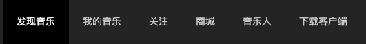
采用列表元素,flex布局
将a链接元素设置为block就可以有宽高,让其宽高占满整个父元素li
- 这样,即使鼠标在文字下方,但仍然在整个li元素中,鼠标也是小手状态
设置a元素内行内元素水平居中 text-allgin:center
HTML
1
2
3
4
5
6
7
8<ul class="list">
<li class="item active"><a href="#">发现音乐</a></li>
<li class="item"><a href="#">我的音乐</a></li>
<li class="item"><a href="#">关注</a></li>
<li class="item"><a href="#">商城</a></li>
<li class="item"><a href="#">音乐人</a></li>
<li class="item"><a href="#">下载客户端</a></li>
</ul>CSS
1
2
3
4
5
6
7
8
9
10
11
12
13.topbar .bar-left .list {
display: flex;
}
.topbar .bar-left .list .item a {
display: block;
text-align: center;
color: #ccc;
}
.topbar .bar-left .list .item.active a,
.topbar .bar-left .list .item:hover a{
background-color: #000;
color: #fff;
}
3.2.1.3. 选中时小图标
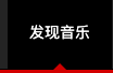
带有active类的li元素下方下方有一个小尖角
尖角图像在logo同一张的精灵图中
- 所以采用背景图定位显示尖角
尖角位置是底部水平居中显示的
所以采用绝对定位,水平居中
而绝对定位之前需要将父元素先设置成相对定位
1 | .topbar .bar-left .list .item a { |
3.2.1.4. hot图标
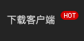
将 最后一个 li元素 添加 hot类
HTML
1
<li class="item hot"><a href="#">下载客户端</a></li>
CSS
- 依然采用伪元素添加图标,不过采用相对定位,略微偏移图标位置
1
2
3
4
5
6
7
8
9
10
11.topbar .bar-left .list .item.hot a::after {
content: "";
display: inline-block;
width: 26px;
height: 13px;
background: url(../images/topbar_sprite.png) -192px 0;
position: relative;
left: 8px;
top: -5px;
}
3.2.1.5. hot图标代码抽取
hot图标可能会在页面内出现多次,图标的大小和在精灵图中的位置是固定的,不需要多次重复,可以进行代码抽取
抽取大小和定位
1
2
3
4
5
6.hot_icon {
display: inline-block;
width: 26px;
height: 13px;
background: url(../images/topbar_sprite.png) -192px 0;
}舍弃伪元素,改为i元素
HTML
1
2
3
4<li class="item hot">
<a href="#">下载客户端</a>
<i class="hot_icon"></i>
</li>CSS
1
2
3
4
5.topbar .bar-left .list .item.hot .hot_icon{
position: relative;
left: -15px;
top: -5px;
}
3.2.2. bar-right
- 整体布局:三个div元素
1 | <div class="bar-right"> |
3.2.2.1. search
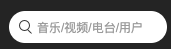
整体div.search,内部拥有 i.tip,input两个元素,采用flex布局,侧轴居中
i元素所用搜索图标来自于精灵图topbar_sprite.png,单独抽取其大小和在精灵图中的位置成立search_icon类
input元素设置其宽度和占位符的样式
- :placeholder-shown伪类用于选中占位符文本
HTML
1
2
3
4<div class="search">
<i class="search_icon"></i>
<input type="text" name="searchWord" value="" placeholder="音乐/视频/电台/用户">
</div>CSS
1
2
3
4
5
6
7
8
9
10
11
12
13
14
15
16
17
18
19
20
21
22
23
24
25
26
27
28
29
30.search_icon {
display: inline-block;
width: 13px;
height: 14px;
background: url(../images/topbar_sprite.png) -10px -108px;
}
.topbar .bar-right .search {
width: 158px;
height: 32px;
box-sizing: border-box;
background-color: #fff;
border-radius: 32px;
display: flex;
align-items: center;
padding: 0 10px;
}
.topbar .bar-right .search input {
width: 85%;
margin-left: 5px;
}
.topbar .bar-right .search input:placeholder-shown {
color: #9b9b9b;
font-size: 12px;
}
3.2.2.2. author
div.author整体高度为32px,有1px的边框,所以内部内容高度为30px
a元素内的文字为了居中
- 设置line-height=height垂直居中
- 设置text-align:center水平居中
HTML
1
2
3<div class="author">
<a href="#">创作者中心</a>
</div>CSS
1
2
3
4
5
6
7
8
9
10
11
12
13
14
15
16
17
18
19
20
21
22
23
24
25.topbar .bar-right .author {
width: 90px;
height: 32px;
margin: 0 12px;
box-sizing: border-box;
border: 1px solid #4F4F4F;
border-radius: 20px;
}
.topbar .bar-right .author a {
color: #ccc;
font-size: 12px;
display: block;
height: 30px;
line-height: 30px;
text-align: center;
}
.topbar .bar-right .author:hover {
border-color: #fff;
}
.topbar .bar-right .author:hover a {
color: #fff;
}
3.2.2.3. login

登录采用a链接元素,有三种状态
- 初始状态文字颜色为 #787878
- 鼠标进入 div.login 的区域,文字颜色变为 color:#999
- 鼠标进入 a元素的区域,文字颜色重新变为 color:#787878;,并带有下划线
HTML
1
2
3<div class="login">
<a href="#">登录</a>
</div>CSS
1
2
3
4
5
6
7
8
9
10
11.topbar .bar-right .login a {
color: #787878;
font-size: 12px;
}
.topbar .bar-right .login:hover a{
color: #999;
}
.topbar .bar-right .login a:hover {
color: #787878;
text-decoration: underline;
}
3.3. topnav

div.topnav 内部就一个列表,列表中有6个li元素,li元素中有a链接元素,a链接元素中有span元素,存储文字
整体采用flex布局,使其横向排列,主要的设置在span上,让span元素撑起整个li
- span元素内部有padding,才能在选中状态下出现深色椭圆
HTML
1
2
3
4
5
6
7
8
9
10
11
12
13
14
15
16
17
18
19
20
21
22
23
24<div class="topnav">
<div class="wrapper_01">
<ul class="list">
<li class="item active">
<a href="#"><span>推荐</span></a>
</li>
<li class="item">
<a href="#"><span>排行榜</span></a>
</li>
<li class="item">
<a href="#"><span>歌单</span></a>
</li>
<li class="item">
<a href="#"><span>主播电台</span></a>
</li>
<li class="item">
<a href="#"><span>歌手</span></a>
</li>
<li class="item">
<a href="#"><span>新碟上架</span></a>
</li>
</ul>
</div>
</div>CSS
1
2
3
4
5
6
7
8
9
10
11
12
13
14
15
16
17
18
19
20.topnav .list {
display: flex;
margin-left: 180px;
}
.topnav .list .item a {
display: block;
color: #fff;
text-align: center;
font-size: 12px;
}
.topnav .list .item a span{
padding: 3px 13px;
border-radius: 20px;
margin: 0 17px;
}
.topnav .list .item:hover a span,
.topnav .list .item.active a span{
background-color: #9B0909;
}
4. banner
4.1. banner整体布局
div.banner高度为285px,内部放置 div.wrapper_02元素,规定其宽度982px并居中显示
- 采用flex布局,刚好放下两个元素
div.wrapper_02元素内部有 div.carousel 和 div.download 两个div元素
- div.carousel 元素 用来实现轮播图,宽度为730px,高度为父元素的100%
- div.download元素 用来实现右侧的下载客户端链接,宽度为254px,高度为父元素的100%
显然两者宽度相加大于父元素宽度
- 故div.download 元素采用绝对定位,右边偏-1px,左边也就偏-1px
- top为0,bottom为0,高度=父元素高度285-top0-bottom0-margin-top0-margin-bottom0=285px
HTML
1
2
3
4
5
6
7
8
9
10
11
12
13
14
15
16
17<div class="banner">
<div class="wrapper_02">
<div class="carousel">
<a href="#">carousel</a>
</div>
<!-- 两侧图标 -->
<div class="left-icon">
<a href="#"></a>
</div>
<div class="right-icon">
<a href="#"></a>
</div>
<div class="download">
<a href="#">download</a>
</div>
</div>
</div>CSS
1
2
3
4
5
6
7
8
9
10
11
12
13
14
15
16
17
18
19
20
21
22
23
24
25
26
27.wrapper_02 {
width: 982px;
margin: 0 auto;
}
.banner .wrapper_02{
height: 285px;
background-color: red;
position: relative;
}
.banner .carousel {
width: 730px;
height: 100%;
background-color: purple;
}
.banner .download {
width: 254px;
background-color: blue;
position: absolute;
right: -1px;
top: 0;
bottom: 0;
}
4.2. carousel
4.2.1. 效果展示

4.2.2. 实现过程记录
应该使用js实现图片轮播,配合点击小图标切换图片
- 用js的setInterval实现
只实现样式布局,图片按时间轮播
div.carsousel 元素中包裹 ul.images 元素
- ul.images元素内部采用flex布局,故图片可以水平排布
- ul.images元素中的每个a链接元素宽度都是 div.carousel 元素的宽度,故 ul.images元素的宽度为500%
- div.carsousel 元素需要设置overflow:hidden; 使得2,3,4号图片在可视区不可见
为什么播放的是4张图片,放置的是5张图片?
首先,在图片04后不放置会出现什么情况?
- ul.images元素整体向左移动至margin-left:-300%时,可视区中显示的就是图片04
- 之后再设置向右移动至 margin-left-400%,可视区内就会逐渐完整的出现 div.carousel 元素背景色紫色
- 如果设置的是回到起点 margin-left:0,可视区就会出现明显的闪过04,03,02,直至01号图
- 如果设置极快的时间回到图片01,那图片04和图片01之间就没有缓慢的移动效果
- ul.images元素整体向左移动至margin-left:-300%时,可视区中显示的就是图片04
其次,为什么第5张图片是第1张图片?
- 轮播效果就是感觉首尾相连 01-02-03-04-01-02-…
- 图片04播完就应该显示图片01
最后,如何实现轮播?
- 通过animation,关键帧来设置图片的 margin-left 的偏移量,实现图片向左移动的效果
- 为了图片可以短暂的停留在可视区,设置图片暂停时间
- 在整个10s内发生了什么?
- 0%-15%:可视区显示图片01
- 15%-25%:div.images整体缓慢向左移动至margin-left:-100%,直至可视区完整显示图片02
- 25%-40%:可视区显示图片02
- 40%-50%:div.images整体缓慢向左移动至margin-left:-200%,直至可视区完整显示图片03
- 50%-65%:可视区显示图片03
- 65%-75%:div.images整体缓慢向左移动至margin-left:-300%,直至可视区完整显示图片04
- 75%-90%:可视区显示图片04
- 90%-99.9999%:div.images整体缓慢向左移动至margin-left:-400%,直至可视区完整显示图片01
- 预留的0.0001%是为了整体以肉眼不可见的时间快速回到开始的位置
- 99.9999%-100%:div.images整体快速移动至margin-left:0%,静待开启下一次移动
ul.tip 元素高度为25px
绝对定位,距离底部5px,叠放在 ul.images 元素之上
采用flex布局,让内部元素水平居中
内部每个a元素宽度高度为20px,通过精灵图banner_sprite.png背景来显示图标
a的hover和点击切换图片功能需要js的点击事件实现
4.2.3. 代码
HTML
1
2
3
4
5
6
7
8
9
10
11
12
13
14
15
16
17
18
19
20
21
22
23
24
25
26
27<div class="carousel">
<!-- 图 -->
<ul class="images">
<li class="item">
<a href="#"><img src="./images/carusel/01.png" alt=""></a>
</li>
<li class="item">
<a href="#"><img src="./images/carusel/02.png" alt=""></a>
</li>
<li class="item">
<a href="#"><img src="./images/carusel/03.png" alt=""></a>
</li>
<li class="item">
<a href="#"><img src="./images/carusel/04.png" alt=""></a>
</li>
<li class="item">
<a href="#"><img src="./images/carusel/01.png" alt=""></a>
</li>
</ul>
<!-- 链接 -->
<ul class="tip">
<li class="active"><a href="#"></a></li>
<li><a href="#"></a></li>
<li><a href="#"></a></li>
<li><a href="#"></a></li>
</ul>
</div>CSS
1
2
3
4
5
6
7
8
9
10
11
12
13
14
15
16
17
18
19
20
21
22
23
24
25
26
27
28
29
30
31
32
33
34
35
36
37
38
39
40
41
42
43
44
45
46
47
48
49
50
51
52
53
54
55
56
57
58
59
60.banner .carousel .images {
width: 500%;
height: 100%;
display: flex;
animation: carousel 10s linear infinite;
}
@keyframes carousel {
/* 0-25 是播放下一个图片间隔
0-15 是图片暂停时间间隔
15-25 是移动时间间隔
*/
0%,15% {
margin-left: 0;
}
25%,40% {
margin-left: -100%;
}
50%,65% {
margin-left: -200%;
}
75%,90% {
margin-left: -300%;
}
/* 尽量快的回到起点 */
99.9999% {
margin-left: -400%;
}
100%{
margin-left: 0;
}
}
.banner .carousel .images:hover {
animation-play-state: paused;
}
.banner .carousel .images img{
width: 100%;
height: 100%;
}
.banner .carousel .tip {
display: flex;
justify-content: center;
width: 100%;
position: absolute;
bottom: 5px;
}
banner .carousel .tip li a{
display: block;
width: 20px;
height: 20px;
margin: 0 2px;
background: url(../images/banner_sprite.png) 3px -343px;
}
.banner .carousel .tip li.active a,
.banner .carousel .tip li:hover a{
background-position: -16px -343px;
}
4.3. left-icon,right-icon
左右两边的图标的功能点击转换轮播图片需要js配合
左右图标相同点
- 宽度37px高度63px
- 都来自于精灵图banner_sprite.png
- 相对于 div.wrapper_02 父元素绝对定位来偏离div.wrapper_02元素
- 为了实现左右图标垂直居中,设置top0,bottom0,margin: auto 0
- 父元素高度285 = a元素高度63+top0+bottom0+margin-top+margin-bottom
- 故122px margin-top和margin-bottom 平分
左右图标不同点
- 左图标向左偏离68px left:-68px;
- 右图标向右偏离68px right:-68px;
- 位于精灵图不同位置
HTML
1
2
3
4
5
6
7<!-- 两侧图标 -->
<div class="left-icon">
<a href="#"></a>
</div>
<div class="right-icon">
<a href="#"></a>
</div>CSS
1
2
3
4
5
6
7
8
9
10
11
12
13
14
15
16
17
18
19
20
21
22
23
24
25.banner .left-icon a,
.banner .right-icon a {
position: absolute;
top: 0;
bottom: 0;
margin: auto 0;
background: url(../images/banner_sprite.png) no-repeat;
width: 37px;
height: 63px;
}
.banner .left-icon a {
left: -68px;
background-position: 0 -360px;
}
.banner .right-icon a {
right: -68px;
background-position: 0 -508px;
}
.banner .left-icon a:hover,
.banner .right-icon a:hover {
background-color: #666;
}
4.4. download
div.download元素 采用标准流垂直布局,内部一个a元素,一个p元素
设置a元素为块级元素来给其添加宽高,没有内容
- a元素鼠标悬停效果看起来像颜色加深
- 其实是鼠标悬停时为a元素增加背景图,背景图中的按钮颜色较深
p元素水平居中显示
HTML
1
2
3
4<div class="download">
<a href="#"></a>
<p>PC 安卓 iPhone WP iPad Mac 六大客户端</p>
</div>CSS
1
2
3
4
5
6
7
8
9
10
11
12
13
14
15
16
17
18
19
20
21
22.banner .download {
width: 254px;
background: url(../images/download.png) no-repeat;
/* background-color: blue; */
}
.banner .download a {
display: block;
width: 215px;
height: 56px;
margin: 186px 0 0 19px;
}
.banner .download a:hover {
background: url(../images/download.png) no-repeat 0 -290px;
}
.banner .download p {
color: #8d8d8d;
text-align: center;
font-size: 12px;
/* margin: 10px auto; */
}
5. main
wrap.png
5.1. main整体布局
div.main元素内部有一个 div.wrapper_03 元素
div.wrapper_03 元
- 宽度为980px,有左右1px的边框,总长982px,刚好=div.banner元素的宽度
- 采用flex布局,使其内部元素水平排布
- 背景图 wrap.png 铺满整个盒子来充当两个子元素之间的划线
div.wrapper_03 元素内部分为 div.left-area元素和 div.right-area元素
- div.left-area元素宽度为729px
- div.right-area元素宽度为250px
- 两者占不满父元素的宽度,所以采用贴边space-between
HTML
1
2
3
4
5
6
7
8
9
10<div class="main">
<div class="wrapper_03">
<div class="left-area">
left-area
</div>
<div class="right-area">
right-area
</div>
</div>
</div>CSS
1
2
3
4
5
6
7
8
9
10
11
12
13
14
15
16
17
18
19
20
21
22
23
24
25.wrapper_03 {
width: 980px;
margin: 0 auto;
}
.main .wrapper_03 {
border: 1px solid #d3d3d3;
border-width: 0 1px;
background: url(../images/wrap.png) 100% 100%;
min-height: 700px;
display: flex;
justify-content: space-between;
}
.main .left-area {
width: 729px;
background-color: pink;
}
.main .right-area {
width: 250px;
background-color: green;
}
5.2. right-area
内部有两个元素 div.user-login 和 div.singer
- div.user-login是210x126 的盒子
- div.singer 内部有一个入驻歌手列表和一个热门主播列表
HTML
1
2
3
4<div class="right-area">
<div class="user-login"></div>
<div class="singer"></div>
</div>
5.2.1. user-login
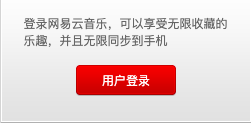
div.right-area元素内的 div.user-login元素,背景是一张精灵图 main_sprite.png
div.user-login元素有一个p元素和一个a元素,两者垂直布局
- p元素存放文字,通过设置上下padding来与a元素拉开距离
- a元素改为块级元素设置宽高,背景也是精灵图main_sprite.png
- 当鼠标悬停在a元素上时,a元素的背景还是来自于精灵图main_sprite.png
HTML
1
2
3
4
5
6
7<div class="right-area">
<div class="user-login">
<p>登录网易云音乐,可以享受无限收藏的乐趣,并且无限同步到手机</p>
<a href="#">用户登录</a>
</div>
</div>
</div>CSS
1
2
3
4
5
6
7
8
9
10
11
12
13
14
15
16
17
18
19
20
21
22
23
24
25
26
27
28
29
30
31
32
33
34
35
36
37
38
39
40
41
42
43
44
45
46
47
48
49
50
51
52
53
54
55
56
57
58.main .right-area .user-login {
height: 126px;
background: url(../images/main_sprite.png) ;
}
.main .right-area .user-login p {
color: #666;
padding: 16px 0;
width: 205px;
margin: 0 auto;
}
.main .right-area .user-login a {
display: block;
width: 100px;
height: 31px;
line-height: 31px;
color: #fff;
text-align: center;
margin: 0 auto;
background: url(../images/main_sprite.png) 0 -195px;
}
.main .right-area .user-login a:hover {
background-position: -110px -195px;
}
### 抽取共同header

- 入驻歌手和热门主播所在的盒子中,两者样式是一样的
- 有下边框,下间距,字体大小和颜色也一样
- 可以抽取成一个样式
- header 共同样式 header_type_01
```css
.header_type_01 {
display: flex;
justify-content: space-between;
align-items: center;
padding-bottom: 3px;
border-bottom: 1px solid #ccc;
}
.header_type_01 h3 {
color: #333;
font-size: 12px;
font-weight: 700;
}
.header_type_01 a {
color: #666;
}
.header_type_01 a:hover {
text-decoration: underline;
}实现header
HTML
1
2
3
4
5
6
7
8
9
10
11
12
13
14<div class="singer">
<div class="settled-singer">
<div class="header_type_01">
<h3>入驻歌手</h3>
<a href="#">查看全部 ></a>
</div>
</div>
<div class="hot-streamer">
<div class="header_type_01">
<h3>热门主播</h3>
</div>
</div>
</div>CSS
1
2
3
4.main .right-area .singer {
padding: 15px 20px;
background-color: #fff;
}
5.2.2. 按钮背景
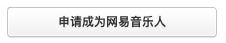
这是一个a元素,背景图
 是只有右圆角的图片
- 因为不知道按钮到底有多宽,不好直接将两边圆角放在一张图片中,不好拉伸
a元素中放一个子元素,背景图
 是有左圆角和长度颜色的图片
- 根据子元素长度,背景图中的多余长度会被裁剪掉
- 子元素背景图和a元素背景图来凑成完整圆角
按钮共同样式 btn_type_01
1
2
3
4
5
6
7
8
9
10
11
12
13
14
15
16
17
18.btn_type_01 {
display: block;
background: url(../images/button_sprite.png) no-repeat;
}
.btn_type_01.btn {
background-position: right -100px;
padding-right: 5px;
}
.btn_type_01.content {
background-position: 0 -59px;
padding-left: 5px;
}
.btn_type_01.btn:hover {
background-position: right -182px;
}
.btn_type_01.btn:hover .content {
background-position: 0 -141px;
}实现按钮
HTML
1
2
3<a href="#" class="btn_type_01 btn">
<i class="btn_type_01 content">申请成为网易音乐人</i>
</a>CSS
1
2
3
4
5
6
7
8
9
10.main .right-area .singer .btn {
color: #333;
text-align: center;
box-sizing: border-box;
width: 210px;
height: 31px;
line-height: 31px;
border-radius: 4px;
margin-bottom: 30px;
}
5.2.3. 歌手列表
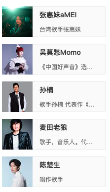
整体是一个ul>li*5的无序列表,li元素中有a元素,a元素包裹img.avatar元素和div.info元素
a元素因为设置为flex布局,所以可以设置宽高210x62,a元素内两个元素贴边布局
div.info元素
- 内部还是flex布局,子元素两边间距相等space-around
- 设置flex-grow:1,用来占满 a.item元素的剩余空间
- 为了内部p元素歌手信息在一行显示时多余用…表示,需要设置overflow:hidden;防止div.info元素向外扩张
img.avatar元素是张图片
HTML
1
2
3
4
5
6
7
8
9
10
11
12<ul class="list">
<li>
<a href="#" class="item">
<img src="./images/singer01.jpeg" alt="" class="avatar">
<div class="info">
<span>张惠妹aMEI</span>
<p>台湾歌手张惠妹</p>
</div>
</a>
</li>
...
</ul>CSS
1
2
3
4
5
6
7
8
9
10
11
12
13
14
15
16
17
18
19
20
21
22
23
24
25
26
27
28
29
30
31
32
33
34
35
36
37
38
39
40
41
42
43.main .right-area .list {
margin-top: 20px;
}
.main .right-area .list .item {
display: flex;
justify-content: space-between;
width: 210px;
height: 62px;
margin-bottom: 14px;
background-color: #fafafa;
}
.main .right-area .settled_singer .item:hover {
background-color: #eee;
}
.main .right-area .list .item .avatar {
width: 62px;
height: 62px;
}
.main .right-area .list .item .info {
flex: 1;
overflow: hidden;
display: flex;
flex-direction: column;
justify-content: space-around;
border: 1px solid #e9e9e9;
border-left: none;
padding: 0 14px;
}
.main .right-area .list .item .info span {
font-weight: 700;
font-size: 14px;
}
.main .right-area .list .item .info p {
color: #666;
white-space: nowrap;
text-overflow: ellipsis;
overflow: hidden;
}
5.2.4. 主播列表
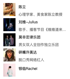
主播列表跟歌手列表的布局是一样的,其高度和间距不同
HTML
1
2
3
4
5
6
7
8
9
10
11<ul class="list">
<li class="item">
<a href="#" class="avatar">
<img src="./images/streamer01.jpeg" alt="">
</a>
<div class="info">
<a href="#"><span>陈立</span></a>
<p>心理学家、美食家陈立教授</p>
</div>
</li>
</ul>CSS
1
2
3
4
5
6
7
8
9
10
11
12
13
14
15
16
17
18
19
20
21
22
23
24
25
26.main .right-area .hot-streamer .item {
height: 50px;
background-color: #fff;
margin-bottom: 0;
}
.main .right-area .hot-streamer .item .avatar {
width: 40px;
height: 43px;
margin-right: 10px;
}
.main .right-area .hot-streamer .item .avatar img {
width: 100%;
height: 100%;
}
.main .right-area .hot-streamer .item .info {
padding: 0;
border: none;
}
.main .right-area .hot-streamer .item .info span {
color: #000;
font-weight: 400;
font-size: 12px;
}
.main .right-area .hot-streamer .item .info a:hover {
text-decoration: underline;
}
5.3. left-area
1 | <div class="left-area"> |
5.3.1. 抽取共同header
先分为 div.left_header 和 div.right_header 两个部分,贴边,垂直居中
图标是背景图,整个 div.header_type_02元素右内边距34px来显示该图标
div.left_header 内放置 a元素,div.tab元素
- div.tab元素 内放置a元素和span元素的结合
- a元素之间的竖线就是span元素,设置span元素的左右外边距来隔开a元素
div.right_header 内放置 a元素,i元素
- 需设置i元素为块级元素或行内块级元素来设置宽高,放置背景图
共同头部样式 header_type_02
1
2
3
4
5
6
7
8
9
10
11
12
13
14
15
16
17
18
19
20
21
22
23
24
25
26
27
28
29
30
31
32
33
34
35
36
37
38
39
40
41
42
43
44
45
46
47
48
49
50.header_type_01,
.header_type_02 {
display: flex;
justify-content: space-between;
align-items: center;
}
.header_type_02 {
border-bottom: 2px solid #C10D0C;
background: url(../images/main_sprite.png) no-repeat -225px -156px;
padding: 0 10px 7px 34px;
color: #666;
}
.header_type_02 a {
color: #666;
}
.header_type_02 .left_header {
display: flex;
}
.header_type_02 .left_header .title{
font-size: 20px;
line-height: 28px;
color: #333;
}
.header_type_02 .left_header .tab {
margin: 7px 0 0 20px;
display: flex;
}
.header_type_02 .left_header .tab a:hover {
text-decoration: underline;
}
.header_type_02 .left_header .tab span{
margin: 0 14px;
color: #ccc;
}
.header_type_02 .right_header {
display: flex;
align-items: center;
}
.header_type_02 .right_header a:hover{
text-decoration: underline;
}
.header_type_02 .right_header i {
display: block;
width: 12px;
height: 12px;
background: url(../images/main_sprite.png) 0 -240px;
margin-left: 4px;
}实现header
HTML
1
2
3
4
5
6
7
8
9
10
11
12
13
14
15
16
17
18
19
20
21
22
23
24
25
26
27
28
29
30
31
32
33
34
35
36
37
38
39
40
41
42
43
44
45
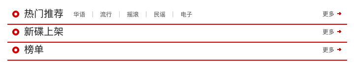
46<div class="left-area">
<div class="recommend">
<div class="header_type_02">
<div class="left_header">
<a href="#" class="title">热门推荐</a>
<div class="tab">
<a href="#">华语</a>
<span>|</span>
<a href="#">流行</a>
<span>|</span>
<a href="#">摇滚</a>
<span>|</span>
<a href="#">民谣</a>
<span>|</span>
<a href="#">电子</a>
</div>
</div>
<div class="right_header">
<a href="#">更多</a>
<i></i>
</div>
</div>
</div>
<div class="new-album">
<div class="header_type_02">
<div class="left_header">
<a href="#" class="title">新碟上架</a>
</div>
<div class="right_header">
<a href="#">更多</a>
<i></i>
</div>
</div>
</div>
<div class="toplist">
<div class="header_type_02">
<div class="left_header">
<a href="#" class="title">榜单</a>
</div>
<div class="right_header">
<a href="#">更多</a>
<i></i>
</div>
</div>
</div>
</div>CSS
1
2
3
4
5.main .left-area {
width: 729px;
background-color: #fff;
padding: 20px
}
5.3.2. recommend
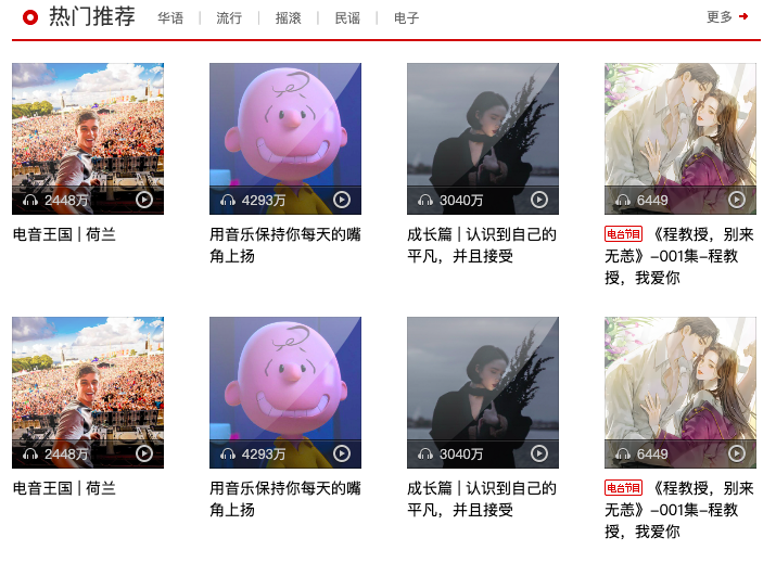
div.recommend 元素中有 div.header_type_02元素 和 ul.list 列表元素
- div.header_type_02元素取自共同header
- ul.list元素中包裹8个li元素,flex布局,设置可以多行排布flex-wrap:wrap;
- 由于每个列表中li元素有30px的左内边距,导致整个ul列表左边多了30px,所以需要将ul元素的左外边距扩30px
ul.list中每个li元素中有一个a元素,a元素中有 div.cover元素 和 div.info元素
- a元素设置为块级元素,宽高为140x204,内部元素垂直布局
div.cover元素宽高为140x140,内部有 img,div.mask_icon_01,div.bottom三个元素
- img元素宽高刚好是父元素宽高
- div.mask_icon_01元素是一张遮罩图片,宽高也是父元素宽高,需要叠在img元素之上,所以使用绝对定位
- div.bottom元素也需要绝对定位,叠在i元素之上
div.bottom元素中有 div.left元素,i.play_icon元素
- div.bottom元素为flex布局,子元素贴边,才能分为左右排布,中间留白
div.left元素有i元素和span元素
- 为了两个元素水平居中排布,使用了flex布局,侧轴居中align-items:center;
div.info元素有可以有 i.show_icon元素和span元素
- i.show_icon元素是一个图标,和span元素水平排布
HTML
1
2
3
4
5
6
7
8
9
10
11
12
13
14
15
16
17
18
19
20
21
22
23
24<div class="recommend">
<div class="header_type_02">
...
</div>
<ul class="list">
<li>
<a href="#" class="item">
<div class="cover">
<img src="./images/recommend01.jpg" alt="电音王国 | 荷兰">
<div class="mask_icon_01"></div>
<div class="bottom">
<div class="left">
<i class="listen_icon"></i>
<span class="data">2448万</span>
</div>
<i class="play_icon"></i>
</div>
</div>
<div class="info">电音王国 | 荷兰</div>
</a>
</li>
...
</ul>
</div>CSS
1
2
3
4
5
6
7
8
9
10
11
12
13
14
15
16
17
18
19
20
21
22
23
24
25
26
27
28
29
30
31
32
33
34
35
36
37
38
39
40
41
42
43
44
45
46
47
48
49
50
51
52
53
54
55
56
57
58
59
60
61
62
63
64
65
66
67
68
69
70
71
72
73
74
75
76
77
78
79
80
81
82
83
84
85
86
87
88
89.listen_icon {
display: inline-block;
width: 14px;
height: 11px;
background: url(../images/iconall_sprite.png) 0 -24px;
}
.play_icon {
display: inline-block;
width: 16px;
height: 17px;
background: url(../images/iconall_sprite.png);
}
.show_icon{
display: inline-block;
width: 35px;
height: 15px;
background: url(../images/icon_sprite.png) -31px -658px;
}
.mask_icon_01 {
position: absolute;
top: 0;
left: 0;
right: 0;
bottom: 0;
display: inline-block;
background: url(../images/coverall_sprite.png);
}
.main .recommend .list {
display: flex;
flex-wrap: wrap;
margin: 20px 0 35px -42px;
}
.main .recommend .list .item {
display: block;
width: 140px;
height: 204px;
overflow: hidden;
padding: 0 0 30px 42px;
}
.main .recommend .list .cover {
width: 140px;
height: 140px;
position: relative;
}
.main .recommend .list .cover img {
width: 100%;
}
.main .recommend .list .cover .bottom {
position: absolute;
bottom: 0;
left: 0;
right: 0;
display: flex;
justify-content: space-between;
align-items: center;
height: 27px;
padding: 0 10px;
box-sizing: border-box;
background: url(../images/coverall_sprite.png) 0 -537px;
color: #ccc;
}
.main .recommend .list .bottom .left{
display: flex;
align-items: center;
}
.main .recommend .list .bottom .data {
margin-left: 6px;
}
.main .recommend .list .info {
color: #000;
font-size: 14px;
margin-top: 8px;
}
.main .recommend .list .info:hover{
text-decoration: underline;
}
.main .recommend .list .info i {
position: relative;
top: 2px;
}
5.3.3. new-album
div.album 元素中有 div.header_type_02元素 和 div.album-roller 元素
- div.header_type_02元素取自共同header
- div.album-roller 元素是有1px边框的盒子,内部有一个1px边框盒子的div.inner元素
- 因为设置了 div.album-roller 元素的高度,为了盒子高度不变,所以设置box-sizing:border-box,使得其高度中包含上下边框宽度
div.inner元素也有1px的边框,为了内部宽高不变也设置box-sizing:border-box
- 内部有左图标 i.left_icon,div.conntent元素,右图标i.right_icon
- 三个元素水平居中align-items:center
div.conntent元素内部有多个ul.list列表
- 每个ul列表水平排布,宽度都为100%
- ul列表为了宽度不被div.conntent元素压缩显示,设置ul列表flex-shrink:0;
- 但也导致div.conntent元素盒子内容超过可视区,需要设置overflow:hidden
每个ul.list列表中有5个li元素
- li元素水平排布,贴边布局,两者间距相等
- 每个li元素宽高为118x150,内部包裹 div.cover,a.title,a.author三个元素,三者垂直布局
div.cover元素有 img,div.mask_icon_02,i.play_icon 三个元素
- img元素宽高为100x100
- div.mask_icon_02元素 绝对定位叠放在img元素之上
- i.play_icon元素 绝对定位叠放在 div.mask_icon_02元素之上。默认不显示,只有当鼠标悬停在div.cover元素,该元素才会显示
HTML
1
2
3
4
5
6
7
8
9
10
11
12
13
14
15
16
17
18
19
20
21
22
23
24
25
26
27
28
29
30<div class="new-album">
<div class="header_type_02">
...
</div>
<div class="album-roller">
<div class="inner">
<a href="#" class="left_icon"></a>
<div class="content">
<ul class="list">
<li>
<a href="#" class="item">
<div class="cover">
<img src="./images/album01.jpeg" alt="">
<div class="mask_icon_02"></div>
<i class="play_icon"></i>
</div>
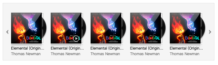
<p class="title">Elemental (Original Motion Picture Soundtrack)</p>
<p class="author">Thomas Newman</p>
</a>
</li>
...
</ul>
<ul class="list">
...
</ul>
</div>
<a href="#" class="right_icon"></a>
</div>
</div>
</div>CSS
1
2
3
4
5
6
7
8
9
10
11
12
13
14
15
16
17
18
19
20
21
22
23
24
25
26
27
28
29
30
31
32
33
34
35
36
37
38
39
40
41
42
43
44
45
46
47
48
49
50
51
52
53
54
55
56
57
58
59
60
61
62
63
64
65
66
67
68
69
70
71
72
73
74
75
76
77
78
79
80
81
82
83
84
85
86
87
88
89
90
91
92
93
94
95
96
97
98
99
100
101
102
103
104
105
106
107
108
109
110
111
112
113
114
115
116.mask_icon_01,
.mask_icon_02 {
position: absolute;
top: 0;
left: 0;
right: 0;
bottom: 0;
display: inline-block;
background: url(../images/coverall_sprite.png);
}
.mask_icon_02 {
background-position: 0 -570px;;
}
.left_icon,
.right_icon {
width: 17px;
height: 17px;
background: url(../images/main_sprite.png);
}
.left_icon {
background-position: -260px -75px;
}
.right_icon{
background-position: -300px -75px;
}
.left_icon:hover {
background-position: -280px -75px;
}
.right_icon:hover {
background-position: -320px -75px;
}
.main .new-album .album-roller {
height: 186px;
box-sizing: border-box;
margin: 20px 0 37px;
border: 1px solid #d3d3d3;
background-color: #f5f5f5;
}
.main .new-album .inner {
height: 100%;
border: 1px solid #fff;
box-sizing: border-box;
display: flex;
align-items: center;
padding: 0 4px;
}
.main .new-album .content {
flex: 1;
margin: 0 4px;
height: 180px;
overflow: hidden;
display: flex;
}
.main .new-album .list {
width: 100%;
flex-shrink: 0;
margin-top: 28px;
display: flex;
justify-content: space-between;
}
.main .new-album .list .item {
display: block;
width: 118px;
height: 150px;
background: url(../images/main_sprite.png) no-repeat -260px 100px;
}
.main .new-album .list .cover {
height: 100px;
margin-bottom: 7px;
position: relative;
}
.main .new-album .list .cover img {
width: 100px;
height: 100px;
}
.main .new-album .list .cover .play_icon {
display: none;
position: absolute;
bottom: 5px;
right: 24px;
width: 22px;
height: 22px;
background-position: 0 -110px;
}
.main .new-album .list .cover:hover .play_icon {
display: block;
}
.main .new-album .list .item p{
white-space: nowrap;
text-overflow: ellipsis;
overflow: hidden;
line-height: 18px;
padding-right: 8px;
}
.main .new-album .list .item p:hover {
text-decoration: underline;
}
.main .new-album .list .item .title {
color: #000;
}
.main .new-album .list .item .author {
color: #666;
}
5.3.4. toplist
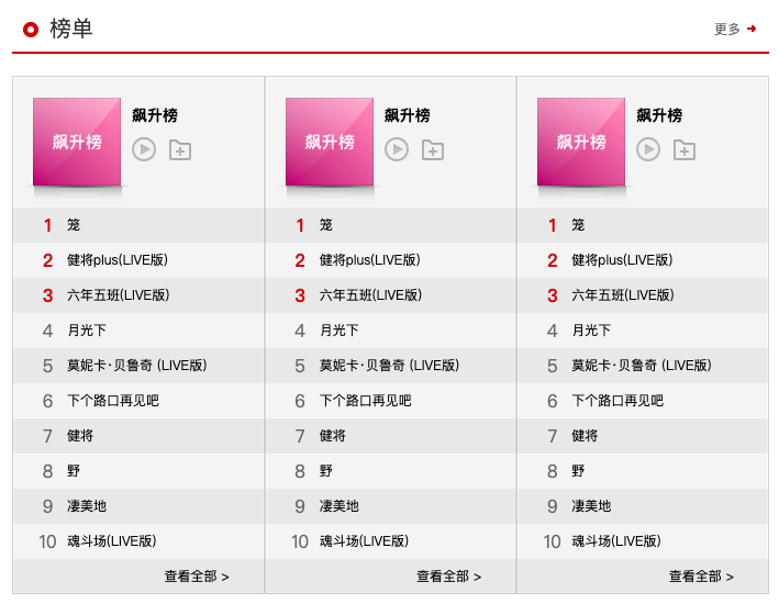
div.toplist元素有div.header_type_02元素 和 div.conent 元素
- div.header_type_02元素取自共同header
div.content元素
- 采用背景色实现首行不同样式,奇偶行不同色
- 有三个列表块级元素 dl.list,三者宽度都为230px
列表采用dl-dt-dd元素,dt.top用于首行,dd用于剩余行,dd中用有序列表ol-li
dt.top元素有 div.cover 和 div.info 元素,两者水平排布
- div.cover元素为块级元素,存放了80x80的图片和一张绝对定位的遮罩图片
- div.info元素存放 a.title 和 div.btn元素
- 两者垂直布局
- a.title元素是独占一行,有下外边距10px
- div.btn元素 存放了 播放图标 和 收藏图标,两者水平布局
dd元素中存放一个 ol-li 有序列表
- ol元素的高度为32px,宽度继承至父元素dd,dd元素宽度也继承至父元素dl
- ol元素行高为32px,使得内部文字垂直居中
- 每个li.item 元素中有 div.order,a.title ,div.icons元素。 div.order元素和a.title元素水平居中,div.icons元素绝对定位放在 li.item元素右边
- div.order元素宽高为35x32,存放的是行号,前三个颜色不同于其他行,设置特别的top3类
- div.icons元素宽高为82x32,内部中存放了 播放图标,添加图标,收藏图标,三者垂直居中排布。默认不显示,只有当鼠标悬停在li.item元素,该元素才会显示
- a.title元素规定显示在一行,多余用…表示,其宽度为父元素剩余空间
- 当div.icons元素不显示时,宽度就是 除父元素内边距,div.order元素外的所有空间
- 当div.icons元素不显示时,宽度就是 除父元素内边距,div.order元素,div.icons元素外的所有空间
HTML
1
2
3
4
5
6
7
8
9
10
11
12
13
14
15
16
17
18
19
20
21
22
23
24
25
26
27
28
29
30
31
32
33
34
35
36
37
38
39
40
41<div class="toplist">
<div class="header_type_02">
...
</div>
<div class="content">
<dl class="list">
<dt class="top">
<div href="#" class="cover">
<img src="./images/toplist01.jpeg" alt="">
<a href="#" class="mask_icon_03"></a>
</div>
<div class="info">
<a href="#" class="title">飙升榜</a>
<div class="btn">
<a href="#" class="play_icon_02"></a>
<a href="#" class="collect_icon"></a>
</div>
</div>
</dt>
<dd>
<ol>
<li class="item">
<div class="order top3">1</div>
<a href="#" class="title">笼</a>
<div class="icons">
<a href="#" class="play_icon_03"></a>
<a href="#" class="add_icon"></a>
<a href="#" class="collect_icon_02"></a>
</div>
</li>
...
<li class="item">
<div class="more">
<a href="#" class="title">查看全部></a>
</div>
</li>
</ol>
</dd>
</dl>
</div>
</div>CSS
- 抽取图标样式
1
2
3
4
5
6
7
8
9
10
11
12
13
14
15
16
17
18
19
20
21
22
23
24
25
26
27
28
29
30
31
32
33
34
35
36
37
38
39
40
41
42
43
44
45
46
47
48
49.play_icon_02,
.collect_icon{
display: inline-block;
width: 22px;
height: 22px;
background: url(../images/main_sprite.png);
}
.play_icon_02 {
background-position: -267px -205px;
}
.play_icon_02:hover{
background-position: -267px -235px;
}
.collect_icon {
background-position: -300px -205px;
}
.collect_icon:hover {
background-position: -300px -235px;
}
.play_icon_03,
.collect_icon_02,
.add_icon {
display: inline-block;
width: 17px;
height: 17px;
}
.play_icon_03,
.collect_icon_02{
background: url(../images/main_sprite.png);
}
.play_icon_03 {
background-position: -267px -268px;
}
.play_icon_03:hover {
background-position: -267px -288px;
}
.collect_icon_02 {
background-position: -297px -268px;
}
.collect_icon_02:hover {
background-position: -297px -288px;
}
.add_icon {
background: url(../images/icon_sprite.png) 0 -700px;
}
.add_icon:hover {
background-position: -22px -700px;
}- 编写样式
1
2
3
4
5
6
7
8
9
10
11
12
13
14
15
16
17
18
19
20
21
22
23
24
25
26
27
28
29
30
31
32
33
34
35
36
37
38
39
40
41
42
43
44
45
46
47
48
49
50
51
52
53
54
55
56
57
58
59
60
61
62
63
64
65
66
67
68
69
70
71
72
73
74
75
76
77
78
79
80
81
82
83
84
85
86
87
88
89
90
91
92
93
94
95
96
97
98
99.main .toplist .content {
height: 472px;
margin-top: 20px;
display: flex;
}
.main .toplist .list {
width: 230px;
flex-shrink: 0;
background: url(../images/toplist_sprite.png);
}
.main .toplist .top {
display: flex;
padding: 20px 0 0 20px;
height: 100px;
}
.main .toplist .top .cover {
display: block;
width: 80px;
height: 80px;
position: relative;
}
.main .toplist .top .cover img {
width: 100%;
height: 100%;
}
.main .toplist .top .info {
margin: 6px 0 0 10px;
}
.main .toplist .top .info .title {
display: block;
font-size: 14px;
color: #000;
margin-bottom: 10px;
font-weight: 700;
}
.main .toplist .top .info .title:hover {
text-decoration: underline;
}
.main .toplist .top .info .play_icon_02 {
margin-right: 8px;
}
.main .toplist .list ol {
margin-left: 15px;
line-height: 32px;
}
.main .toplist .item {
height: 32px;
position: relative;
display: flex;
}
.main .toplist .item:hover .icons{
display: flex;
}
.main .toplist .item .icons{
display: none;
align-items: center;
}
.main .toplist .item .more {
text-align: right;
margin-right: 32px;
flex: 1;
}
.main .toplist .item .order {
font-size: 16px;
color: #666;
width: 35px;
text-align: center;
}
.main .toplist .item .order.top3{
color: #c10d0c;
font-weight: 700;
}
.main .toplist .item .title {
color: #000;
white-space: nowrap;
text-overflow: ellipsis;
overflow: hidden;
flex: 1;
}
.main .toplist .item .title:hover {
text-decoration: underline;
}
.main .toplist .icons .play_icon_03,
.main .toplist .icons .collect_icon_02 {
margin-right: 10px;
}
.main .toplist .icons .add_icon {
margin: 2px 6px 0 0;
}