定位:static,relative,fixed,absolute,sticky,z-index
1. 标准流
默认情况下,元素都是按照normal flow(标准流、常规流、正常流、文档流【document flow】)进行排布
- 从左到右、从上到下按顺序摆放好
- 默认情况下,互相之间不存在层叠现象
1
2
3
4
5
6
7
8
9
10
11
12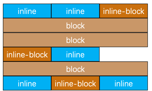
13<body>
<span>span1</span>
<img src="images/cube.jpg" alt="">
<span style="display: inline-block">span2</span>
<div>div</div>
<p>p</p>
<span style="display: inline-block">span</span>
<strong>strong</strong>
<h1>h1</h1>
<span>span3</span>
<span style="display: inline-block">span4</span>
<span>span5</span>
</body>
2. margin-padding调整位置
在标准流中,可以使用margin、padding对元素进行定位
- 其中margin还可以设置负数
比较明显的缺点
- 设置一个元素的margin或者padding,通常会影响到标准流中其他元素的定位效果
- 不便于实现元素层叠的效果
如果希望一个元素可以跳出标准量,单独的对某个元素进行定位呢?
- 可以通过position属性来进行设置
3. 画布和视口
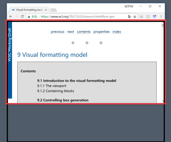
- 视口(Viewport)
- 文档的可视区域,如红框所示
- 画布(Canvas)
- 用于渲染文档的区域,文档内容超出视口范围,可以通过滚动查看
- 如黑框所示
- 宽高对比
- 画布 >= 视口
4. 定位
4.1. 认识元素的定位
定位允许从正常的文档流布局中取出元素,并使它们具有不同的行为
- 例如放在另一个元素的上面
- 或者始终保持在浏览器视窗内的同一位置
可以解决盒子与盒子之间的层叠问题
- 定位之后的元素层级最高,可以层叠在其他盒子上面
可以让盒子始终固定在屏幕中的某个位置
定位在开发中非常常见
4.2. 基本使用
4.2.1. 设置定位方式
属性名:position
属性值:
| 定位方式 | 属性值 |
|---|---|
| 静态定位 | static |
| 相对定位 | relative |
| 绝对定位 | absolute |
| 固定定位 | fixed |
| 粘性定位 | sticky |
4.2.2. 设置偏移值
- 偏移值设置分为两个方向,水平和垂直方向各选一个使用
- 选取的原则一般是就近原则
| 方向 | 属性名 | 属性值 | 含义 |
|---|---|---|---|
| 水平 | left | 数字+px | 距离左边的距离 |
| 水平 | right | 数字+px | 距离右边的距离 |
| 垂直 | top | 数字+px | 距离上边的距离 |
| 垂直 | bottom | 数字+px | 距离下边的距离 |
5. 静态定位 - static
- 元素按照normal flow布局
- 静态定位是默认值
- 注意点:
- 静态定位不能通过方位属性进行移动,即left 、right、top、bottom没有任何作用
- 之后说的定位不包括静态定位,一般特指后几种
6. 相对定位 - relative
元素按照normal flow布局
自恋型定位:相对于自己之前的位置进行移动特点
- 需要配合方位属性实现移动,定位参照对象是元素自己原来的位置
- 在页面中占位置,
没有脱标
应用场景
- 配合绝对定位组cp(子绝父相)
- 在不影响其他元素位置的前提下,对当前元素位置进行微调
7. 固定定位 - fixed
元素脱离normal flow(脱离标准流、脱标)
死心眼型定位,相对于浏览器进行定位移动特点
- 需要配合方位属性实现移动,定位参照对象是
视口(viewport) - 当画布滚动时,固定不动
- 在页面中不占位置,
已经脱标
- 需要配合方位属性实现移动,定位参照对象是
应用场景
- 让盒子固定在屏幕中的某个位置
8. 绝对定位 - absolute
元素脱离normal flow(脱离标准流、脱标)
拼爹型定位,相对于非静态定位的父元素进行定位移动特点
- 需要配合方位属性实现移动
- 定位参照对象是最邻近的定位祖先元素
- 如果找不到这样的祖先元素,参照对象是视口
- 在页面中不占位置,
已经脱标
- 需要配合方位属性实现移动
定位祖先元素
- position值不为static的元素
- 也就是position值为relative、absolute、fixed的元素
应用场景
- 配合绝对定位组cp(子绝父相)
8.1. 子绝父相
在绝大数情况下,子元素的绝对定位都是相对于父元素进行定位
如果希望子元素相对于父元素进行定位,又不希望父元素脱标,常用解决方案
- 父元素 position: relative
- 让父元素成为定位元素,而且父元素不脱离标准流
- 子元素 position: absolute
- 简称为“子绝父相”
- 父元素 position: relative
子绝父相好处
- 父元素是相对定位,则对网页布局影响最小
8.2. 应用-子元素水平垂直居中
1 | <style> |
9. 粘性定位 - sticky
9.1. 认识sticky
- 兼容性查看 https://caniuse.com/?search=sticky
- sticky可以看做是相对定位和固定(绝对)定位的结合体
- 允许被定位的元素表现得像相对定位一样,直到它滚动到某个阈值点
- 当达到这个阈值点时, 就会变成固定(绝对)定位
- sticky是相对于最近的滚动祖先包含滚动视口的
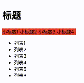
9.2. 案例
利用emmet语法创建100个列表
1 | .box>h1{标题}+.nav>span*4{小标题$}^ul>li*100{列表$} |
div.nav导航栏距离div.box元素上视口值0时,变为固定定位
1 | .box { |
10. position值对比
| 脱离标准流 | 定位元素 | 绝对定位元素 | 定位参照对象 | |
|---|---|---|---|---|
| static – 静态定位 | × | × | × | × |
| relative – 相对定位 | × | √ | × | 元素自己原来的位置 |
| absolute – 绝对定位 | √ | √ | √ | 最邻近的定位祖先元素 如果找不到这样的祖先元素,参照对象是视口 |
| fixed – 固定定位 | √ | √ | √ | 视口 |
11. absolute/fixed特点
11.1. 是脱标元素
可以随意设置宽高- 行内非替换元素也可以随意设置
- 宽高默认由内容决定
- 不再受标准流的约束
- 不再严格按照从上到下、从左到右排布
- 不再严格区分块级(block)、行内级(inline),行内块级(inline-block)的很多特性都会消失
- 不再给父元素汇报宽高数据
- 脱标元素内部默认还是按照标准流布局
11.2. 是绝对定位元素
绝对定位元素(absolutely positioned element)- position值为absolute或者fixed的元素
11.2.1. 定位参数对象宽度
定位参照对象的宽度 = left + right + margin-left + margin-right + 绝对定位元素的实际占用宽度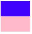
1
2
3
4
5
6
7
8
9
10
11
12
13
14
15
16
17
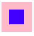
18<div class="father"><div class="son"></div></div>
<style>
.father{
position: relative;
width: 100px;
height: 100px;
background-color: pink;
}
.son{
position: absolute;
left: 0;
right: 0;
background-color: blue;
height: 50px;
}
</style>公式为:父宽(100) = left(0) + right(0) + margin-left(0) + margin-right(0) + 子宽(auto),剩余的100px分给绝对定位元素宽度,等价于把 div.son的宽度设置为100%
1
2
3
4
5
6
7
8
9
10
11
12
13
14
15
16
17
18
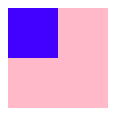
19<div class="father"><div class="son"></div></div>
<style>
.father{
position: relative;
width: 100px;
height: 100px;
background-color: pink;
}
.son{
position: absolute;
left: 0;
right: 0;
background-color: blue;
width: 50px;
height: 50px;
}
</style>公式为:父宽(100) = left(0) + right(0) + margin-left(0) + margin-right(0) + 子宽(50),chrome默认把剩余的50px分给margin-right
1
2
3
4
5
6
7
8
9
10
11
12
13
14
15
16
17
18
19
20
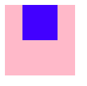
21<div class="father"><div class="son"></div></div>
<style>
.father{
position: relative;
width: 100px;
height: 100px;
background-color: pink;
}
.son{
position: absolute;
left: 0;
right: 0;
background-color: blue;
width: 50px;
height: 50px;
margin: 0 auto;
}
</style>公式为:父宽(100) = left(0) + right(0) + margin-left(auto) + margin-right(auto) + 子宽(50),剩余的50px平均分给margin-left,margin-right,实现水平居中
11.2.2. 定位参照对象高度
定位参照对象的高度 = top + bottom + margin-top + margin-bottom + 绝对定位元素的实际占用高度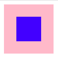
1
2
3
4
5
6
7
8
9
10
11
12
13
14
15
16
17
18
19
20
21
22
23<div class="father"><div class="son"></div></div>
<style>
.father{
position: relative;
width: 100px;
height: 100px;
background-color: pink;
}
.son{
position: absolute;
left: 0;
right: 0;
top: 0;
bottom: 0;
background-color: blue;
width: 50px;
height: 50px;
margin: auto;
}
</style>公式为:
- 父高(100) = top(0) + bottom(0) + margin-top(auto) + margin-bottom(auto) + 子高(50),剩余的50px平均分给margin-top,margin-bottom,实现垂直居中
- 父宽(100) = left(0) + right(0) + margin-left(auto) + margin-right(auto) + 子宽(50),剩余的50px平均分给margin-left,margin-right,实现水平居中
11.2.3. 设置技巧
- 如果希望绝对定位元素的宽高和定位参照对象一样,可以给绝对定位元素设置以下属性
- left: 0、right: 0、top: 0、bottom: 0、margin:0
- 如果希望绝对定位元素在定位参照对象中居中显示,可以给绝对定位元素设置以下属性
- left: 0、right: 0、top: 0、bottom: 0、margin: auto
- 另外,还得设置具体的宽高值(宽高小于定位参照对象的宽高)
11.3. auto是什么
- auto -> 交给浏览器处理
- width: auto
- 行内非替换元素 -> width: 包裹内容
- 块级元素 ->width: 包含块的宽度
- 绝对定位元素 -> width: 包裹内容
11.4. 练习
- 图标来自于 https://www.iconfont.cn/
11.5. HTML
1 | <div class="content"> |
11.6. CSS
1 | <link rel="stylesheet" href="./iconfont.css" /> |
12. 元素的层级关系
12.1. 不同布局方式元素的层级关系
标准流 < 浮动 < 定位
12.2. 不同定位之间的层级关系
- 相对,绝对,固定默认层级相同
- 此时HTML中写在后面的元素层级更高,会覆盖前面的元素
12.3. 改变定位元素的层级 z-index
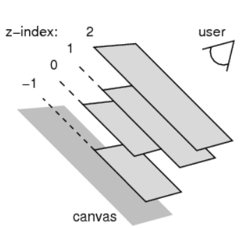
- z-index属性用来
设置定位元素的层叠顺序(仅对定位元素有效) - 属性值:数字,可以是正整数、负整数、0
- 数字越大,层级越高
- 一般设置最高层级
z-index:999;
- 一般设置最高层级
- 如果是兄弟关系
- z-index越大,层叠在越上面
- z-index相等,写在后面的那个元素层叠在上面
- 如果不是兄弟关系
- 各自从元素自己以及祖先元素中,找出
最邻近的2个定位元素进行比较(还是找兄弟) - 而且这2个定位元素必须有设置z-index的具体数值
- 各自从元素自己以及祖先元素中,找出